27 Best Dining Room Paint Colors (Transform Your Eating Space)
Choosing the perfect paint color for your dining room sets the stage for countless memorable meals and gatherings.
This important space deserves special attention, as the right hue can stimulate conversation, enhance appetite, and create the exact atmosphere you desire.
Whether you prefer intimate and cozy or bright and energizing, your dining room’s color palette influences how you and your guests experience every meal.
The right shade can complement your furniture, reflect your personal style, and even make food look more appetizing.
Let’s explore 27 stunning dining room paint colors that will transform your eating space into the gathering spot you’ve always envisioned!
1: Sage Green
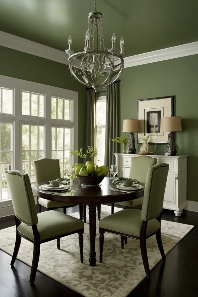
Sage green creates a serene, natural backdrop that complements both modern and traditional dining furniture.
This versatile neutral-adjacent color feels fresh yet timeless, perfect for everyday meals and special occasions alike.
You’ll notice how this gentle green makes food photography look amazing on social media. Sage pairs beautifully with wood tones, whites, and brass accents.
Try Benjamin Moore’s “October Mist” or Sherwin-Williams’ “Clary Sage” for a sophisticated take on this popular shade.
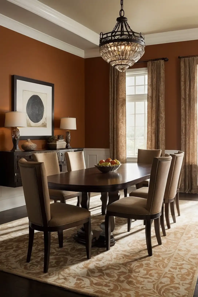
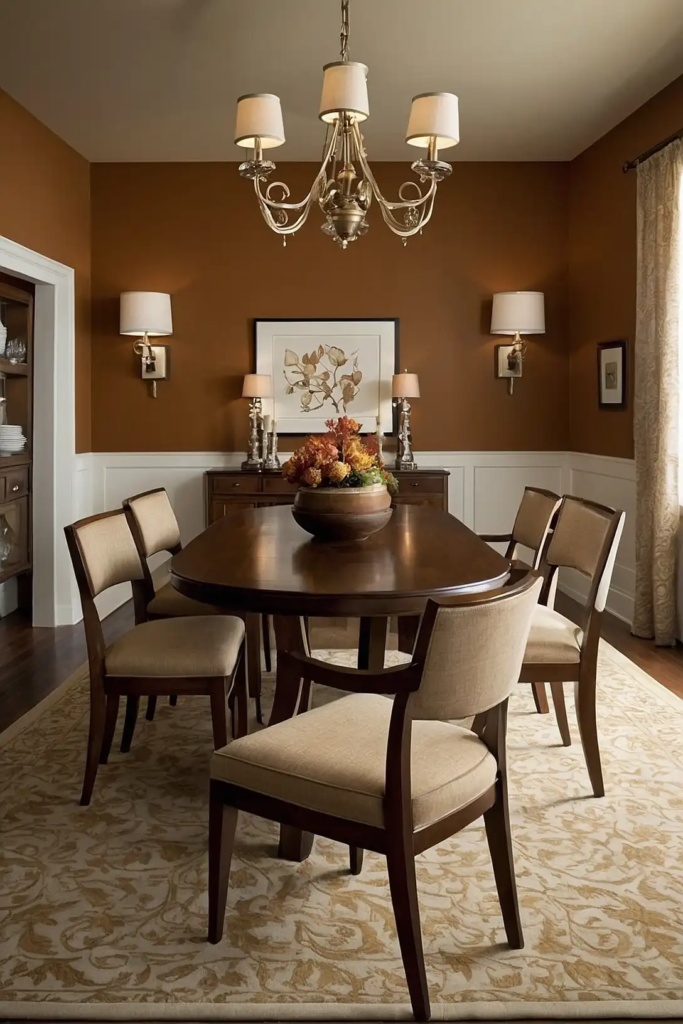
2: Warm Terracotta
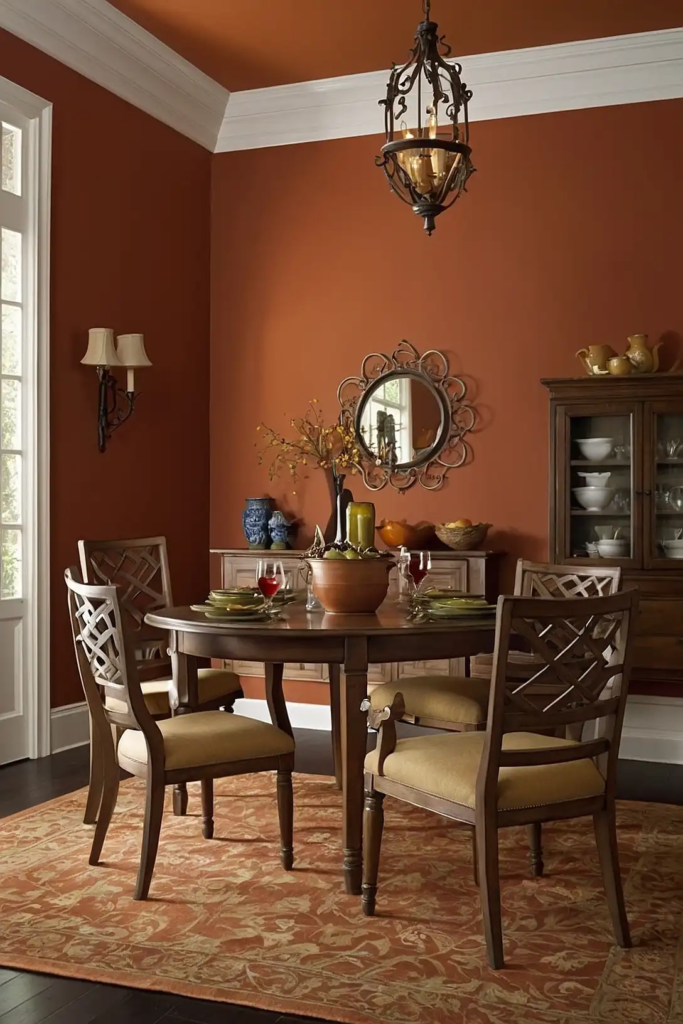
Warm terracotta brings Mediterranean warmth and conversational energy to your dining space.
This earthy orange-red creates an inviting atmosphere that encourages lingering over meals with family and friends.
Your dining room will feel especially cozy and intimate during evening gatherings with this rich background.
Terracotta works magnificently with natural textures like wood, rattan, and linen.
Consider Sherwin-Williams’ “Cavern Clay” or Benjamin Moore’s “Audubon Russet” for an authentic, sun-baked terracotta feel.
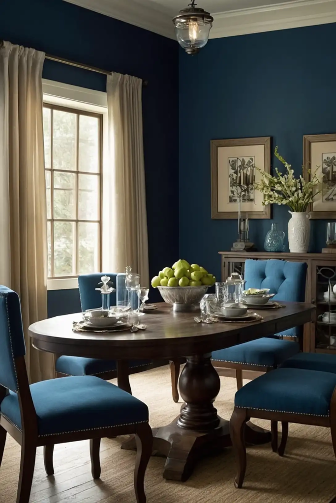
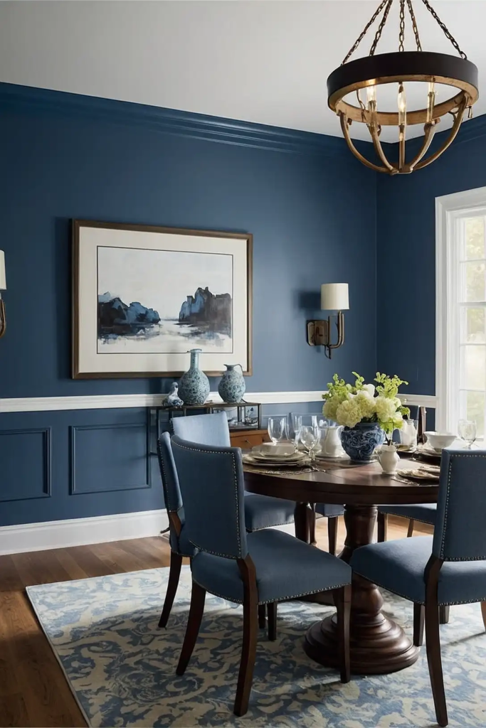
3: Naval Blue
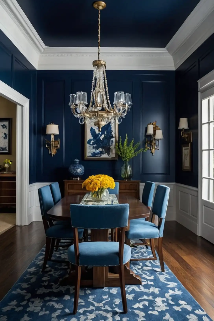
Naval blue delivers dramatic sophistication that transforms ordinary dining rooms into elegant entertaining spaces.
This timeless deep blue creates a luxurious backdrop for both casual and formal dining experiences.
You’ll appreciate how this versatile color changes throughout the day, appearing more dynamic at night under soft lighting.
Navy looks stunning with brass hardware, crisp white trim, and virtually any wood tone.
Try Sherwin-Williams’ “Naval” or Benjamin Moore’s “Hale Navy” for a rich blue that elevates your dining experience.
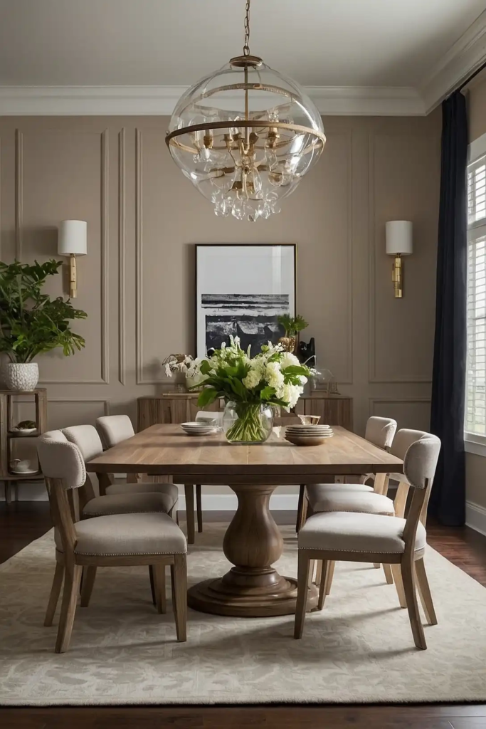
4: Soft Greige
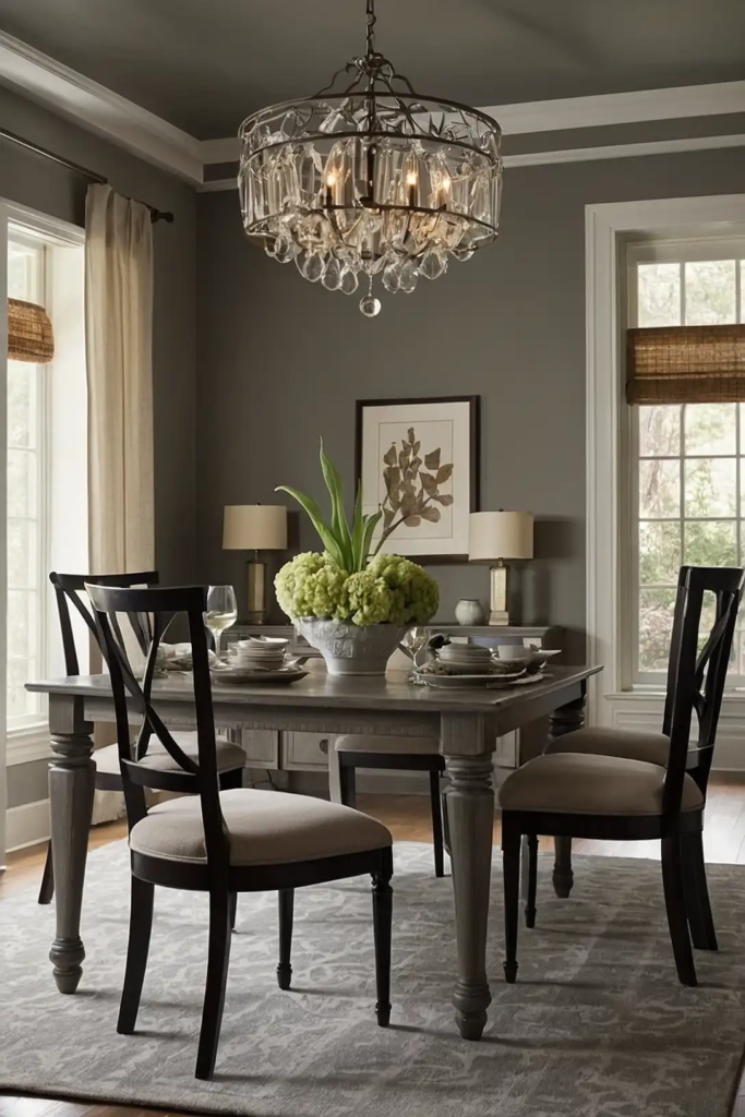
Soft greige provides the perfect neutral backdrop for showcasing statement furniture and colorful table settings.
This balanced gray-beige hybrid adapts beautifully to changing light throughout the day.
Your dining room will feel sophisticated yet approachable with this versatile color.
Greige creates an excellent foundation for seasonal décor changes without competing with your table styling.
Consider Benjamin Moore’s “Balboa Mist” or Sherwin-Williams’ “Agreeable Gray” for a refined neutral that enhances your dining space.
5: Merlot Red
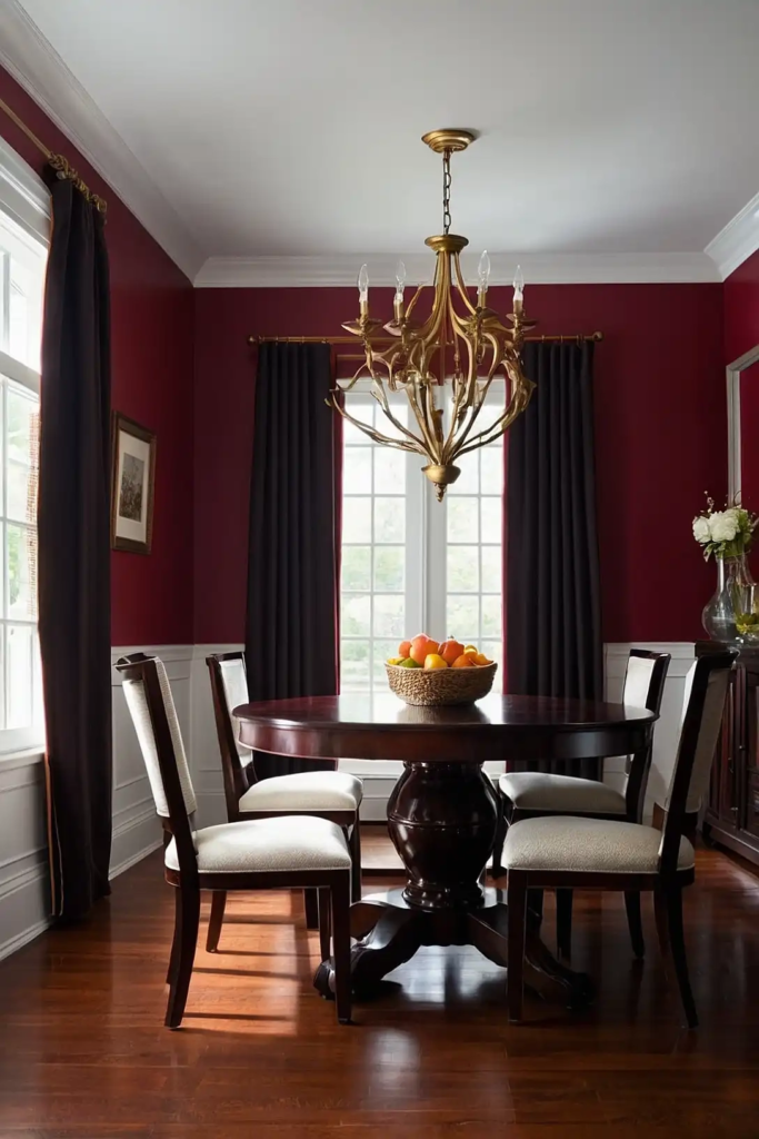
Merlot red infuses your dining area with rich, appetizing energy perfect for stimulating conversation and enjoyment.
This classic dining room choice creates a warm, enveloping atmosphere reminiscent of fine restaurants.
You’ll create an undeniably special feeling for dinner parties and holiday gatherings with this bold choice.
Merlot pairs beautifully with cream trim, dark wood furniture, and gold accents.
Try Benjamin Moore’s “Dinner Party” or Sherwin-Williams’ “Carnelian” for a sophisticated wine-inspired shade.
6: Butter Yellow
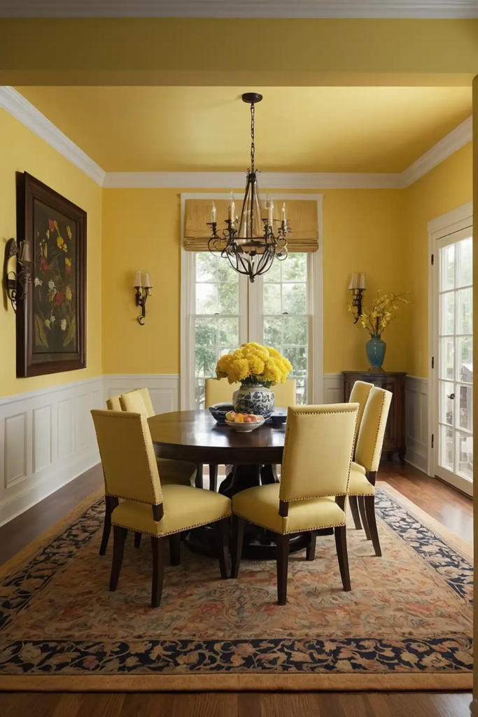
Butter yellow fills your dining space with cheerful, sunny energy perfect for breakfast nooks and family-focused eating areas.
This warm, inviting color enhances morning light and creates a welcoming atmosphere.
Your meals will feel more joyful against this happiness-inducing backdrop. Yellow stimulates conversation and promotes positive social interactions at the table.
Consider Benjamin Moore’s “Golden Straw” or Sherwin-Williams’ “Decisive Yellow” for a buttery shade that brightens your dining experience.
7: Slate Blue
Slate blue offers sophisticated color with unmatched versatility for modern dining spaces.
This medium-toned blue-gray creates a tranquil backdrop that works beautifully with most furniture styles and accent colors.
You’ll appreciate how this understated color enhances both daytime and evening meals with its chameleon-like adaptability.
Slate blue creates a sense of expanded space in smaller dining areas.
Try Sherwin-Williams’ “Debonair” or Benjamin Moore’s “Van Deusen Blue” for a refined slate that elevates your dining space.
8: Warm White
Warm white creates a bright, timeless backdrop that maximizes light and showcases your dining furniture and table settings.
This versatile non-color adapts to your seasonal décor while maintaining an airy, welcoming feel.
Your dining room will feel fresh yet cozy with this practical choice. Warm whites work beautifully in both traditional and contemporary dining spaces.
Consider Benjamin Moore’s “Simply White” or Sherwin-Williams’ “Alabaster” for a creamy white that enhances without overwhelming.
9: Charcoal Gray
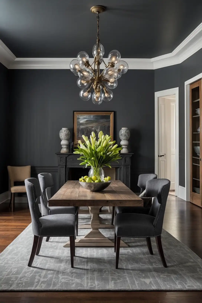
Charcoal gray delivers dramatic sophistication that makes your dining table and food presentations the star of the show.
This modern neutral creates a high-contrast background perfect for contemporary dining spaces.
You’ll create an undeniably chic atmosphere for dinner parties with this bold choice. Charcoal pairs beautifully with crisp white trim and natural wood elements.
Try Benjamin Moore’s “Wrought Iron” or Sherwin-Williams’ “Iron Ore” for a refined charcoal that transforms your dining experience.
10: Blush Pink
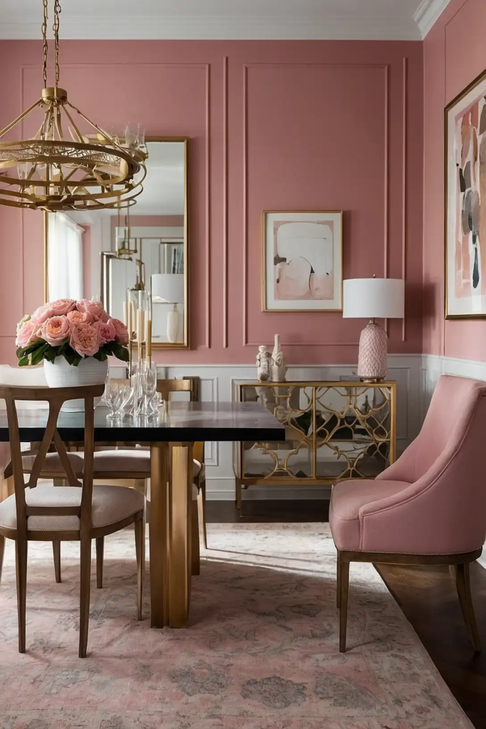
Blush pink infuses your dining space with subtle warmth that flatters skin tones and creates an inviting atmosphere.
This unexpected neutral creates a soft, sophisticated backdrop for both casual and formal dining.
Your guests will feel instantly relaxed and comfortable in this gentle, welcoming environment. Blush pairs beautifully with brass, white, and natural wood accents.
Consider Benjamin Moore’s “First Light” or Sherwin-Williams’ “Romance” for a sophisticated blush that enhances your dining space.
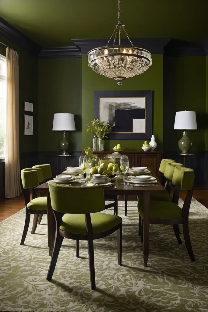
11: Forest Green
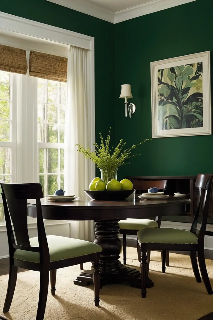
Forest green creates an enveloping, nature-inspired backdrop perfect for intimate dinner parties and special occasions.
This rich jewel tone brings dramatic sophistication to dining spaces of all sizes.
You’ll notice how this deep green makes white dinnerware and glassware sparkle against its luxurious background.
Forest green pairs beautifully with wood tones, gold accents, and crisp white trim.
Try Benjamin Moore’s “Hunter Green” or Sherwin-Williams’ “Rookwood Green” for a timeless forest shade.
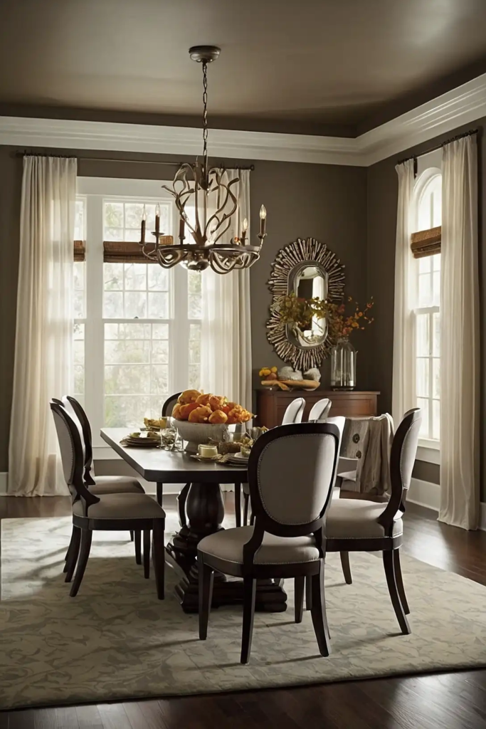
12: Warm Taupe
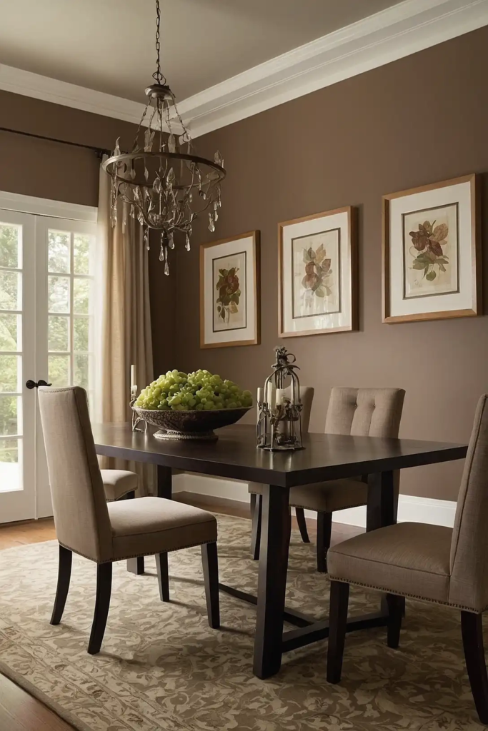
Warm taupe offers neutral versatility with subtle depth perfect for dining spaces that transition from breakfast to dinner parties.
This sophisticated beige-gray-brown hybrid complements most furniture styles and color schemes.
Your dining room will feel both elegant and approachable with this practical choice.
Taupe creates an excellent foundation for showcasing colorful table settings and seasonal décor.
Consider Benjamin Moore’s “Pashmina” or Sherwin-Williams’ “Loggia” for a refined taupe that enhances your dining experience.
13: Peacock Blue
Peacock blue delivers jewel-toned drama that transforms ordinary dining rooms into extraordinary entertaining spaces.
This rich teal-blue creates an unforgettable backdrop for special meals and celebrations.
You’ll create an atmosphere of luxury and sophistication with this bold, confident choice. Peacock blue pairs magnificently with brass accents, cream trim, and dark wood furniture.
Try Benjamin Moore’s “Caribbean Teal” or Sherwin-Williams’ “Oceanside” for a vibrant peacock that elevates your dining space.
14: Soft Mushroom
Soft mushroom provides earthy sophistication with remarkable versatility for transitional dining spaces.
This complex neutral creates a warm, grounding atmosphere that works beautifully with most design styles.
Your dining room will feel both contemporary and timeless with this trending color choice.
Mushroom enhances both natural and artificial light for comfortable dining at any hour.
Consider Benjamin Moore’s “Cumulus Cloud” or Sherwin-Williams’ “Accessible Beige” for a sophisticated mushroom that enriches your dining experience.
15: Classic Black
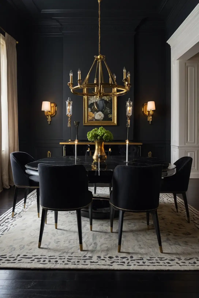
Classic black creates dramatic sophistication that makes your dining furniture and table settings pop with high-contrast impact.
This bold choice brings undeniable elegance to formal dining spaces. You’ll transform ordinary meals into special occasions with this luxury restaurant-inspired backdrop.
Black dining rooms reflect candlelight beautifully for magical evening gatherings.
Try Benjamin Moore’s “Black Beauty” or Sherwin-Williams’ “Tricorn Black” for a rich, enveloping atmosphere.
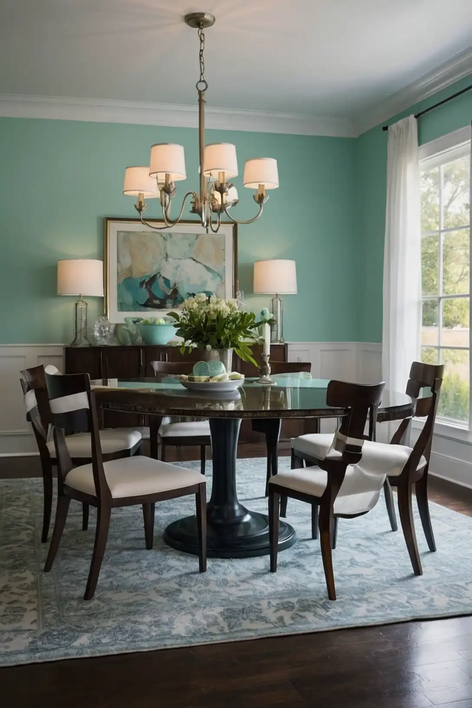
16: Pale Aqua
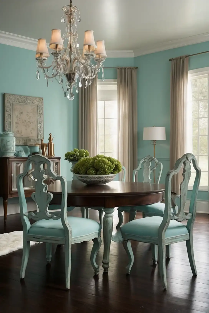
Pale aqua infuses your dining space with subtle freshness that creates a bright, happy atmosphere for family meals.
This gentle blue-green evokes water and sky, bringing natural tranquility to your dining experience.
Your guests will feel instantly relaxed in this serene, uplifting environment. Aqua works beautifully with white furniture, natural woods, and silver accents.
Consider Benjamin Moore’s “Crystal Blue” or Sherwin-Williams’ “Tidewater” for a refreshing aqua that brightens your dining space.
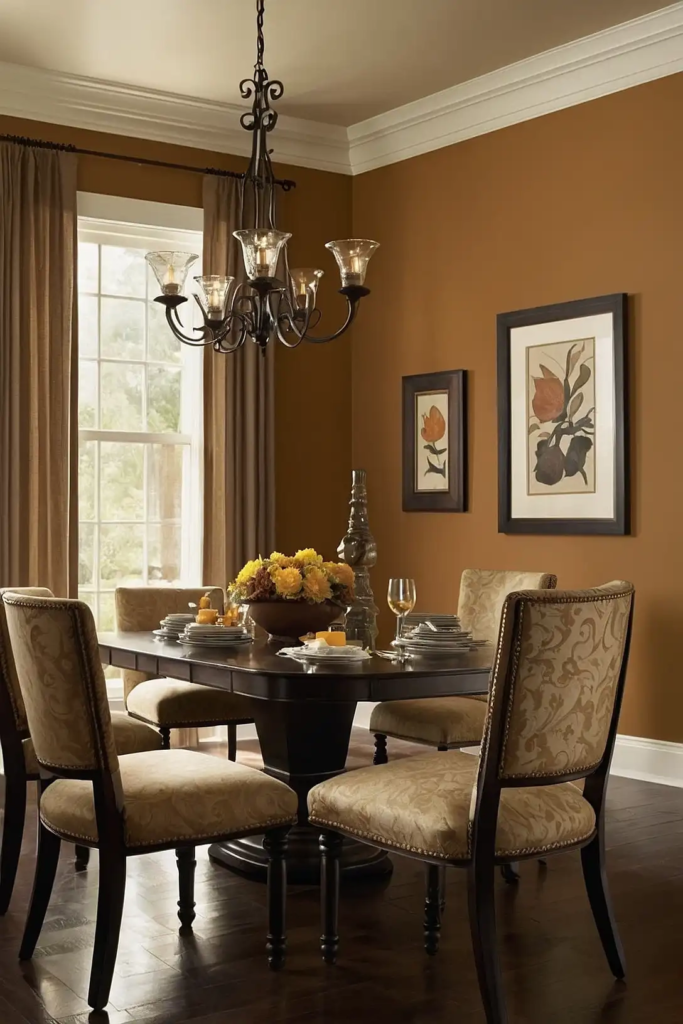
17: Warm Cognac
Warm cognac delivers rich, amber-inspired color that creates an intimate, conversation-friendly atmosphere.
This sophisticated brown-orange hybrid brings whiskey-warm vibes to dining spaces of all sizes.
You’ll create a cozy, enveloping feeling perfect for lingering over after-dinner conversations.
Cognac pairs beautifully with cream trim, blue accents, and both light and dark wood furniture.
Try Benjamin Moore’s “Cognac” or Sherwin-Williams’ “Cut the Mustard” for an inviting shade that enhances your dining experience.
18: Dove Gray
Dove gray offers elegant neutrality with just enough depth to create interest without overwhelming.
This versatile light-to-medium gray creates a sophisticated backdrop that complements both traditional and modern dining furniture.
Your dining room will feel fresh yet cozy with this practical choice. Dove gray allows your table settings and food presentations to stand out beautifully.
Consider Benjamin Moore’s “Stonington Gray” or Sherwin-Williams’ “Silverplate” for a refined gray that elevates your dining space.
19: Olive Green
Olive green brings natural sophistication with timeless appeal to dining spaces both traditional and modern.
This complex green creates a subtle backdrop that works beautifully with most wood tones and accent colors.
You’ll appreciate how this versatile color changes throughout the day, creating different moods from breakfast to dinner.
Olive pairs magnificently with brass, terra cotta, and crisp white accents.
Try Farrow & Ball’s “Olive” or Benjamin Moore’s “October Mist” for a sophisticated olive that enhances your dining experience.
20: Pale Lavender
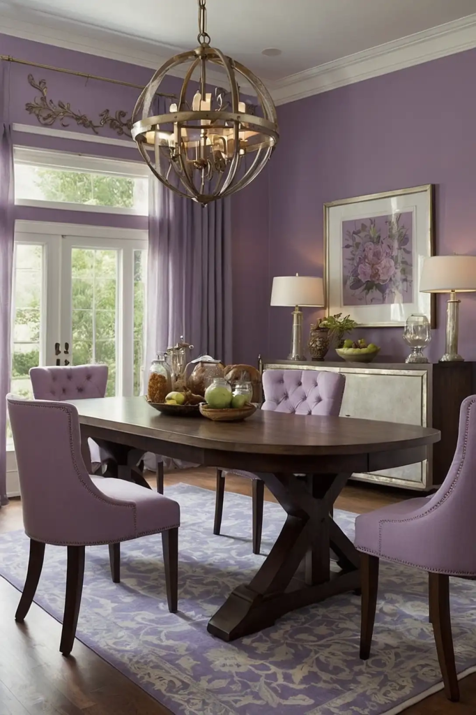
Pale lavender infuses your dining space with unexpected sophistication and gentle color.
This subtle purple creates a soft, flattering light that enhances both the food and the diners around your table.
Your guests will feel relaxed yet energized in this uniquely painted space. Lavender works surprisingly well as a neutral with most furniture styles and accent colors.
Consider Benjamin Moore’s “Violet Mist” or Sherwin-Williams’ “Mild Blue” for a sophisticated lavender that transforms your dining experience.
21: Caramel
Caramel creates a rich, warm envelope of color that encourages lingering conversations and memorable meals.
This golden-brown hue brings inviting sophistication to dining spaces of all sizes.
You’ll notice how this color creates a particularly magical atmosphere during evening meals with soft lighting.
Caramel pairs beautifully with cream trim, blue accents, and both light and dark wood furniture.
Try Benjamin Moore’s “Golden Retriever” or Sherwin-Williams’ “Hubbard Squash” for a delicious caramel that enhances your dining space.
22: Soft Denim Blue
Soft denim blue delivers casual sophistication with remarkable versatility for everyday dining spaces.
This approachable medium blue creates a fresh, timeless backdrop that works with most furniture styles.
Your dining room will feel both contemporary and classic with this practical color choice. Denim blue enhances both natural and artificial light for comfortable dining at any hour.
Consider Benjamin Moore’s “Van Deusen Blue” or Sherwin-Williams’ “Indigo Batik” for a refined denim that elevates your dining experience.
23: Soft Mint
Soft mint brings gentle freshness to your dining space, creating a bright, happy atmosphere for everyday meals.
This pale green infuses your room with subtle color while maintaining the versatility of a neutral.
Your guests will feel instantly uplifted in this cheerful, welcoming environment. Mint works beautifully with white trim, natural woods, and gold or copper accents.
Try Benjamin Moore’s “Fresh Mint” or Sherwin-Williams’ “Lighthearted Mint” for a refreshing shade that brightens your dining space.
24: Warm Ochre
Warm ochre delivers golden-yellow energy that creates an instantly welcoming atmosphere in dining spaces.
This earthy color brings sunny sophistication to both traditional and modern eating areas.
You’ll create a cozy, vibrant environment that encourages conversation and connection around the table. Ochre pairs beautifully with navy, white, and natural wood elements.
Consider Sherwin-Williams’ “Butterscotch” or Benjamin Moore’s “Golden Vista” for a rich ochre that enhances your dining experience.
25: Plum
Plum creates dramatic sophistication with undeniable personality for dining spaces.
This rich purple brings jewel-toned luxury to your meals, creating a unique backdrop for both casual and formal dining experiences.
Your dining room will feel exceptionally special and memorable with this bold choice. Plum pairs magnificently with gold accents, cream trim, and dark wood furniture.
Try Benjamin Moore’s “Shadow” or Sherwin-Williams’ “Plum Brown” for a sophisticated purple that transforms your dining space.
26: Pale Oak
Pale oak offers neutral sophistication with subtle warmth that complements most dining furniture styles.
This versatile light beige creates a fresh, timeless backdrop that enhances both traditional and contemporary spaces.
Your dining room will feel bright yet cozy with this practical choice. Pale oak allows colorful table settings and food presentations to stand out beautifully.
Consider Benjamin Moore’s “Pale Oak” or Sherwin-Williams’ “Accessible Beige” for a refined neutral that elevates your dining experience.
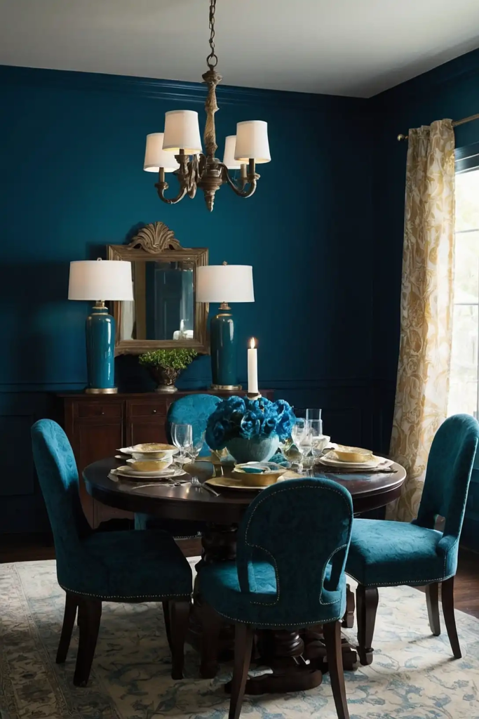
27: Deep Teal
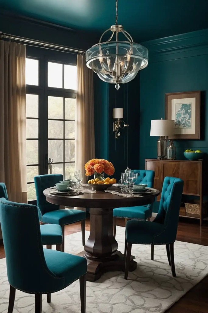
Deep teal delivers rich color depth that transforms ordinary dining rooms into extraordinary entertaining spaces.
This blue-green jewel tone creates an unforgettable backdrop for special meals and gatherings.
You’ll create an atmosphere of luxury and sophistication with this bold, confident choice.
Teal pairs magnificently with brass accents, cream trim, and both light and dark wood furniture.
Try Benjamin Moore’s “Galapagos Turquoise” or Sherwin-Williams’ “Oceanside” for a vibrant teal that elevates your dining space.
Conclusion
With these 27 dining room paint colors, you can create the perfect atmosphere for your meals and gatherings.
Consider your furniture, lighting, and dining style when choosing your ideal shade. Happy entertaining!