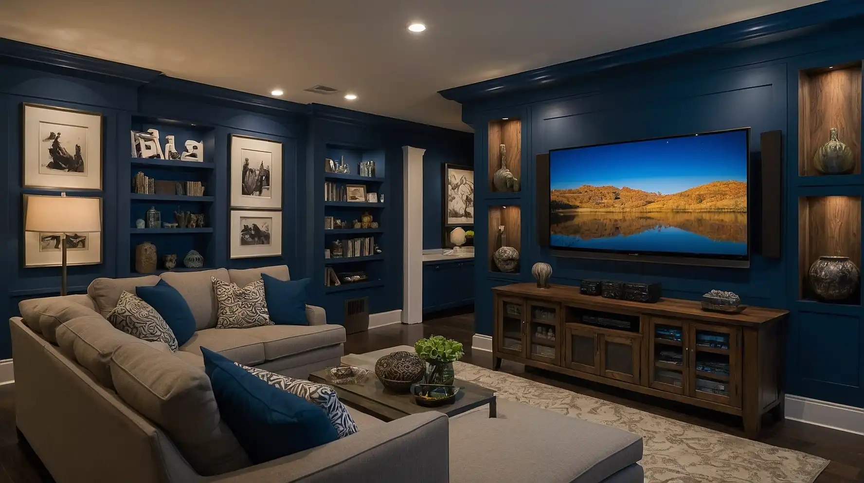
27 Best Paint Colors for Media Rooms (Ultimate Viewing Experience Guide)
Creating the perfect media room involves more than just selecting the right screen and sound system.
The paint color on your walls significantly impacts your viewing experience, affecting everything from light reflection to mood setting.
Choosing the ideal shade can enhance contrast, reduce eye strain, and create the immersive atmosphere you’re seeking.
Different colors serve different purposes, from creating a dramatic theater-like environment to establishing a versatile entertainment space.
Let’s explore the 27 best paint colors that will transform your media room into the ultimate viewing haven you’ve always dreamed of!
1: Matte Black

Matte black creates the ultimate theater experience by eliminating light reflection and maximizing screen contrast.
This bold choice absorbs ambient light rather than bouncing it back at your screen.
You’ll notice deeper blacks and more vibrant colors on your display when surrounded by this dramatic hue.
Pair with strategic accent lighting to prevent the space from feeling too cave-like.
Consider Benjamin Moore’s “Black Beauty” or Sherwin-Williams’ “Tricorn Black” in a matte finish for best results.
2: Charcoal Gray
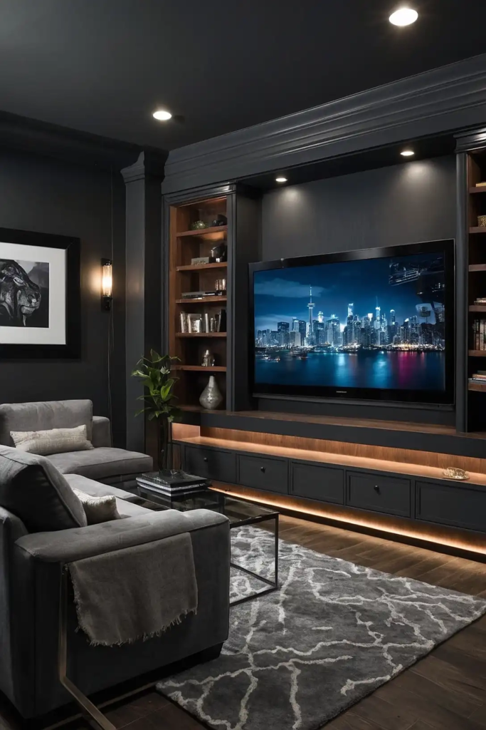
Charcoal gray offers a softer alternative to pure black while still providing excellent light absorption properties.
This sophisticated neutral creates a premium viewing environment without the intensity of black.
Your media room will feel cozy yet refined with this versatile shade. Charcoal works well with most furniture styles and accent colors.
Try Behr’s “Graphic Charcoal” or PPG’s “Knight’s Armor” for a rich, deep gray that enhances your viewing experience.
3: Navy Blue
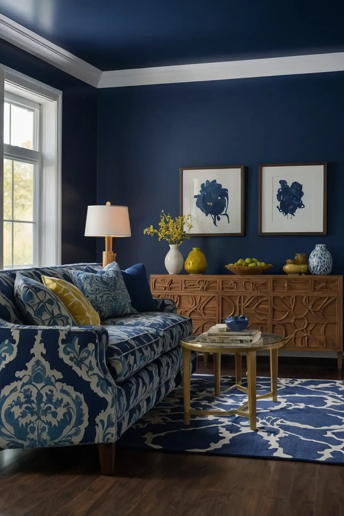
Navy blue delivers a dramatic backdrop that reduces light reflection while adding a touch of personality.
This timeless color creates depth in your space while maintaining a sophisticated atmosphere.
Your screen’s colors will pop against this rich background. Navy also transitions beautifully from daytime viewing to evening movie marathons.
Consider Sherwin-Williams’ “Naval” or Benjamin Moore’s “Hale Navy” for a classic, elegant navy that enhances your media experience.
4: Deep Purple
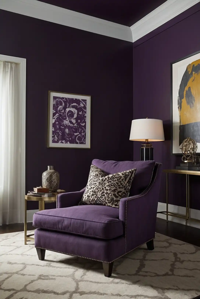
Deep purple introduces a creative yet functional option for serious movie enthusiasts.
This unexpected choice absorbs light effectively while adding a touch of luxury and drama to your space.
You’ll create a unique entertainment environment that stands out from typical media rooms.
Purple also historically represents royalty and creativity—perfect for your premium viewing space.
Try Behr’s “Active Volcano” or Sherwin-Williams’ “Concord Grape” for a rich purple that performs beautifully in low-light settings.
5: Forest Green
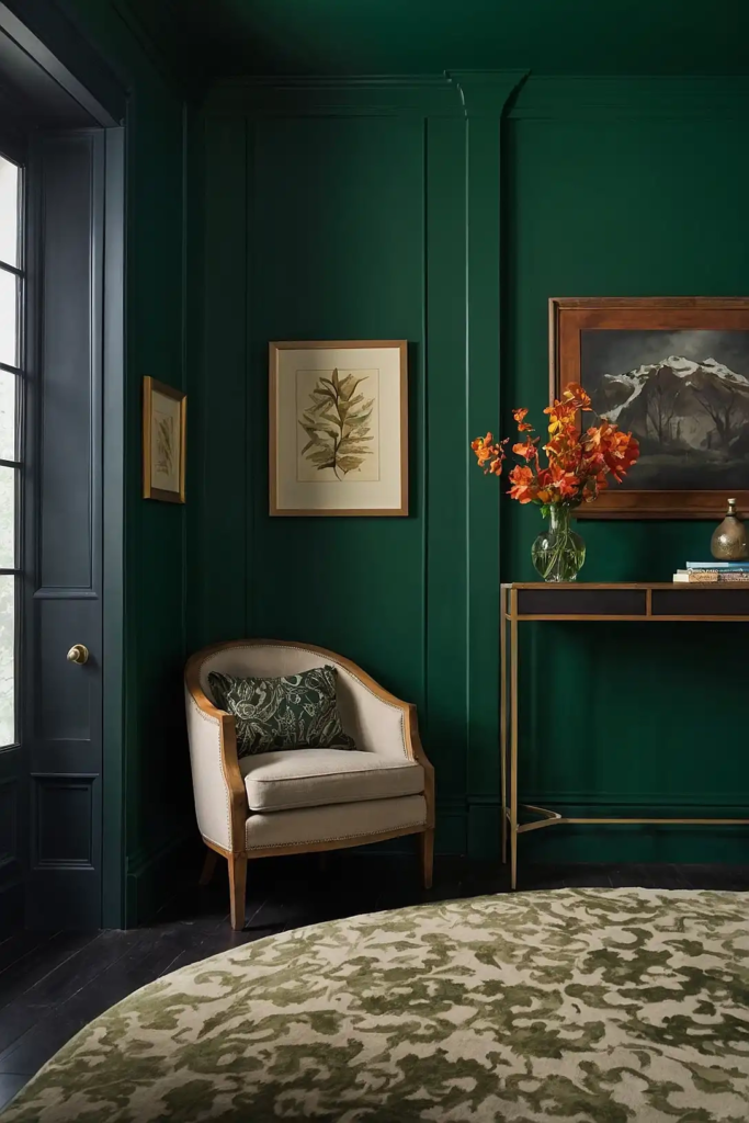
Forest green combines light-absorbing properties with a natural, grounding presence.
This rich hue creates a sophisticated atmosphere while minimizing screen glare and distractions.
Your media room will feel both elegant and comfortable with this versatile color. Green also works wonderfully with both warm and cool accent tones.
Consider Benjamin Moore’s “Hunter Green” or Farrow & Ball’s “Studio Green” for a deep, sophisticated shade that enhances viewing quality.
6: Chocolate Brown
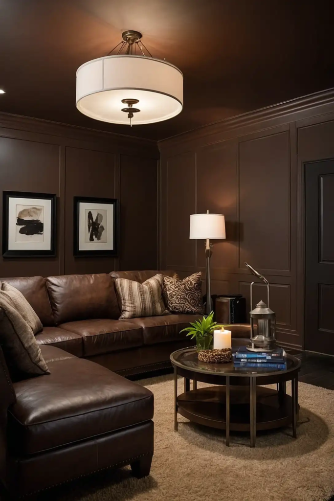
Chocolate brown offers warmth while maintaining excellent light absorption for your media room.
This rich neutral creates a cozy, inviting atmosphere perfect for family movie nights.
You’ll appreciate how this color reduces eye strain during extended viewing sessions. Brown also pairs beautifully with most furniture finishes and accent colors.
Try Sherwin-Williams’ “Turkish Coffee” or Benjamin Moore’s “Caponata” for a rich brown that enhances your viewing experience.
7: Gunmetal Gray
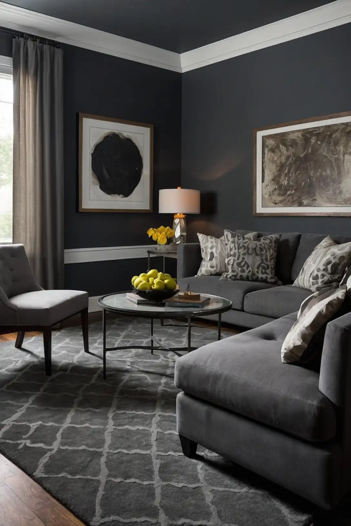
Gunmetal gray provides the ideal balance between light absorption and reflectivity for versatile media rooms.
This medium-dark neutral works well in spaces that serve multiple purposes beyond just movie watching.
Your room will maintain a contemporary feel while still delivering excellent viewing conditions. This practical choice handles both natural and artificial light beautifully.
Consider Behr’s “Graphic Charcoal” or Sherwin-Williams’ “Peppercorn” for a balanced gray that performs in various lighting conditions.
8: Midnight Blue
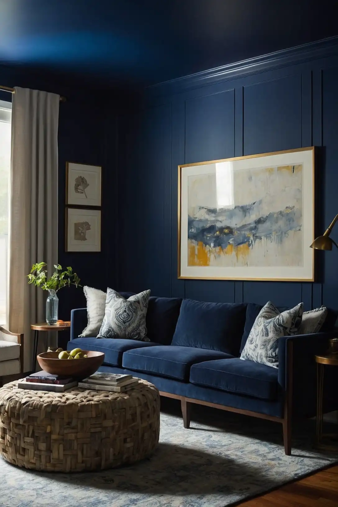
Midnight blue creates a dramatic, enveloping atmosphere that’s perfect for immersive viewing experiences.
This deeply saturated hue absorbs light effectively while adding sophistication to your space.
You’ll notice enhanced contrast and color vibrancy on your screen against this rich background. The color feels both contemporary and timeless.
Try Benjamin Moore’s “Hale Navy” or Sherwin-Williams’ “Naval” in a matte finish for optimal viewing conditions.
9: Burgundy Red
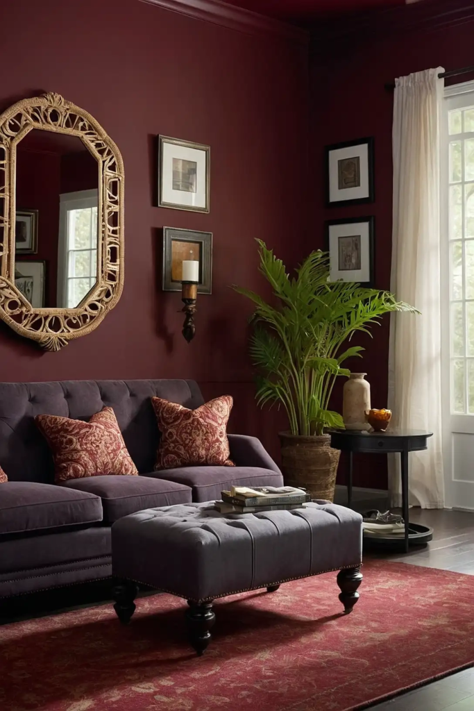
Burgundy red introduces warmth and drama while maintaining good light absorption properties.
This rich color creates a luxurious cinema atmosphere reminiscent of classic movie theaters.
Your media room will feel exceptionally cozy and inviting with this bold choice. Burgundy pairs beautifully with gold or brass accents for an upscale theater experience.
Consider Sherwin-Williams’ “Bordeaux” or Benjamin Moore’s “Caliente” for a sophisticated red that enhances your viewing space.
10: Olive Green
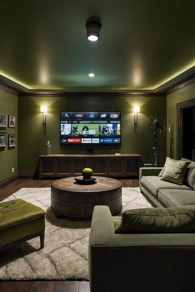
Olive green offers a unique blend of warmth and light control for media rooms.
This understated color creates a comfortable viewing environment without feeling too dark or cave-like.
You’ll appreciate how this natural hue complements most furniture styles and accent colors.
Olive provides excellent viewing conditions while maintaining a versatile, livable space.
Try Farrow & Ball’s “Green Smoke” or Benjamin Moore’s “Soft Fern” for a sophisticated olive that performs well in media settings.
11: Dark Slate Blue
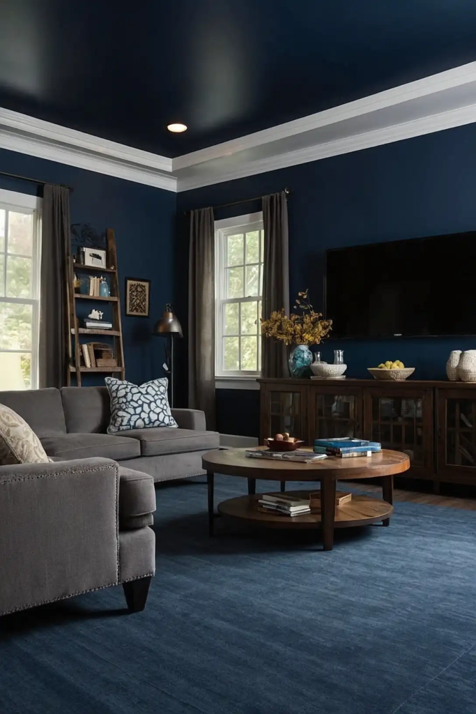
Dark slate blue delivers a perfect balance of drama and functionality for dedicated media spaces.
This rich color absorbs light efficiently while creating a more interesting alternative to traditional blacks and grays.
Your viewing experience will benefit from reduced glare and enhanced screen contrast. This versatile color works well with various design styles from modern to traditional.
Consider Sherwin-Williams’ “Indigo Batik” or Benjamin Moore’s “Gentleman’s Gray” for a sophisticated slate blue that enhances viewing quality.
12: Espresso Brown
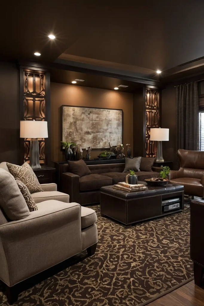
Espresso brown creates a rich, enveloping atmosphere perfect for dedicated media rooms.
This deep neutral absorbs light effectively while providing a warm, inviting backdrop for movie nights.
You’ll notice improved picture contrast and reduced eye strain with this practical color choice. Espresso also pairs beautifully with most furniture and accent colors.
Try Benjamin Moore’s “French Press” or Behr’s “Turkish Coffee” for a deep brown that enhances your viewing experience.
13: Charred Eggplant
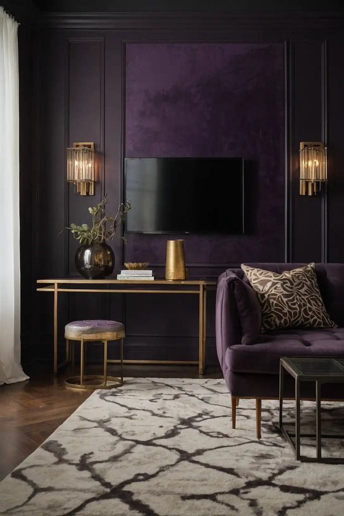
Charred eggplant introduces an unexpected but highly effective color for serious media enthusiasts.
This deep purple-black hybrid absorbs light beautifully while adding subtle color interest.
Your screen’s colors will pop dramatically against this rich backdrop. This sophisticated choice works particularly well in contemporary spaces.
Consider Benjamin Moore’s “Shadow” or Sherwin-Williams’ “Plum Brown” for a deep eggplant that creates the perfect viewing environment.
14: Pewter Gray
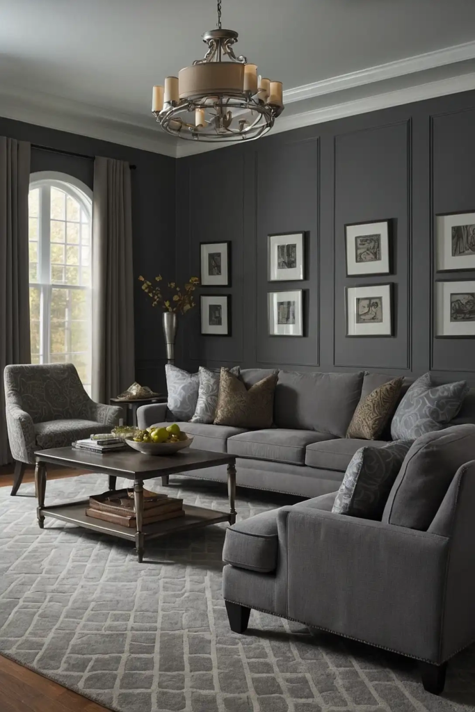
Pewter gray offers a versatile middle ground that works in multi-purpose media rooms. This medium-toned neutral reduces glare without creating an overly dark environment.
You’ll appreciate how this practical color adapts to different lighting conditions throughout the day.
Pewter works beautifully in spaces that transition from family room to theater settings.
Try Sherwin-Williams’ “Serious Gray” or Benjamin Moore’s “Stonington Gray” for a balanced pewter that enhances viewing while maintaining versatility.
15: Deep Teal
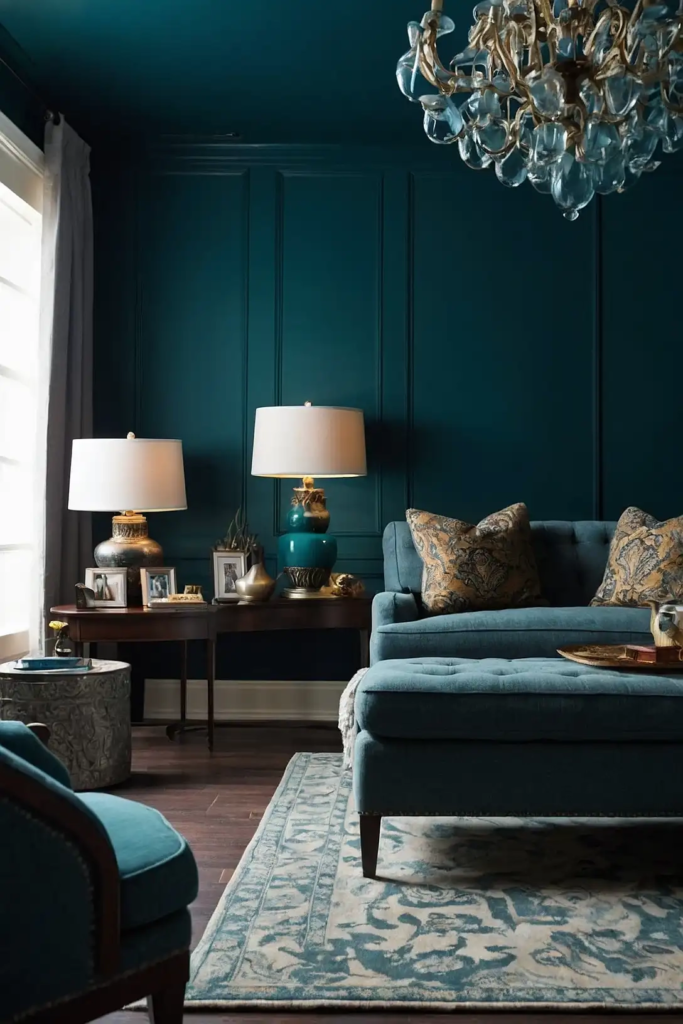
Deep teal brings rich color to your media room while still providing excellent light absorption.
This sophisticated blue-green creates a unique viewing environment with personality and depth.
Your space will feel both dramatic and inviting with this unexpected choice. Teal pairs beautifully with both metallic and wood accents.
Consider Benjamin Moore’s “Mediterranean Teal” or Sherwin-Williams’ “Oceanside” in a matte finish for optimal viewing conditions.
16: Smoky Charcoal
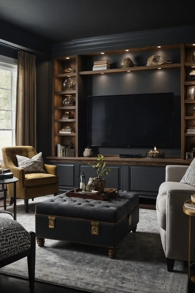
Smoky charcoal delivers premium viewing properties with a softer approach than pure black.
This complex neutral has subtle undertones that create depth and interest in your media space.
You’ll enjoy reduced screen glare and eye strain during extended movie marathons. This versatile color adapts beautifully to different lighting scenarios.
Try Benjamin Moore’s “Graphite” or Behr’s “Carbon” for a sophisticated charcoal that enhances your viewing experience.
17: Dark Moss Green
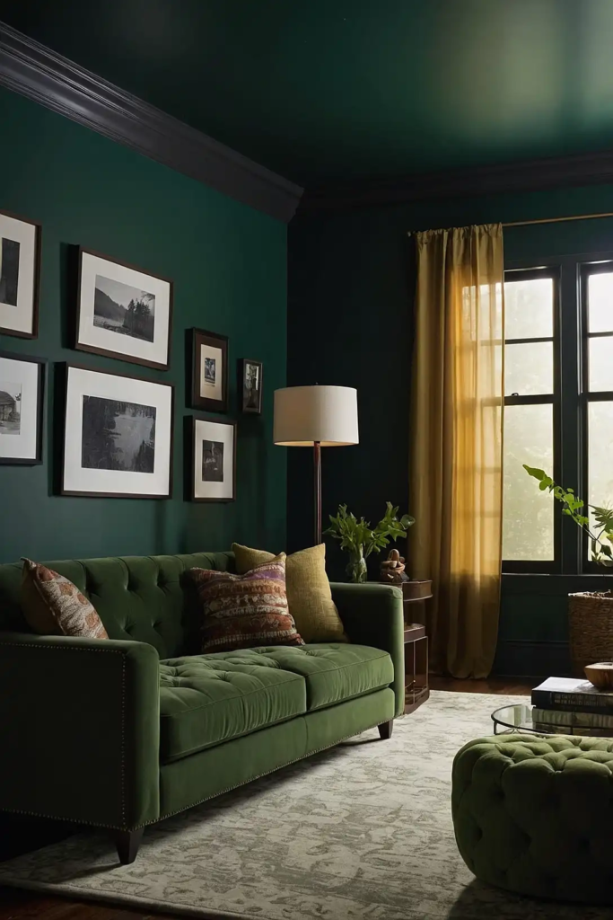
Dark moss green combines effective light absorption with a natural, organic feeling.
This deep, muted green creates a comfortable viewing environment with character and warmth.
Your media room will feel connected to nature while still providing premium viewing conditions. This versatile color works well in both traditional and contemporary spaces.
Consider Farrow & Ball’s “Green Smoke” or Benjamin Moore’s “Essex Green” for a rich moss tone that performs beautifully in media rooms.
18: Inky Blue-Black
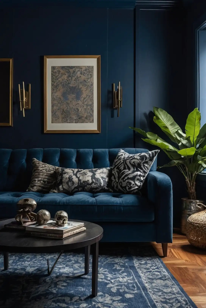
Inky blue-black provides dramatic light absorption with subtle color depth. This hybrid shade delivers the practical benefits of black with slightly more character and warmth.
Your screen colors will appear vibrant and true against this rich background. The subtle blue undertones add sophistication without compromising viewing quality.
Try Sherwin-Williams’ “Inkwell” or Benjamin Moore’s “Hale Navy” in a matte finish for a rich blue-black that enhances your media experience.
19: Warm Taupe
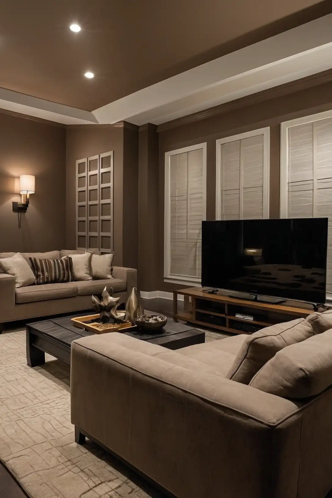
Warm taupe offers a lighter alternative for casual media rooms that serve multiple purposes.
This balanced neutral reduces glare while maintaining a bright, versatile atmosphere.
You’ll create a welcoming space that transitions easily from daytime activities to evening movie watching. Taupe pairs beautifully with nearly any accent color or furniture style.
Consider Benjamin Moore’s “Weimaraner” or Sherwin-Williams’ “Mega Greige” for a sophisticated taupe that works in versatile media spaces.
20: Dark Denim Blue
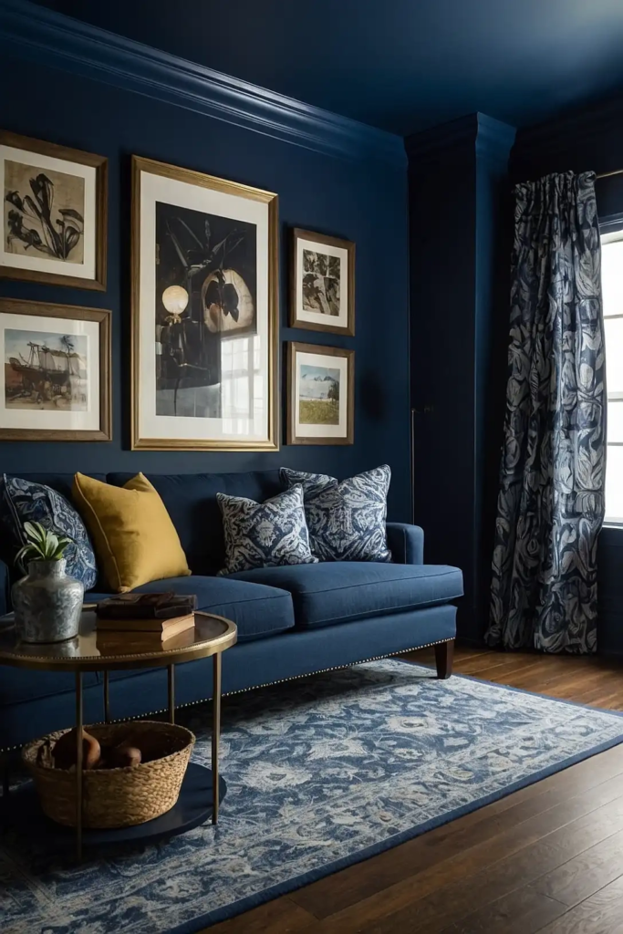
Dark denim blue provides excellent viewing properties while maintaining a familiar, comfortable feel.
This approachable color absorbs light effectively without the starkness of black or charcoal.
Your media room will feel both stylish and functional with this versatile choice. Denim blue works particularly well in family-friendly entertainment spaces.
Try Benjamin Moore’s “Hale Navy” or Sherwin-Williams’ “Naval” for a rich denim blue that enhances viewing quality.
21: Graphite Gray
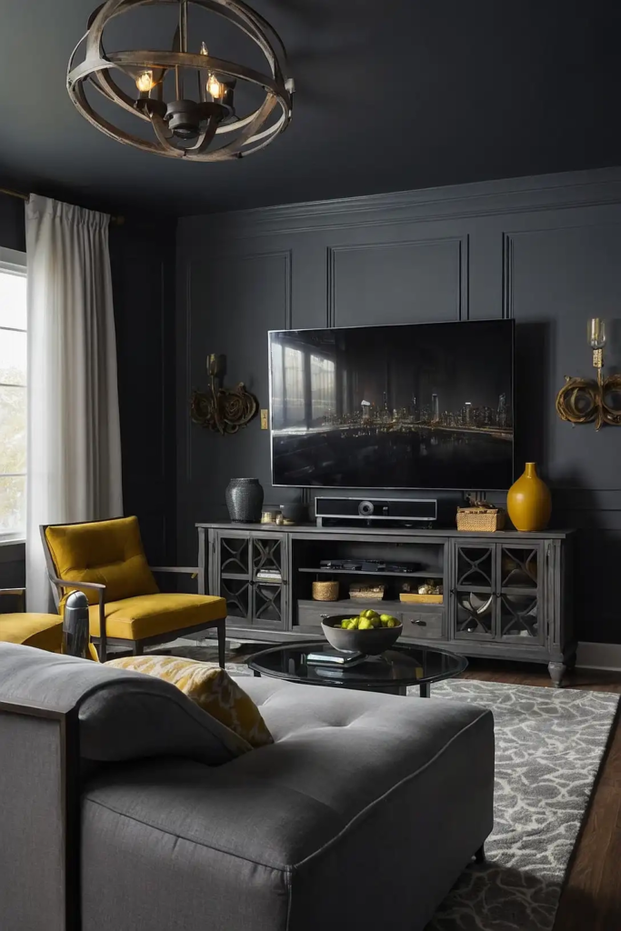
Graphite gray delivers premium light control with a sophisticated edge. This deep neutral has subtle undertones that add depth and interest to your media space.
You’ll enjoy improved screen contrast and reduced eye strain during extended viewing sessions. Graphite provides a more nuanced alternative to flat black or charcoal.
Consider Sherwin-Williams’ “Grizzle Gray” or Benjamin Moore’s “Kendall Charcoal” for a rich graphite that performs beautifully in media rooms.
22: Mahogany Red
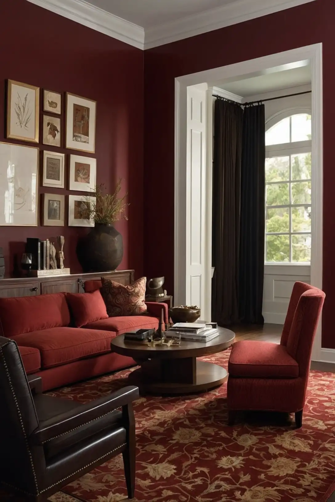
Mahogany red introduces warmth and character while maintaining good light absorption.
This rich color creates a luxurious, enveloping atmosphere perfect for dedicated media spaces.
Your room will feel both dramatic and inviting with this bold choice. Mahogany pairs beautifully with traditional woodwork and leather furniture.
Try Benjamin Moore’s “Dinner Party” or Sherwin-Williams’ “Rookwood Red” for a sophisticated mahogany that enhances your viewing experience.
23: Licorice Black
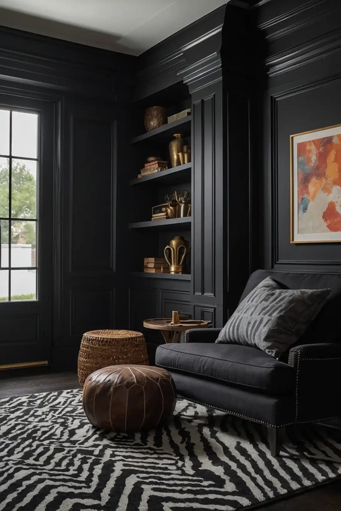
Licorice black offers maximum light absorption for the serious movie enthusiast. This deep, true black creates a professional theater experience right in your home.
You’ll notice significantly improved screen contrast and color vibrancy with this dramatic choice. Pair with strategic lighting to prevent the space from feeling too cavernous.
Consider Sherwin-Williams’ “Tricorn Black” or Benjamin Moore’s “Black” in a matte finish for the ultimate theater experience.
24: Stormy Blue
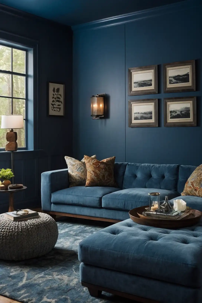
Stormy blue combines excellent viewing properties with a touch of character and depth.
This moody color creates a sophisticated atmosphere that enhances your media experience.
Your screen colors will appear vivid and true against this complex background. Stormy blue feels both contemporary and timeless in entertainment spaces.
Try Benjamin Moore’s “Gentlemen’s Gray” or Sherwin-Williams’ “Dard Hunter Green” for a rich stormy blue that performs beautifully in media rooms.
25: Deep Auberge
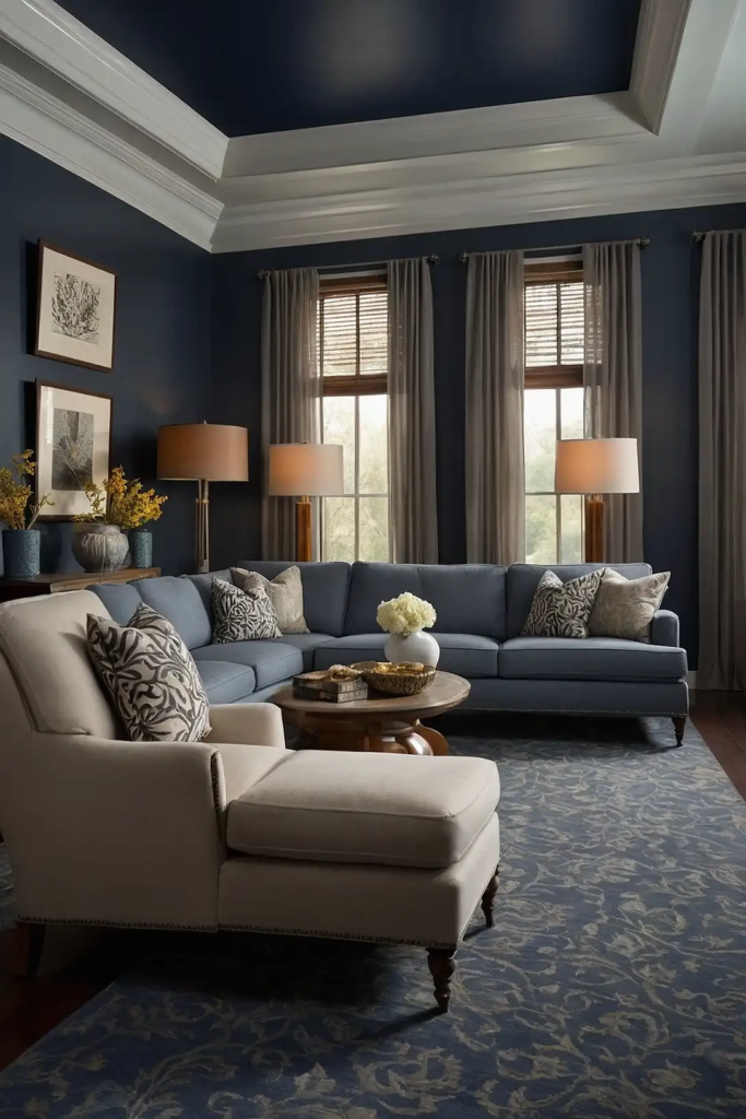
Deep Auberge delivers dramatic light absorption with unexpected sophistication.
This rich purple-brown creates a unique viewing environment that stands apart from typical media rooms.
You’ll create an immersive atmosphere that feels both luxurious and functional. Aubergine pairs beautifully with metallic accents for a premium theater experience.
Consider Sherwin-Williams’ “Plum Brown” or Benjamin Moore’s “Shadow” for a sophisticated aubergine that enhances viewing quality.
26: Iron Ore Gray
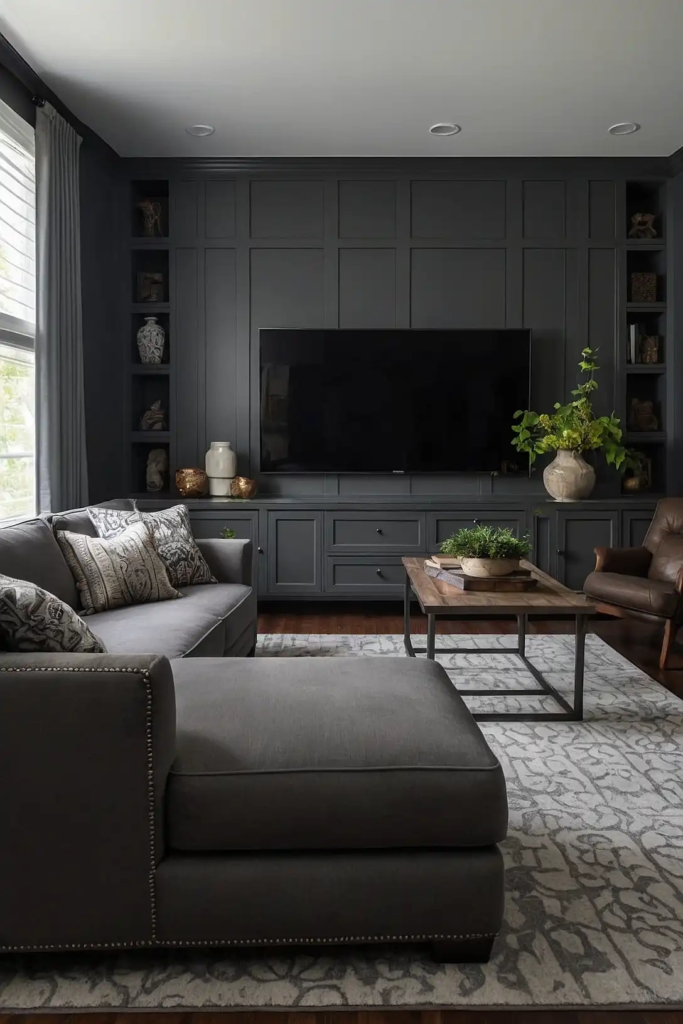
Iron ore gray provides excellent light control with industrial-inspired character. This deep, slightly warm gray creates a contemporary backdrop that minimizes distractions.
Your viewing experience will benefit from reduced glare and enhanced screen contrast. This versatile neutral works with virtually any design style.
Try Sherwin-Williams’ “Iron Ore” or Benjamin Moore’s “Wrought Iron” for a rich iron gray that enhances your media space.
27: Matte Onyx
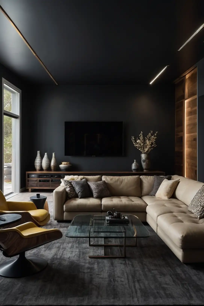
Matte onyx delivers premium light absorption with a slightly softer approach than pure black.
This deep, complex shade creates the ultimate viewing environment for serious enthusiasts.
You’ll notice significantly improved picture quality and reduced eye strain during extended movie marathons.
The matte finish is essential for eliminating any potential screen reflection.
Consider Benjamin Moore’s “Onyx” or Farrow & Ball’s “Pitch Black” in a matte finish for a sophisticated viewing experience.
Conclusion
With these 27 media room paint options, you can create the perfect viewing environment for your space.
Remember that lighting, screen size, and room usage should all influence your final color choice. Happy movie watching!

