27 Best Paint Colors for Interior Walls That Will Transform Your Home
Choosing the perfect paint color can transform any room from ordinary to extraordinary.
The right shade creates ambiance, affects your mood, and ties your décor elements together seamlessly.
With thousands of options available, finding your ideal color might seem overwhelming. Don’t worry!
We’ve researched the most versatile, timeless, and trending interior paint colors to help you make the perfect choice.
Ready to refresh your space? Let’s explore the 27 best paint colors that designers and homeowners love for interior walls.
1: Classic Cloud White

Benjamin Moore’s Cloud White offers a crisp, clean backdrop that works in any room.
This versatile neutral creates a fresh canvas that makes artwork and furniture pop against it.
Unlike stark whites, it carries subtle warm undertones that prevent rooms from feeling cold or clinical.
Use it throughout your home for a cohesive, airy feel that never goes out of style.
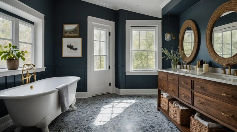
2: Sophisticated Hale Navy

This deep, rich navy creates instant sophistication in dining rooms, offices, and accent walls. The blue-black undertones provide depth without the heaviness of pure black.
Hale Navy pairs beautifully with brass accents, creating a timeless, tailored look.
You’ll appreciate how this color changes throughout the day, looking almost denim-like in natural light.
3: Calming Sage Green

This muted, earthy green brings the tranquility of nature indoors. Perfect for bedrooms and bathrooms, sage creates a spa-like atmosphere that helps reduce stress.
Sage’s neutral quality allows it to function almost like a background color while still adding character.
It complements wood tones beautifully and pairs well with crisp whites for contrast.
4: Warm Greige Balance

Greige—the perfect marriage of gray and beige—creates a sophisticated neutral that works with both cool and warm color schemes.
This chameleon-like quality makes it incredibly versatile. Unlike pure gray, greige carries warmth that prevents rooms from feeling cold or stark.
Use it throughout open floor plans to create visual continuity while still keeping spaces interesting.
5: Dramatic Charcoal Gray
This deep, smoky gray creates instant drama and sophistication in dining rooms, home offices, and powder rooms.
The rich undertones add depth without the heaviness of black.
Charcoal works wonderfully as an accent wall color behind light furniture or artwork. In well-lit rooms, it creates a cozy, intimate atmosphere rather than a gloomy one.
6: Blush Pink Neutral

Don’t dismiss pink as just for nurseries! Modern blush pink functions as a sophisticated neutral with warmth and subtle color that flatters all skin tones.
This versatile shade works beautifully in bedrooms, living rooms, and dining spaces.
The key is choosing a muted, dusty version without too much brightness or obvious purple undertones.
7: Terracotta Warmth

This earthy, reddish-brown brings Mediterranean warmth to any space.
Terracotta creates instant coziness in living areas, dining rooms, and entryways with its rich, grounding presence.
The color connects beautifully to nature, especially when paired with wood tones and natural textiles.
It reflects a gorgeous amber glow in evening light that makes everyone look their best.
8: Perfect Pewter Gray

Pewter gray strikes the ideal balance between warm and cool undertones, making it easier to work with than pure gray.
This chameleon-like quality helps it coordinate with various décor styles.
The soft, silvery appearance changes subtly throughout the day, keeping your space feeling dynamic.
Use it in living areas, kitchens, and hallways for a sophisticated, adaptable backdrop.
9: Sunlit Butter Yellow

This cheerful, golden hue brings perpetual sunshine to kitchens, breakfast nooks, and laundry rooms.
Unlike intense yellows, butter yellow provides warmth without overwhelming your space.
The subtle gold undertones create a welcoming atmosphere that makes everyone feel instantly at home. This color pairs beautifully with white trim for a clean, classic look.
10: Tranquil Pale Blue

This soft, airy blue creates a sense of calm in bedrooms, bathrooms, and home offices. Studies show that blue tones can lower blood pressure and reduce stress levels.
Unlike nursery blues, sophisticated pale blue has gray or green undertones for a more mature feel.
The color recedes visually, making smaller spaces feel more expansive and serene.
11: Rich Emerald Green

This jewel-toned green creates instant luxury in dining rooms, libraries, and accent walls. The deep, saturated color brings drama without the heaviness of black or charcoal.
Emerald pairs beautifully with brass and gold accents for a classic, elegant look.
Use it in rooms with good natural light to appreciate the color’s full depth and complexity.
12: Soft Dove Gray

This light, versatile gray creates a sophisticated neutral backdrop that works with virtually any style.
Unlike cooler grays, dove gray carries subtle warmth that keeps spaces feeling inviting.
This chameleon-like color shifts subtly throughout the day, appearing almost silvery in morning light.
Use it throughout open floor plans to create cohesion while maintaining visual interest.
13: Cozy Caramel

This rich, golden-brown creates instant warmth in living rooms, entryways, and dining spaces.
The color evokes the comfort of caramel without becoming overwhelmingly orange or yellow.
Caramel walls make a beautiful backdrop for artwork and natural wood furniture. The color creates an especially magical glow in spaces with evening western light.
14: Serene Lavender Gray

This sophisticated pastel carries the calming properties of lavender without looking childish or overly feminine.
Gray undertones create a mature, serene quality perfect for bedrooms and offices.
The color shifts beautifully throughout the day, looking more gray in morning light and more lavender in evening light.
Pair it with crisp whites and natural linens for an elegant, restful space.
15: Dramatic Burgundy
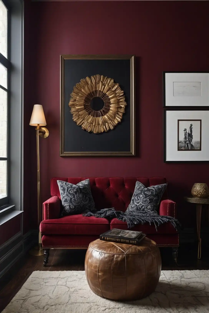
This rich, wine-inspired red creates instant sophistication in dining rooms, libraries, and accent walls. The blue undertones prevent it from feeling too bright or overwhelming.
Burgundy creates a cozy, intimate atmosphere, especially in rooms used primarily in the evening.
It pairs beautifully with gold accents and natural wood for a timeless, elegant look.
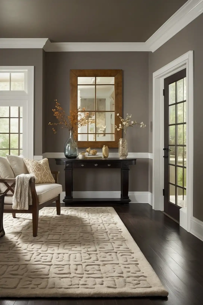
16: Versatile Taupe

This sophisticated neutral bridges the gap between gray and brown, working harmoniously with both cool and warm color schemes.
This versatility makes it perfect for open floor plans. Taupe creates a soft, sophisticated backdrop that allows architectural features and furniture to shine.
Its subtle depth prevents it from ever looking flat or boring on your walls.
17: Ocean Teal

This balanced blue-green creates a refreshing, spa-like atmosphere in bathrooms, bedrooms, and creative spaces.
The color evokes water and sky without being overly beachy or themed.
Teal provides enough color to be interesting while still functioning as a neutral backdrop for artwork and furnishings.
It pairs beautifully with both warm wood tones and crisp whites.
18: Mushroom Gray-Brown

This earthy neutral combines the sophistication of gray with the warmth of brown for a grounded, organic feel.
Perfect for living rooms and hallways, it creates continuity in open floor plans. Mushroom has enough depth to create interest without overwhelming your space.
Its chameleon-like quality allows it to shift subtly throughout the day, keeping your rooms feeling dynamic.
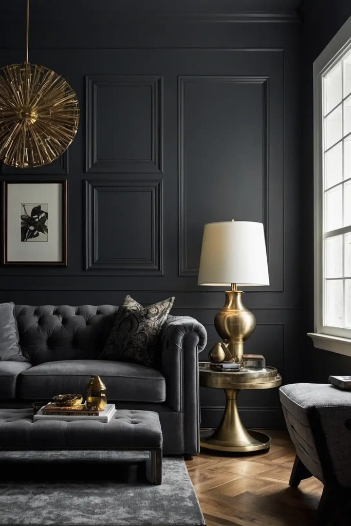
19: Matte Black

This bold, dramatic choice creates instant architectural interest in dining rooms, powder rooms, and accent walls. Modern matte black paints absorb light rather than reflecting it.
Despite its intensity, black can actually make artwork and furniture pop dramatically against it.
The key is using it in rooms with adequate natural light or excellent artificial lighting.
20: Creamy Off-White

This soft, warm white provides more character than bright white without the yellowness of beige. Perfect for creating an airy, welcoming atmosphere throughout your home.
Creamy off-white makes spaces feel larger and ceilings feel higher without looking stark or institutional.
It provides the perfect neutral backdrop for both colorful and monochromatic décor schemes.
21: Dusty Olive Green

This sophisticated, muted green brings nature’s neutral palette indoors. The gray undertones create a mature, calming presence perfect for living areas and bedrooms.
Olive connects beautifully to natural elements like wood and stone, creating organic harmony.
The color changes fascinatingly throughout the day, revealing subtle depth as light shifts.
22: Soft Coral
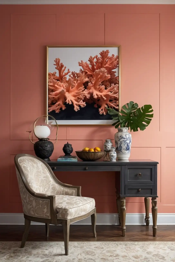
This warm, peachy hue creates a flattering glow that makes everyone look their best.
Perfect for dining rooms, powder rooms, and bedrooms where you want a welcoming atmosphere.
Unlike bright oranges or pinks, soft coral provides warmth without overwhelming intensity.
It creates a particularly magical ambiance in rooms that receive evening golden hour light.
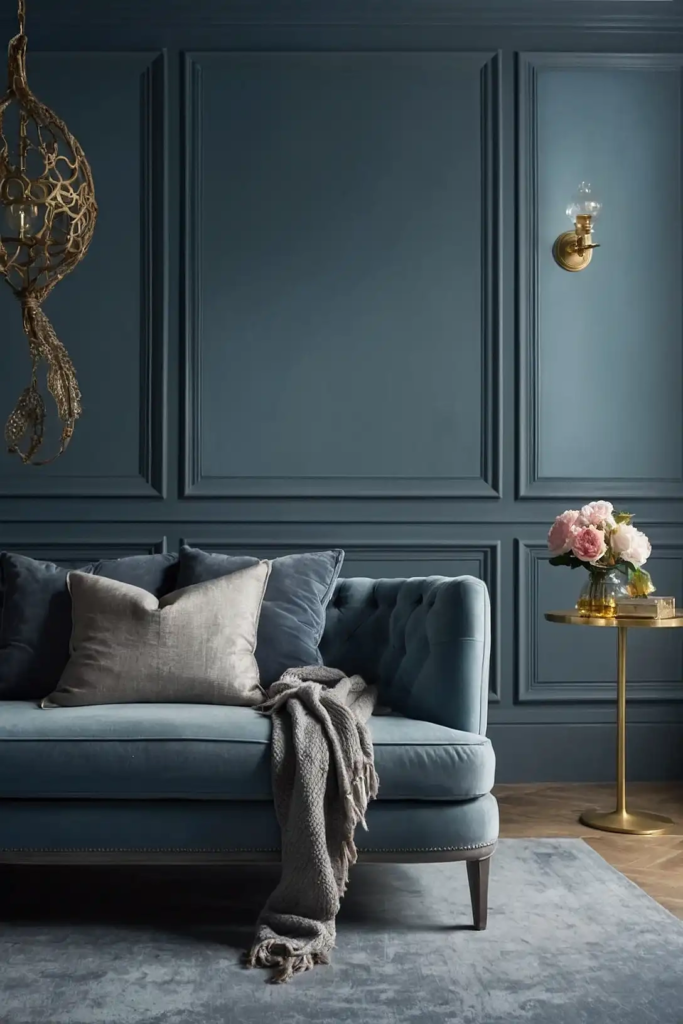
23: Slate Blue

This sophisticated, dusty blue-gray brings cool, calming energy to bedrooms, home offices, and living rooms.
The gray undertones create a mature look that never feels childish.
Slate blue provides enough color to be interesting while still functioning effectively as a neutral. It pairs beautifully with natural wood tones and crisp whites for contrast.
24: Warm Chocolate Brown

This rich, deep brown creates a cozy, intimate atmosphere in libraries, dining rooms, and media spaces. The depth provides drama without the starkness of black or charcoal.
Chocolate brown makes a stunning backdrop for artwork and gold or brass accents.
Use it in rooms with good natural light to appreciate its rich, complex undertones.
25: Silvery Blue-Gray
This sophisticated chameleon color shifts between blue and gray depending on the light. Perfect for bedrooms and living spaces, it creates a serene, adaptable backdrop.
The color’s mercurial quality keeps spaces feeling dynamic and interesting throughout the day.
It pairs beautifully with crisp whites and natural textures for a refined, calming atmosphere.
26: Mustard Yellow

This rich, earthy yellow brings warmth and energy to living rooms, dining areas, and creative spaces.
Unlike bright yellows, mustard’s brown undertones create sophistication rather than intensity.
Mustard creates a wonderful backdrop for mid-century furniture and artwork.
The color feels especially inviting in rooms that receive northern light, counteracting coolness with golden warmth.
27: Perfect Putty
This complex neutral combines aspects of gray, beige, and green for a sophisticated, organic feel.
Perfect for creating continuity in open floor plans while maintaining visual interest.
Putty’s chameleon-like quality shifts subtly throughout the day, preventing it from ever looking flat.
It creates an ideal backdrop for both colorful accents and natural, earthy elements.
Conclusion
The perfect paint color transforms your space instantly and affordably.
Whether you choose bold and dramatic or soft and subtle, your walls create the foundation for your home’s entire aesthetic experience.