27 Best Paint Colors for Your Office Room: Boost Productivity and Style
Choosing the right paint color for your office can transform your work experience.
The perfect shade creates an environment that enhances focus, reduces stress, and inspires creativity.
Your office walls influence your mood and productivity more than you might realize.
With remote work becoming increasingly common, investing in your workspace has never been more important.
Ready to find your perfect office palette? Let’s explore the 27 best paint colors that will elevate your workspace and potentially boost your performance.
1: Serene Blue (Benjamin Moore’s Breath of Fresh Air)
This soft, airy blue creates a calm atmosphere that helps reduce stress during busy workdays. The subtle shade promotes clear thinking without being distracting.
Blue naturally lowers blood pressure and heart rate, making it ideal for high-pressure work environments.
It works particularly well in offices where you need to maintain focus for extended periods.
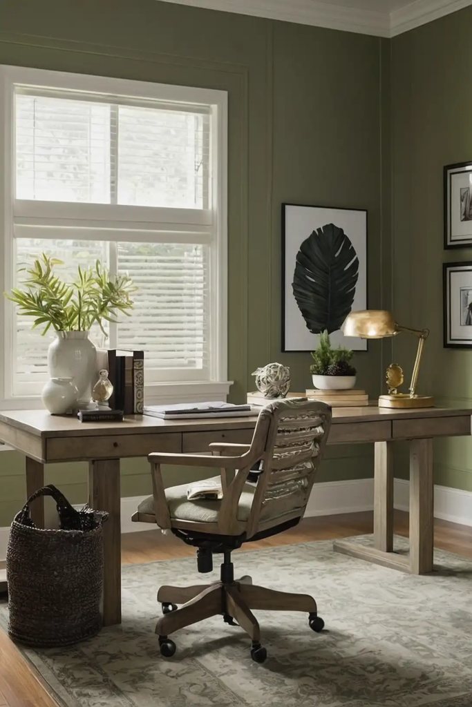
2: Sage Green (Sherwin-Williams’ Clary Sage)
This muted green brings nature’s calming influence into your workspace. It creates a balanced environment that promotes concentration while reducing eye strain.
Sage connects you to the outdoors, especially beneficial in offices with limited natural light.
The color supports sustained focus without the fatigue that can come with brighter shades.
3: Crisp White (Benjamin Moore’s Simply White)

This clean white maximizes light reflection and creates a sense of spaciousness in your office.
It provides a blank canvas that allows your ideas and work to take center stage.
White promotes clarity and organization in your thinking process. It’s particularly effective in smaller office spaces that benefit from an open, airy feeling.
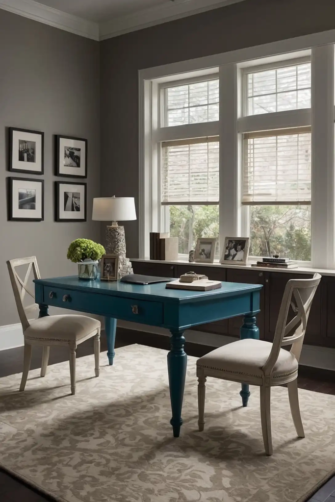
4: Soft Gray (Behr’s Silver Drop)
This versatile neutral creates a sophisticated backdrop for your workspace. It provides enough color to avoid sterility while remaining subtle enough not to distract.
Gray complements virtually any accent color or furniture style you might choose.
It creates a professional atmosphere that transitions easily between focused work and video conferences.
5: Buttery Yellow (Sherwin-Williams’ Butter Up)
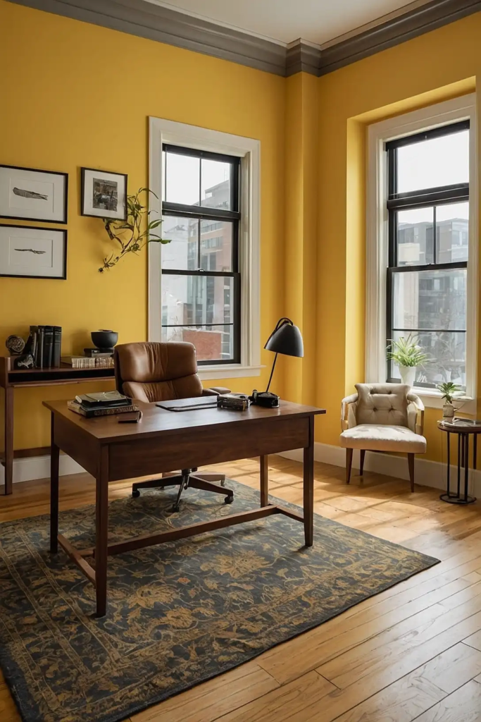
This warm yellow infuses your office with subtle energy and positivity. It creates a welcoming atmosphere that can help combat the mid-afternoon productivity slump.
Yellow stimulates mental activity without overwhelming your senses.
It works beautifully in north-facing offices that receive cooler, indirect light throughout the day.
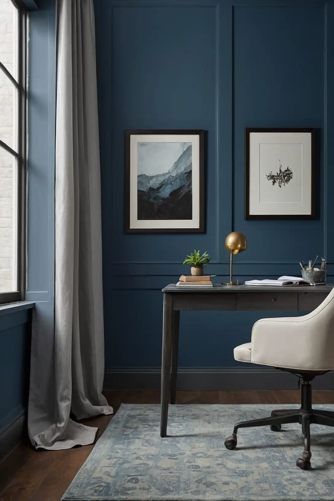
6: Dusty Blue (Benjamin Moore’s Mount Saint Anne)
This muted blue-gray creates a focused, professional atmosphere in your workspace. It provides a sophisticated backdrop that enhances concentration during complex tasks.
Dusty blue offers the productivity benefits of blue without feeling cold or impersonal.
It pairs beautifully with wood furniture for a balanced, harmonious office environment.
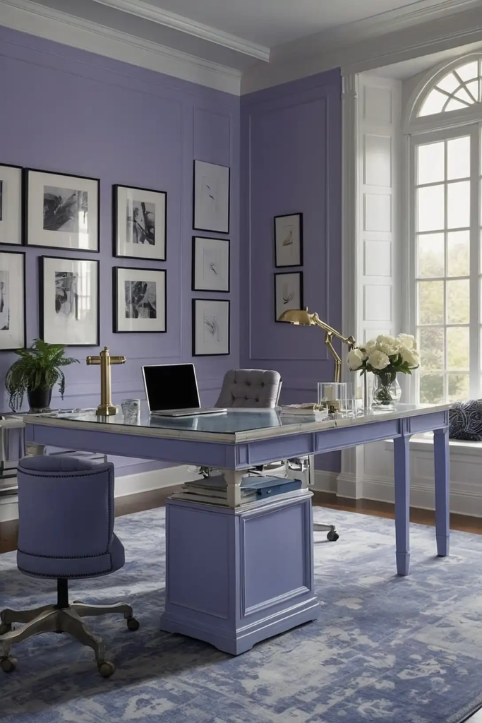
7: Soft Lavender (Behr’s French Lilac)
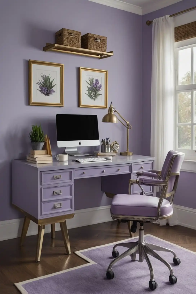
This gentle purple creates a unique, creative atmosphere in your office. It combines the calming properties of blue with the energy of red for a balanced effect.
Lavender stimulates both sides of your brain, supporting tasks that require both analytical thinking and creativity.
It works wonderfully in offices dedicated to design, writing, or artistic work.
8: Greige (Sherwin-Williams’ Agreeable Gray)
This perfect blend of gray and beige creates a versatile, welcoming foundation for any office style. It provides warmth without being distracting or too casual.
Greige works with virtually any furniture finish or accent color.
It creates a timeless backdrop that won’t feel dated as office trends evolve.
9: Soft Mint (Benjamin Moore’s Fresh Mint)
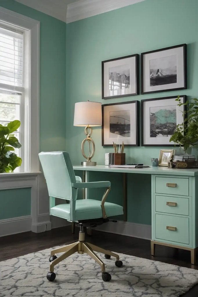
This light, refreshing green creates an invigorating yet soothing office environment. It provides gentle stimulation without overwhelming your senses during long workdays.
Mint promotes feelings of cleanliness and clarity in your workspace.
It pairs beautifully with white furniture for a crisp, organized aesthetic that supports productivity.
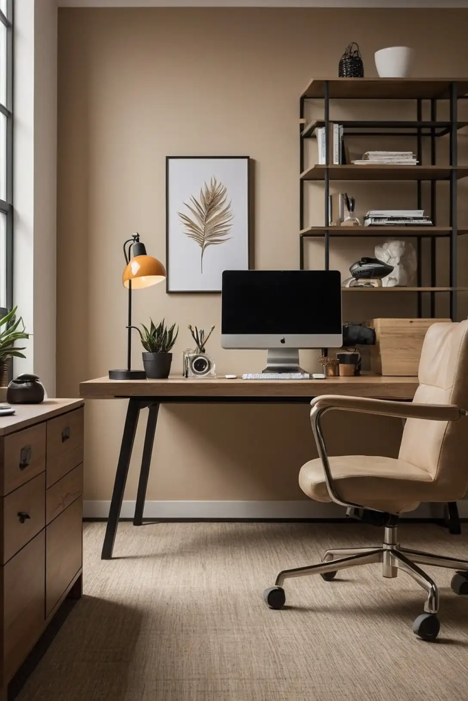
10: Warm Taupe (Behr’s Perfect Taupe)

This neutral beige-gray creates a grounded, focused atmosphere in your office. It provides warmth without being distracting or overly stimulating.
Taupe complements most furniture styles and décor choices.
It creates a versatile backdrop that works for everything from focused solo work to client meetings.
11: Pale Blue (Sherwin-Williams’ Sleepy Blue)
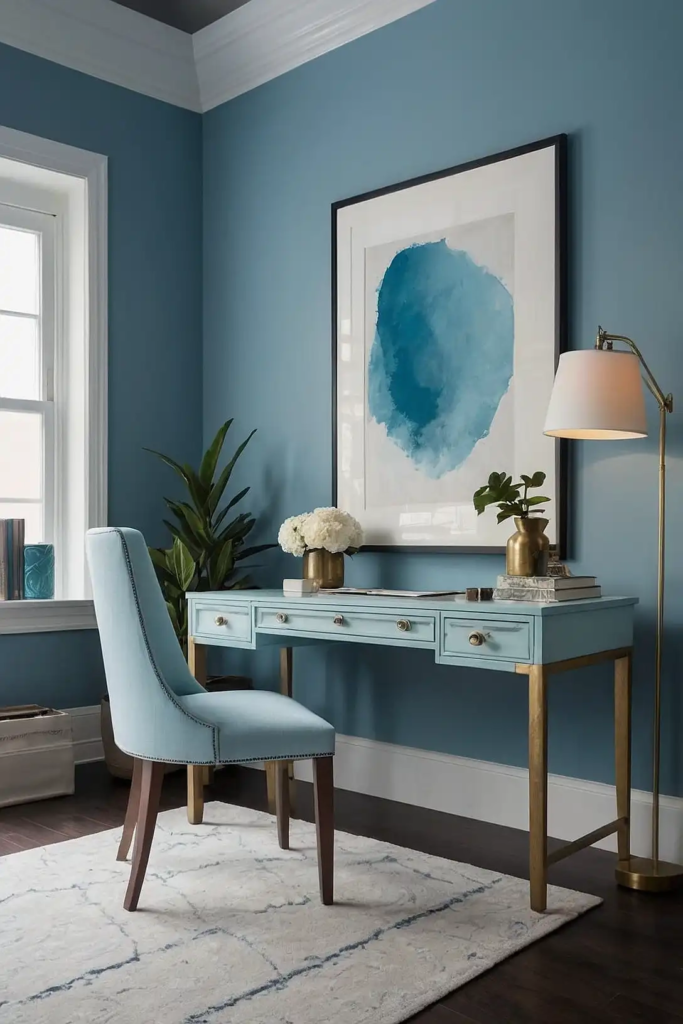
This soft blue creates a tranquil atmosphere that promotes concentration and reduces stress.
It provides a soothing backdrop for demanding cognitive work.
Pale blue makes your space feel larger and more open. It works particularly well in smaller offices or those with limited natural light.
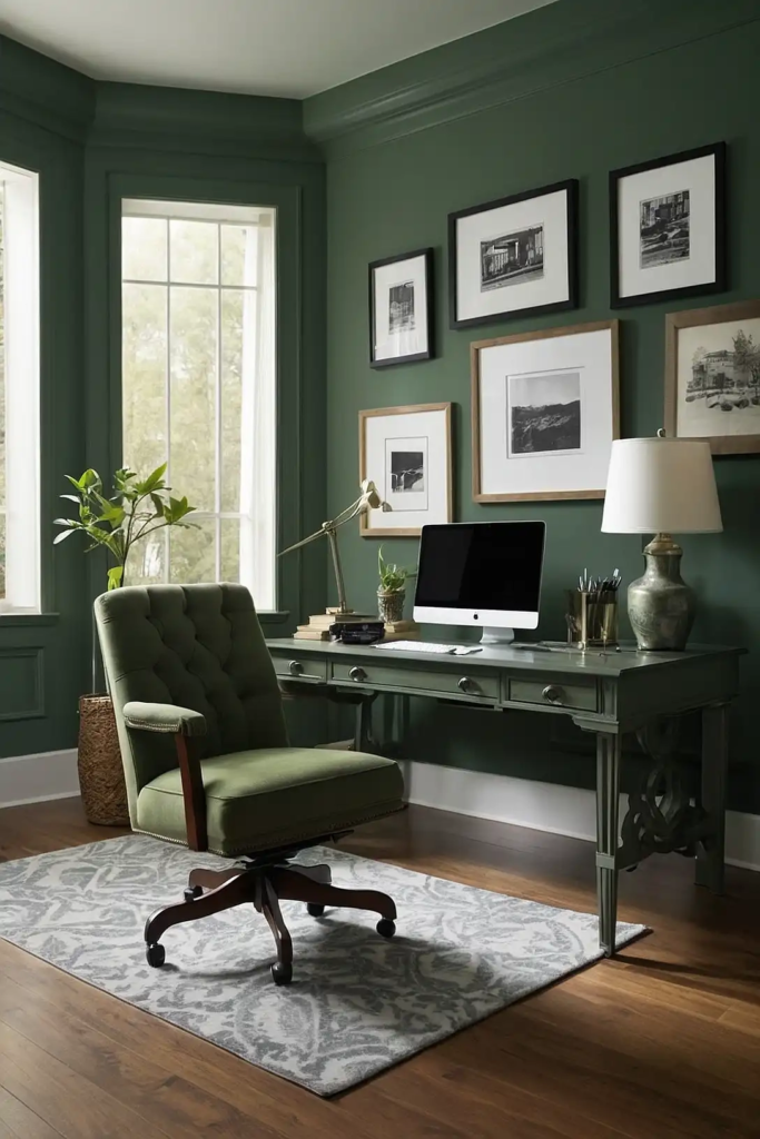
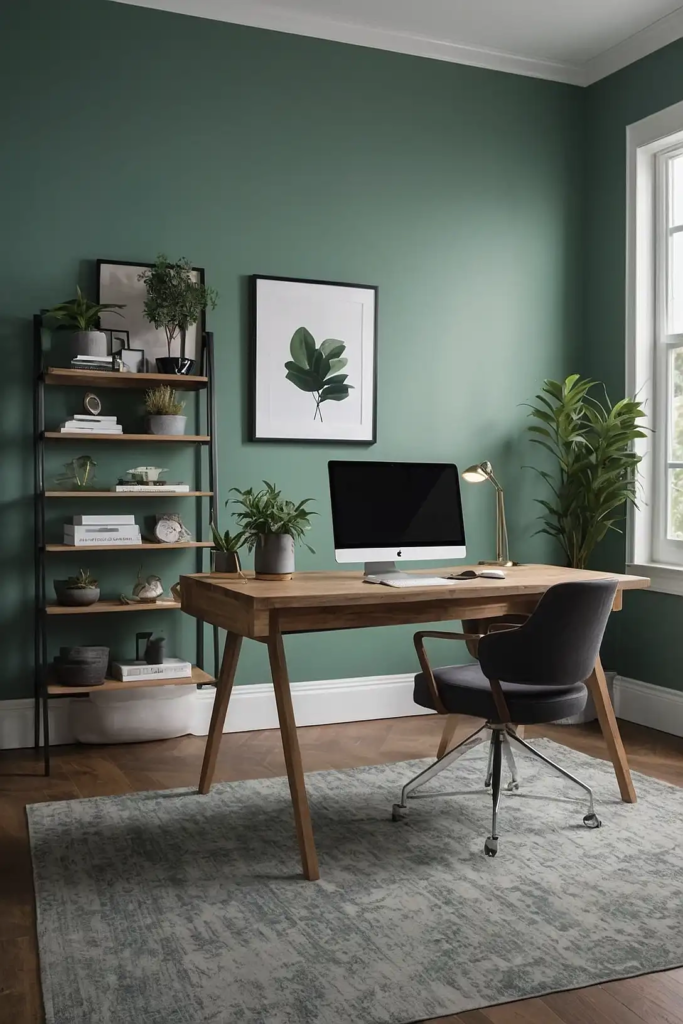
12: Light Olive (Benjamin Moore’s October Mist)
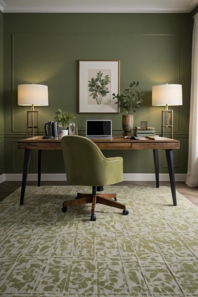
This subtle green introduces nature’s balancing influence into your workspace. It creates a grounded environment that supports sustained focus and wellbeing.
Olive connects you with the natural world during indoor work hours.
It works beautifully with both modern and traditional office furniture styles.
13: Warm Off-White (Behr’s Polar Bear)
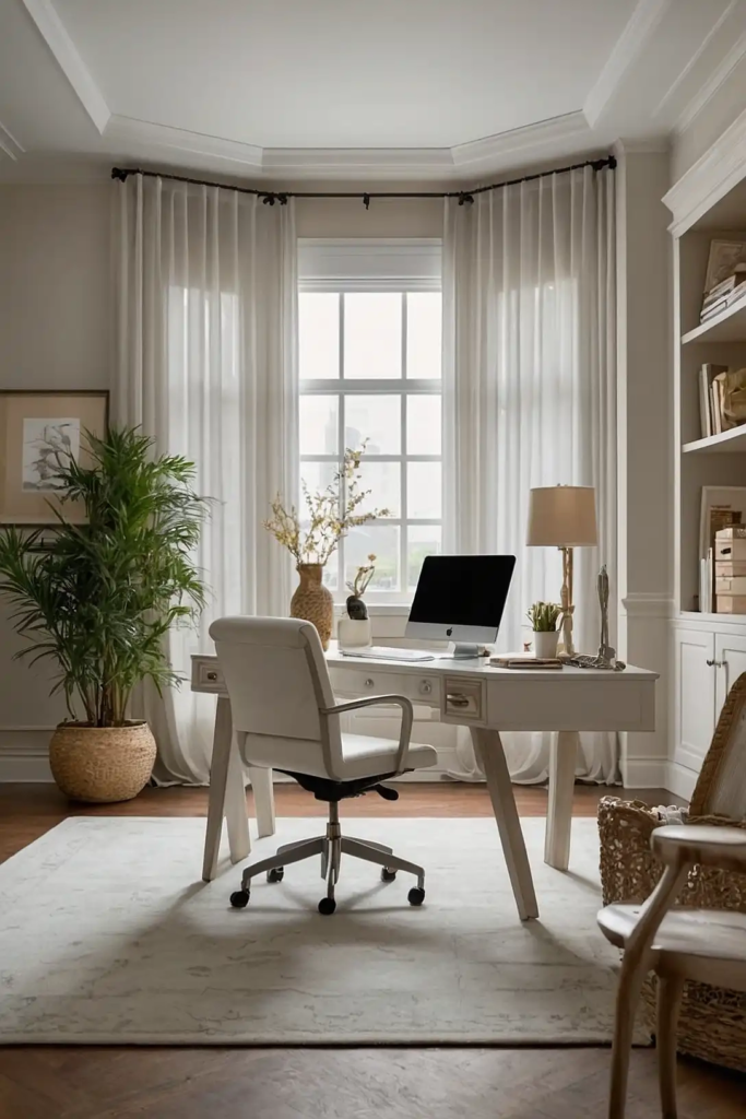
This soft white creates a clean, inviting atmosphere without the harshness of bright white. It reflects light while maintaining a comfortable, approachable feeling.
Off-white provides the perfect backdrop for colorful office accessories and artwork.
It creates a flexible foundation that adapts to changing work needs and styles.
14: Slate Blue (Sherwin-Williams’ Downing Slate)
This deep blue-gray creates a sophisticated, focused atmosphere in your workspace. It provides depth and character while promoting concentration.
Slate blue reduces visual distractions during intensive work periods.
It pairs beautifully with brushed metal accents for a contemporary professional aesthetic.
15: Blush Pink (Benjamin Moore’s First Light)
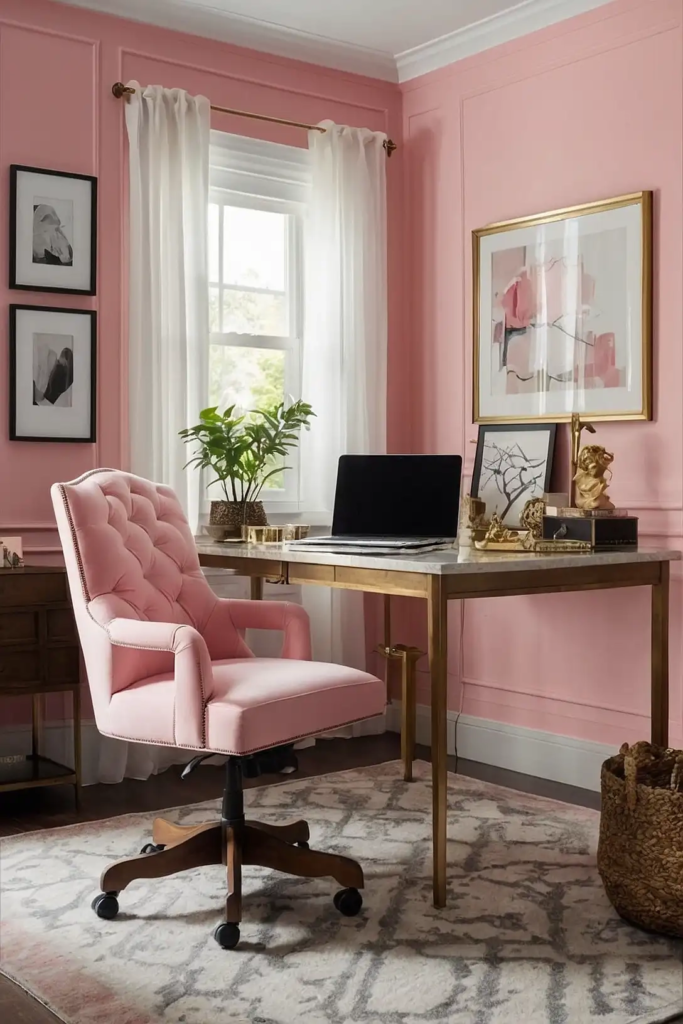
This soft pink creates a welcoming, creative atmosphere in your office. It provides gentle energy without overwhelming your senses during long workdays.
Blush promotes optimism and fresh thinking in your workspace.
It works particularly well in offices dedicated to creative pursuits and innovation.
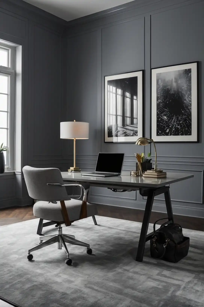
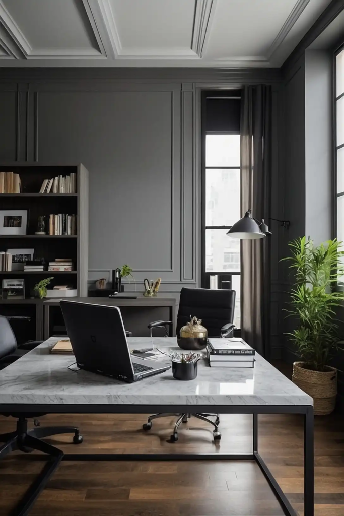
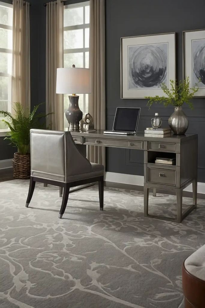
16: Charcoal Gray (Behr’s Dark Pewter)
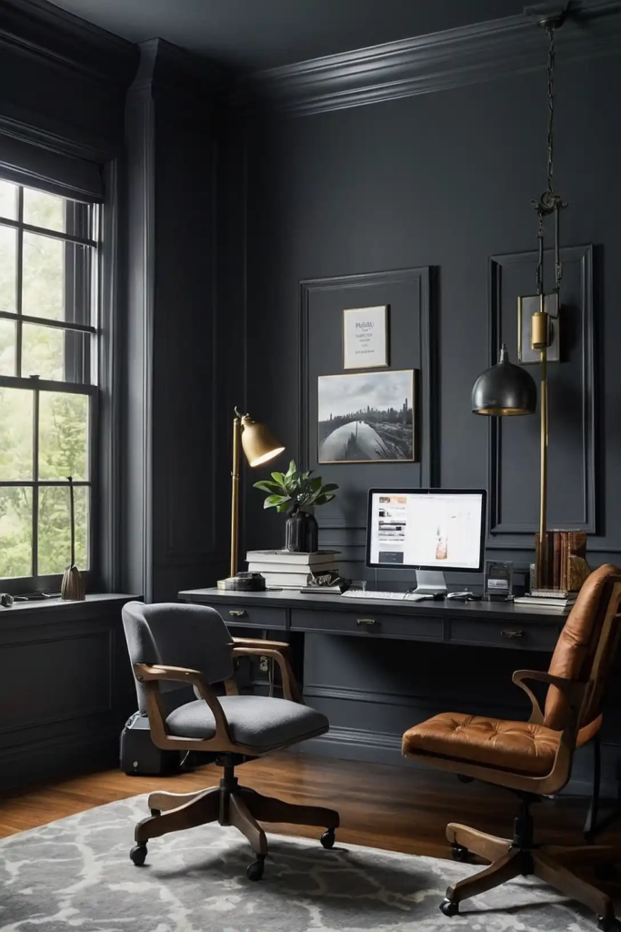
This deep gray creates a focused, dramatic backdrop for your workspace. It provides sophistication and depth while minimizing visual distractions.
Charcoal creates a defined space that helps you mentally transition into work mode.
It works beautifully in home offices where separation from living areas is important.
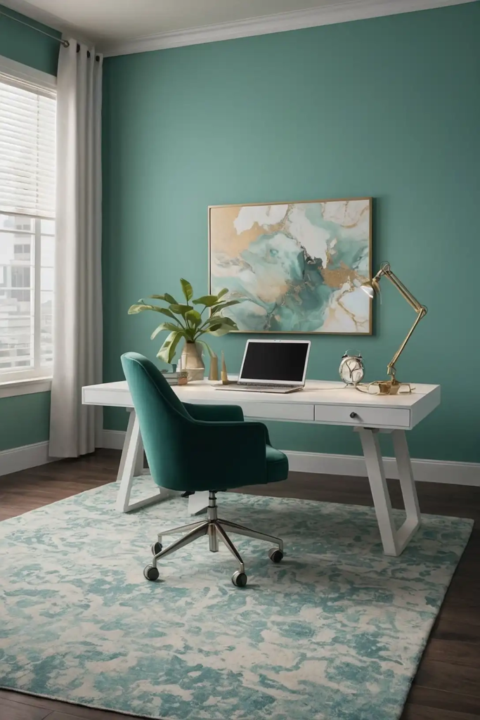
17: Pale Aqua (Sherwin-Williams’ Rain-washed)
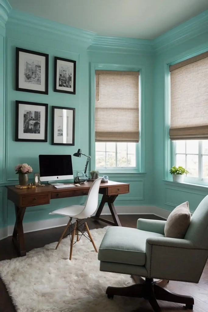
This light blue-green creates a refreshing, balanced atmosphere in your office.
It provides gentle stimulation while maintaining a calming influence.
Aqua combines the focus of blue with the balance of green. It works wonderfully in spaces where you alternate between detailed tasks and creative thinking.
18: Warm Beige (Benjamin Moore’s Manchester Tan)
This neutral tan creates a comfortable, grounded atmosphere in your workspace.
It provides warmth without being too casual or distracting.
Beige complements natural materials like wood and leather. It creates a timeless foundation that works with changing office styles and needs.
19: Soft Seafoam (Behr’s Sea-glass)
This gentle green-blue creates a refreshing, peaceful office environment.
It provides connection to nature while promoting clear thinking.
Seafoam reduces eye strain during long screen-focused work sessions. It works beautifully in offices with moderate to high natural light.
20: Muted Coral (Sherwin-Williams’ Coral Isle)
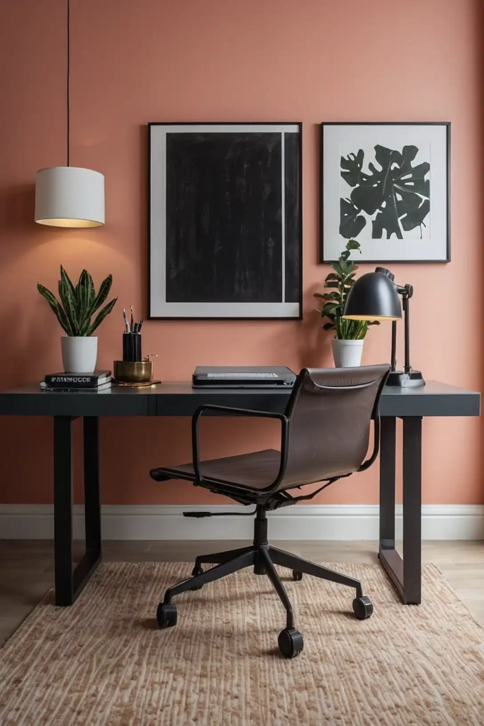
This soft orange-pink creates an energetic yet balanced atmosphere in your workspace.
It provides warmth and creativity without being overwhelming.
Coral stimulates conversation and collaboration in meeting areas. It works particularly well as an accent wall in offices where you host clients or team discussions.
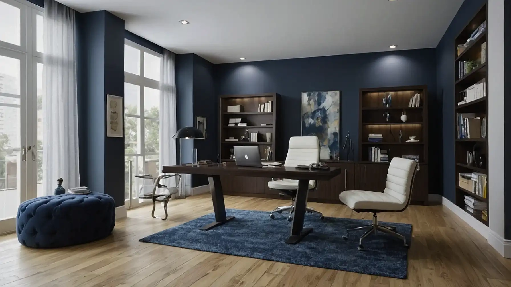
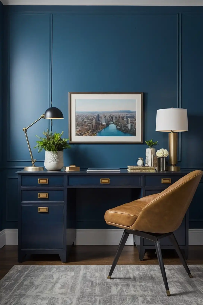
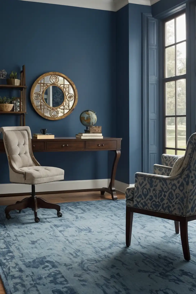
21: Classic Navy (Benjamin Moore’s Hale Navy)
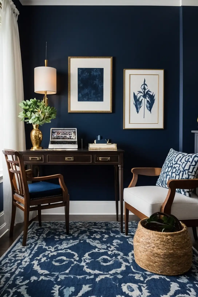
This deep blue creates a professional, focused atmosphere in your office.
It provides sophistication and depth while promoting concentration.
Navy creates a sense of authority and competence in your workspace. It works beautifully as an accent wall behind your desk for video conference backgrounds.
22: Pale Olive (Behr’s Camouflage)
This muted green creates a natural, balanced environment in your workspace. It provides connection to the outdoors while supporting sustained focus.
Olive promotes endurance during long work sessions.
It pairs beautifully with both light and dark wood furniture for a harmonious office setting.
23: Light Periwinkle (Sherwin-Williams’ Upward)
This soft lavender-blue creates a creative, thoughtful atmosphere in your office. It combines the calming qualities of blue with the innovation of purple.
Periwinkle supports both analytical thinking and creative problem-solving.
It works wonderfully in offices where you regularly switch between different types of tasks.
24: Warm Gray (Benjamin Moore’s Revere Pewter)
This balanced gray creates a sophisticated, adaptable backdrop for your workspace. It provides enough color to feel welcoming without being distracting.
Warm gray transitions beautifully between different lighting conditions throughout the day.
It creates a professional environment that works for both focused work and virtual meetings.
25: Soft Terracotta (Behr’s Mesa Peach)
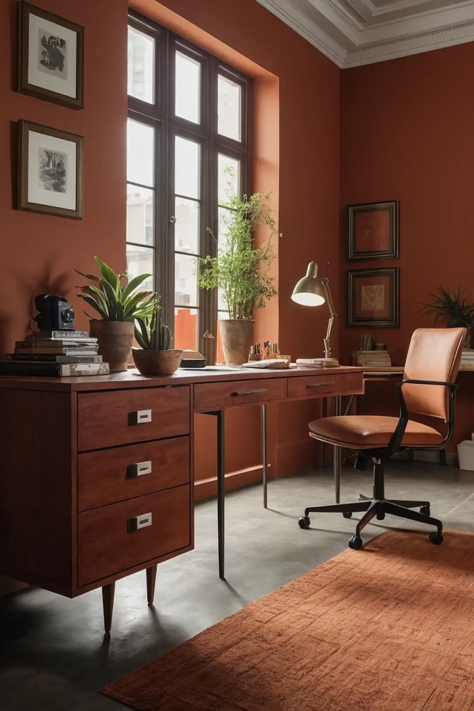
This muted orange-brown creates a warm, grounding atmosphere in your office. It provides gentle energy while maintaining a professional appearance.
Terracotta connects you with natural elements during indoor work hours.
It works beautifully in spaces with good natural light, changing subtly throughout the day.
26: Light Pewter (Sherwin-Williams’ Repose Gray)
This soft gray creates a calm, focused environment for your workspace. It provides a neutral backdrop that helps reduce visual noise and distraction.
Pewter complements virtually any decorative style or furniture finish.
It creates a timeless foundation that won’t look dated as office trends evolve.
27: Pale Eucalyptus (Benjamin Moore’s Acadia White)
This very light green-gray creates a fresh, clean atmosphere in your office. It provides subtle color while maintaining an open, airy feeling.
Eucalyptus promotes clarity and focus without being sterile or cold.
It works beautifully in any office space, adapting well to different lighting conditions throughout the day.
Conclusion
The right paint color transforms your office from a simple workspace into a productivity powerhouse.
Choose a shade that supports your work style and watch your focus and creativity flourish.