27 Best Paint Colors for Small Kitchens: Space-Enhancing Shades That Transform Your Cooking Area
Choosing the right paint color for your small kitchen can dramatically transform the space.
The perfect shade creates an illusion of openness while adding personality and style.
Your kitchen deserves a color that maximizes light reflection and creates a welcoming atmosphere. With limited square footage, each design choice carries greater impact.
Ready to make your compact kitchen feel more spacious and inviting? Explore these 27 perfect paint colors that work wonders in smaller cooking spaces.
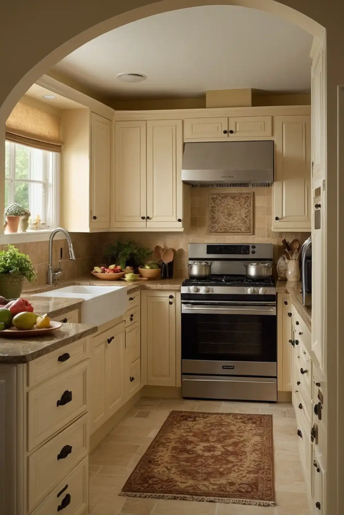
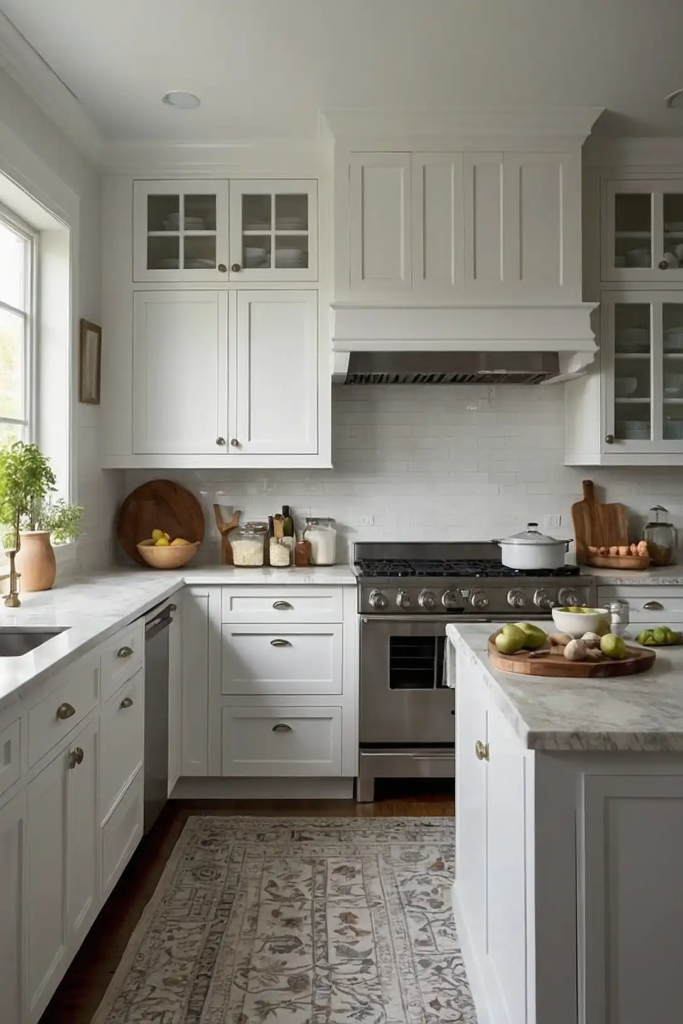
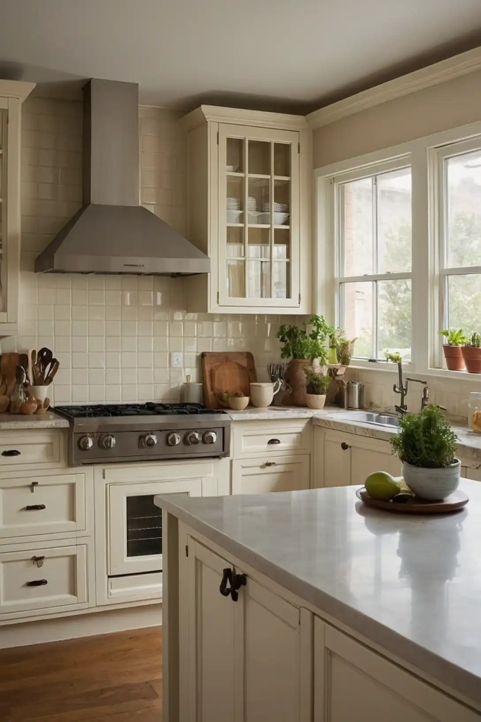
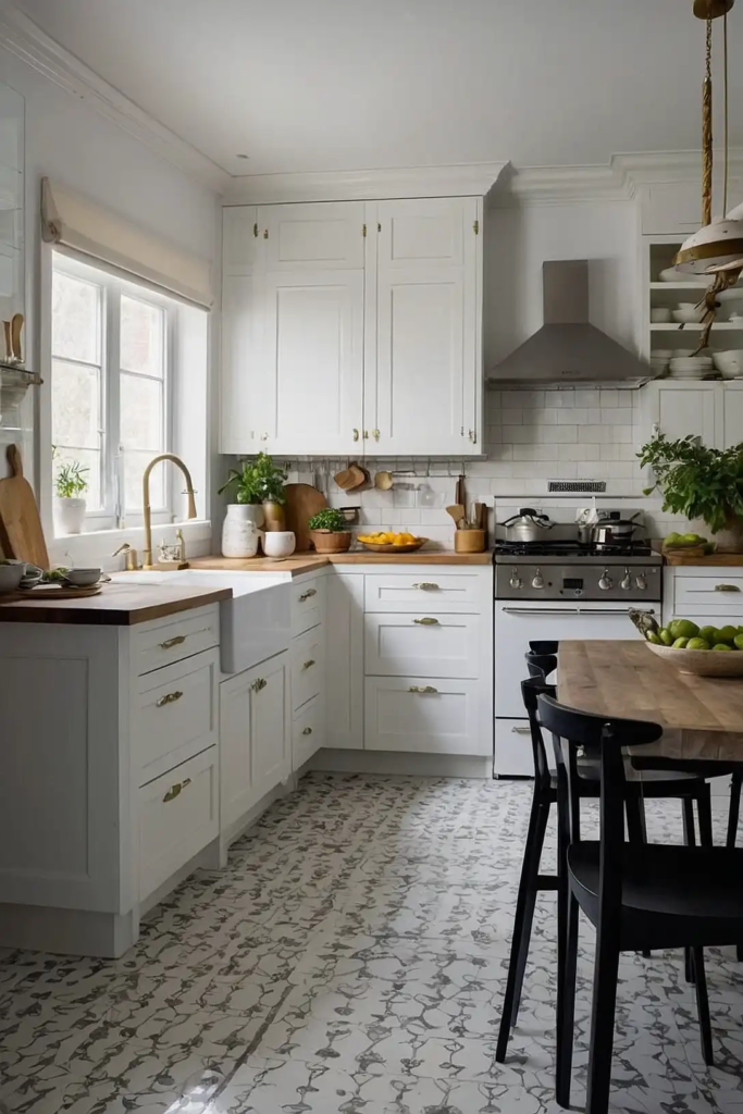
1: Crisp White (Benjamin Moore’s White Dove)
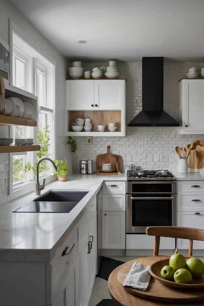
This clean, bright white creates an airy, open feeling in confined kitchen spaces.
The subtle warmth prevents it from feeling clinical while maximizing light reflection.
White Dove works beautifully on both cabinets and walls. It provides a perfect backdrop for colorful accessories and makes your small kitchen feel instantly more spacious.
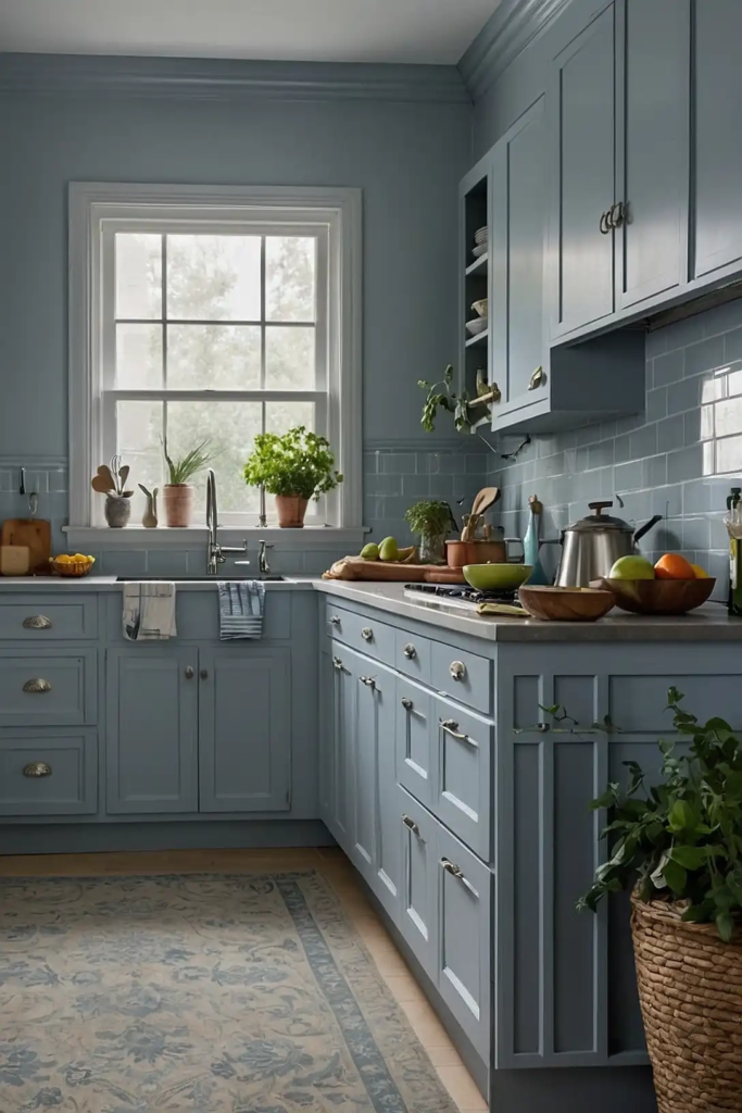
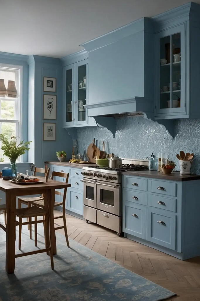
2: Soft Sky Blue (Sherwin-Williams’ Rain-washed)
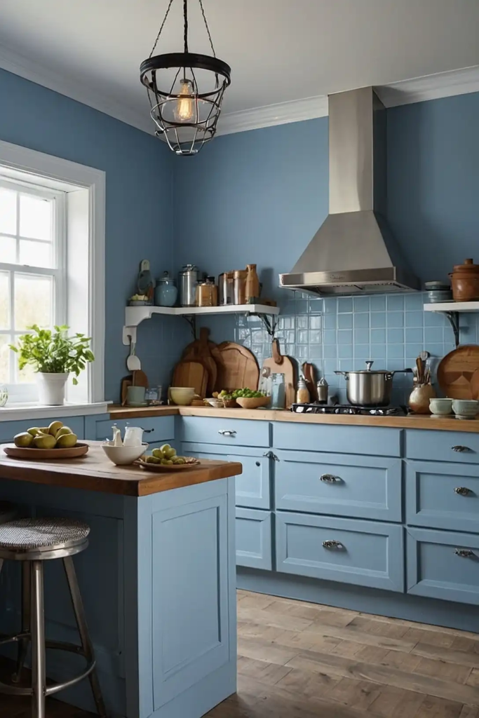
This gentle blue brings the feeling of open skies into your compact kitchen. The subtle green undertones create depth without darkening your space.
Rainwashed pairs beautifully with white cabinets and natural wood elements.
It creates a fresh, airy atmosphere that visually expands your kitchen’s boundaries.
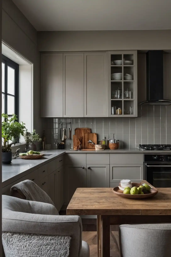
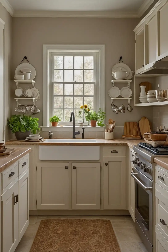
3: Pale Greige (Behr’s Silver Drop)
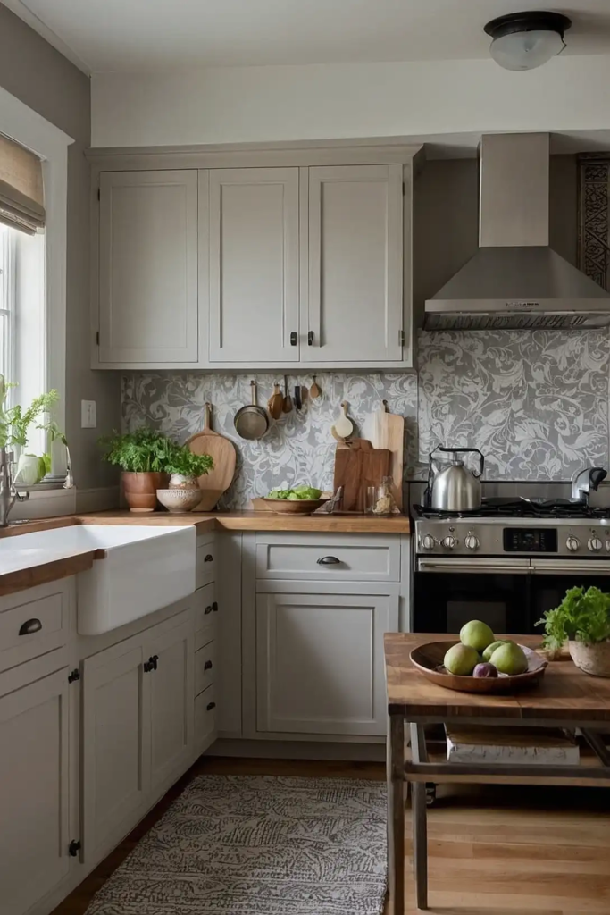
This light gray-beige creates a neutral foundation that makes small kitchens feel more spacious.
The balanced undertones work well in both north and south-facing rooms.
Silver Drop complements virtually any cabinet color or countertop material. It provides subtle color without overwhelming your limited wall space.
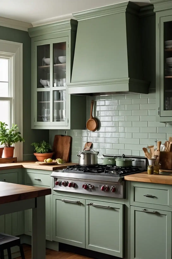
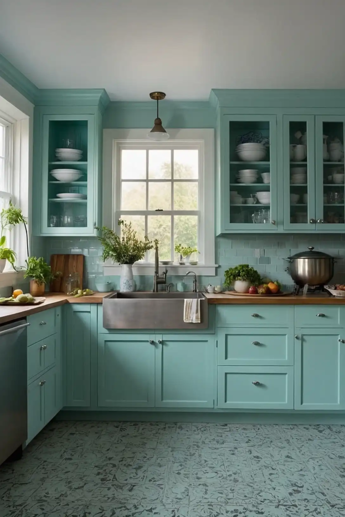
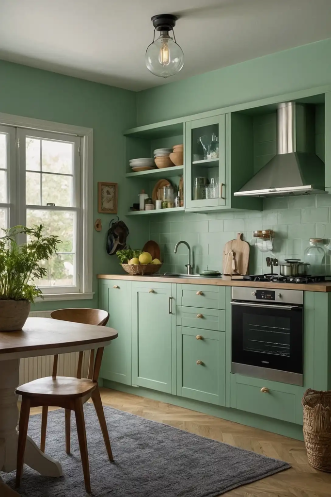
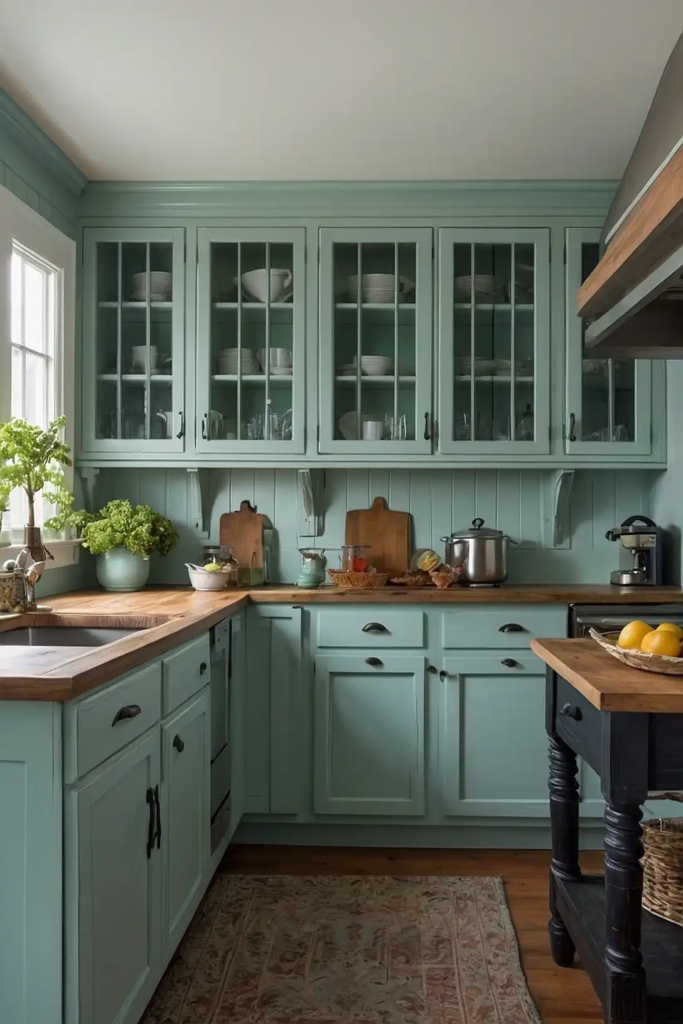
4: Soft Mint (Benjamin Moore’s Fresh Mint)
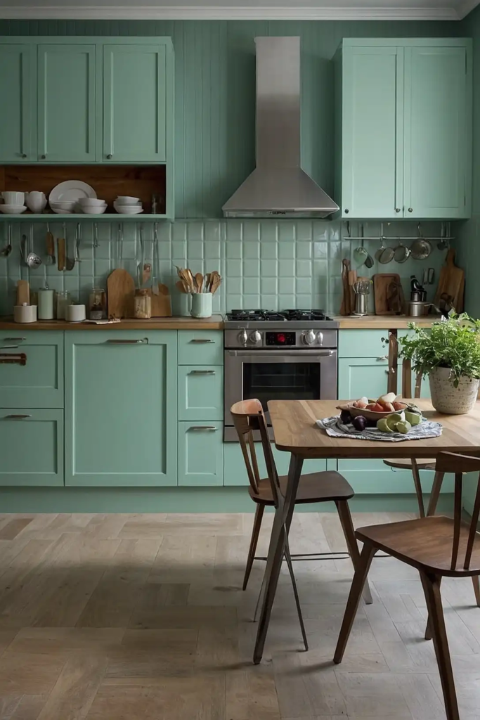
This light, refreshing green brings subtle color while maintaining an open, airy feeling.
The cool tone creates depth without making your kitchen feel closed in.
Fresh Mint pairs wonderfully with white trim and natural materials. It adds personality to your small kitchen without compromising the sense of space.
5: Warm Cream (Sherwin-Williams’ Creamy)
This soft off-white brings subtle warmth to small kitchen spaces.
The gentle yellow undertones create a welcoming atmosphere without feeling dark or heavy.
Creamy works beautifully in kitchens with limited natural light. It brightens your space while adding more character than stark white.
6: Pale Gray (Benjamin Moore’s Gray Owl)
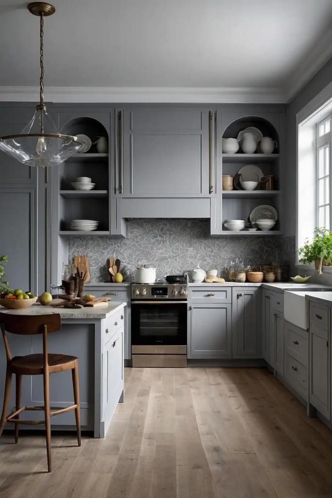
This light, versatile gray creates a contemporary backdrop that expands visual space.
The balanced undertones work in both cool and warm color schemes.
Gray Owl adapts beautifully to changing light throughout the day. It provides subtle sophistication without overwhelming your compact kitchen.
7: Soft Coral (Sherwin-Williams’ Coral Reef)
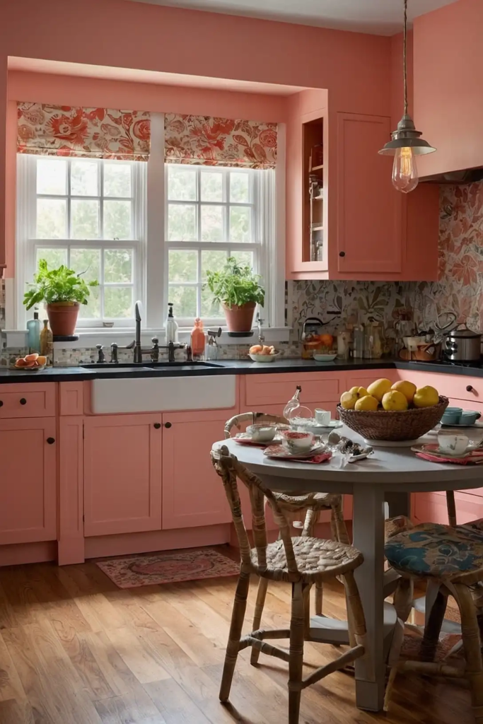
This gentle peachy-pink adds unexpected warmth and character to small kitchens.
The soft hue creates a welcoming atmosphere without visually shrinking your space.
Coral Reef pairs beautifully with white cabinets and gold hardware. It brings personality while maintaining enough lightness to keep your kitchen feeling open.
8: Pale Yellow (Benjamin Moore’s Hawthorne Yellow)
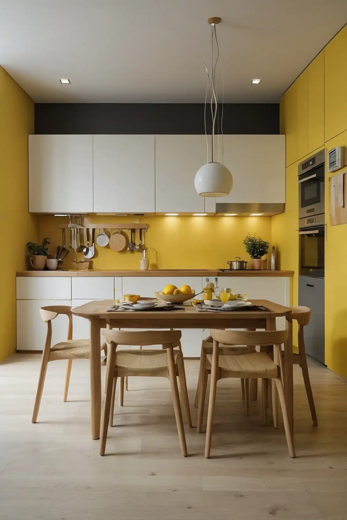
This soft butter yellow brightens small kitchens without overwhelming them.
The gentle warmth creates a cheerful atmosphere even in spaces with limited natural light.
Hawthorne Yellow complements both white and wood cabinet finishes. It brings subtle sunshine to your kitchen throughout the year.
9: Light Sage (Sherwin-Williams’ Sea Salt)
This muted green-gray creates a spa-like feeling in compact kitchen spaces.
The subtle color shifts throughout the day, adding depth without darkness.
Sea Salt connects your kitchen to nature despite limited space. It works beautifully with marble, quartz, and natural wood elements.
10: Soft White (Behr’s Ultra Pure White)
This bright, clean white maximizes light reflection in small kitchen spaces.
The neutral undertones work with any accent color or cabinet finish.
Ultra Pure White visually pushes walls outward, creating an expansive feeling. It provides a perfect blank canvas for adding personality through accessories and textiles.
11: Pale Blue-Gray (Benjamin Moore’s Breath of Fresh Air)
This light, airy blue creates a sense of openness in compact kitchens.
The subtle gray undertones add sophistication without weighing down your space.
Breath of Fresh Air makes your kitchen feel like it extends into the sky. It pairs beautifully with white trim and stainless steel appliances.
12: Soft Greige (Sherwin-Williams’ Agreeable Gray)
This perfect blend of gray and beige creates a versatile background that expands visual space. The warm undertones prevent it from feeling cold while maintaining lightness.
Agreeable Gray complements virtually any cabinet color or countertop material.
It provides subtle depth without overwhelming your limited wall area.
13: Pale Aqua (Benjamin Moore’s Beach Glass)
This soft blue-green evokes water and sky, visually expanding your kitchen space.
The subtle color adds personality without making your kitchen feel smaller.
Beach Glass creates a fresh, serene atmosphere in compact cooking areas. It pairs wonderfully with white cabinets and natural wood accents.
14: Warm White (Sherwin-Williams’ Alabaster)
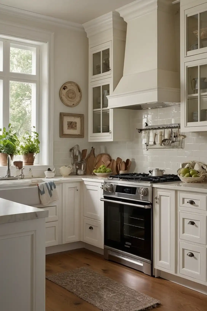
This creamy white brings subtle warmth to small kitchen spaces.
The gentle undertones prevent it from feeling stark while maintaining excellent light reflection.
Alabaster works beautifully on both walls and cabinets. It creates a cohesive look that blurs boundaries and makes your kitchen feel more spacious.
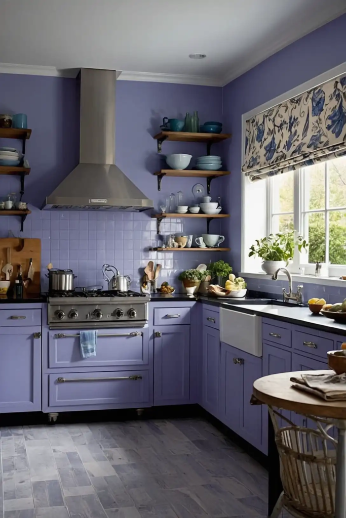
15: Soft Lavender (Benjamin Moore’s Lavender Mist)
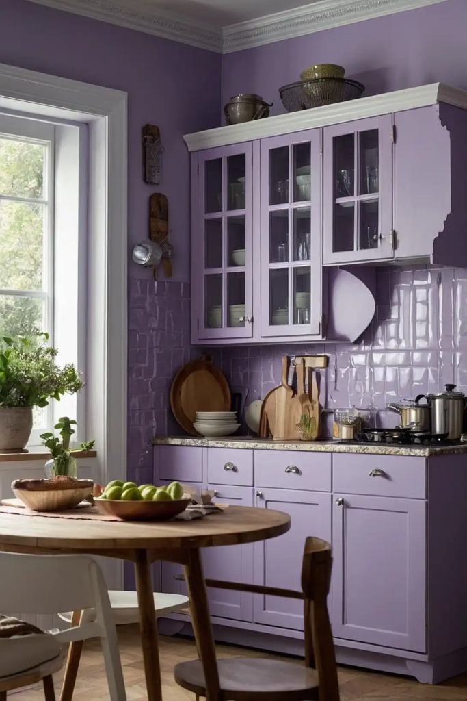
This pale purple adds unexpected character to small kitchens. The cool undertones help walls recede visually, creating a more expansive feeling.
Lavender Mist provides subtle color without overwhelming your space.
It pairs surprisingly well with many countertop materials, adding unique personality to compact kitchens.
16: Light Taupe (Sherwin-Williams’ Accessible Beige)
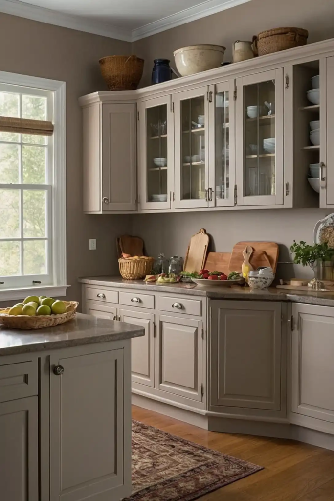
This warm neutral creates a cozy yet spacious feeling in small kitchens.
The balanced undertones work beautifully in spaces with both cool and warm elements.
Accessible Beige complements natural stone and wood elements. It adds depth without darkness, making your compact kitchen feel more substantial.
17: Pale Green (Benjamin Moore’s Spring Mint)
This soft green brings nature’s freshness into small kitchen spaces.
The light color adds personality while maintaining an open, airy feeling.
Spring Mint creates a cheerful atmosphere in compact cooking areas. It pairs beautifully with white cabinets and natural wood accents.
18: Soft Blush (Sherwin-Williams’ Romance)
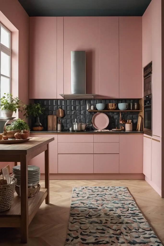
This pale pink adds subtle warmth and unexpected character to small kitchens.
The gentle hue creates a welcoming atmosphere without overwhelming your space.
Romance pairs wonderfully with gray or white cabinets. It brings personality while maintaining enough lightness to keep your kitchen feeling spacious.
19: Light Pewter (Benjamin Moore’s Revere Pewter)
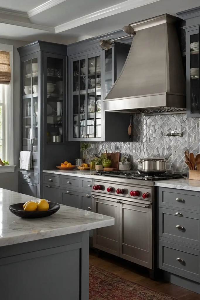
This warm gray creates sophisticated depth without darkening small kitchen spaces.
The perfect balance of warm and cool undertones works in various lighting conditions.
Revere Pewter complements most cabinet colors and countertop materials. It adds substance without weight, making your compact kitchen feel more refined.
20: Soft Turquoise (Sherwin-Williams’ Tidewater)
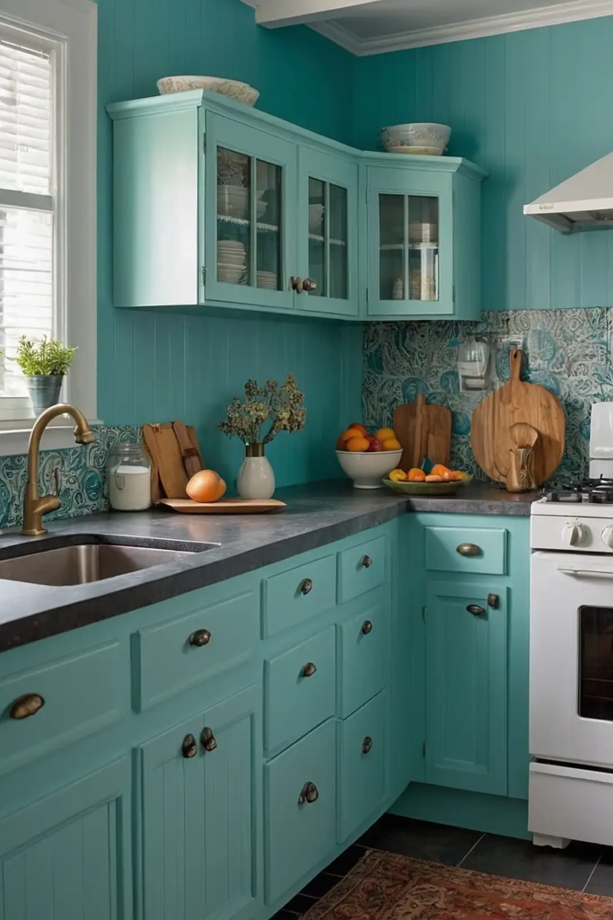
This gentle blue-green brings coastal freshness to small kitchen spaces.
The soft hue creates depth without making your kitchen feel closed in.
Tidewater pairs beautifully with white trim and natural wood elements. It adds personality while maintaining an open, spacious feeling.
21: Creamy Off-White (Benjamin Moore’s Swiss Coffee)
This warm off-white brings subtle richness to small kitchen spaces.
The gentle yellow undertones create a welcoming atmosphere without feeling dark.
Swiss Coffee works wonderfully in kitchens with limited natural light. It brightens your space while adding more character than pure white.
22: Pale Blue (Sherwin-Williams’ Mild Blue)
This soft blue creates a sense of openness in compact kitchens.
The gentle hue recedes visually, making your walls appear farther away.
Mild Blue brings subtle color without overwhelming your space. It pairs beautifully with both white and wood cabinets for a fresh, airy feel.
23: Light Sand (Benjamin Moore’s Manchester Tan)
This warm neutral creates a cozy yet spacious feeling in small kitchens.
The subtle depth adds character without compromising your room’s openness.
Manchester Tan complements natural materials and white trim. It provides a perfect backdrop for both traditional and contemporary kitchen elements.
24: Soft Seafoam (Sherwin-Williams’ Fleeting Green)
This gentle green-blue brings subtle color while maintaining an open, airy feeling.
The cool undertones help walls recede visually in compact spaces.
Fleeting Green adds personality without overwhelming limited wall area. It creates a fresh, serene atmosphere in busy cooking spaces.
25: Cool White (Benjamin Moore’s Chantilly Lace)
This crisp, clean white maximizes light reflection in small kitchen spaces.
The cooler undertones create a bright, contemporary feeling without sterility.
Chantilly Lace works beautifully on both walls and cabinets. It creates a seamless look that visually expands your kitchen’s boundaries.
26: Pale Peach (Sherwin-Williams’ Naïve Peach)
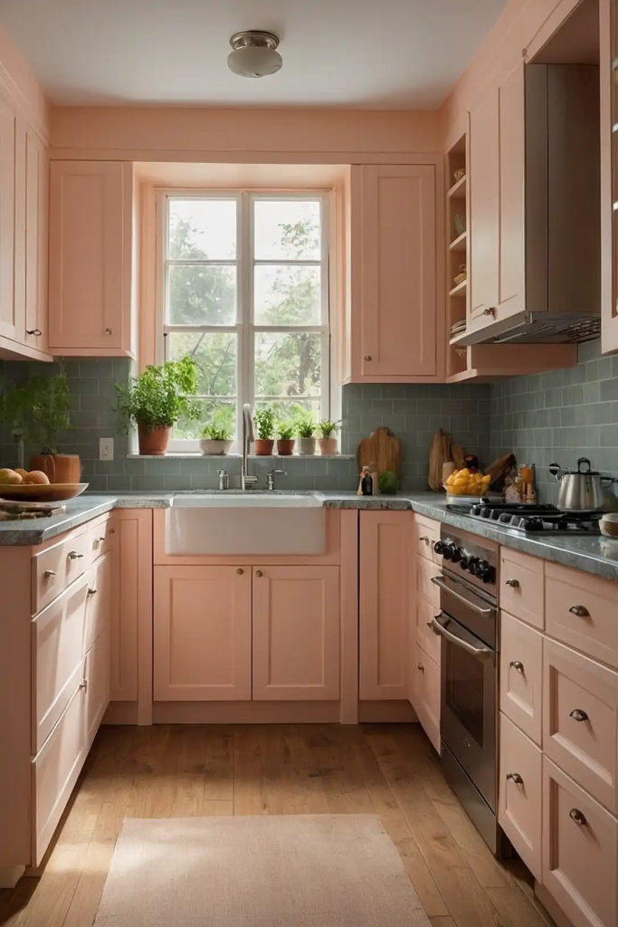
This soft peachy tone brings warm, inviting energy to small kitchens.
The gentle hue adds personality without visually shrinking your space.
Naive Peach creates a subtle glow, especially in morning and evening light. It pairs beautifully with white cabinets and brass or copper accents.
27: Light Periwinkle (Benjamin Moore’s Gentle Gray)
This soft lavender-blue adds unexpected character to small kitchens. The cool undertones help walls recede visually, creating a more expansive feeling.
Gentle Gray provides subtle color depth without overwhelming your space.
It brings unique personality while maintaining an open, airy atmosphere.
Conclusion
The right paint color transforms your small kitchen from cramped to spacious.
Choose light, reflective shades that add personality without overwhelming your compact cooking area.