27 Luminous Paint Colors That Brighten Even the Darkest Rooms
Choosing the right paint color for a room with limited natural light can transform a dark, cave-like space into a bright, welcoming retreat.
The perfect shade can reflect what little light exists and create the illusion of brightness without appearing harsh or artificial.
Low light rooms present unique challenges but also opportunities to play with color psychology in ways that sunny spaces cannot.
The right paint choice works with your room’s lighting situation rather than fighting against it.
Ready to brighten your dim spaces? These 27 paint colors specifically excel in rooms with minimal natural light, creating atmosphere and luminosity where the sun doesn’t shine.
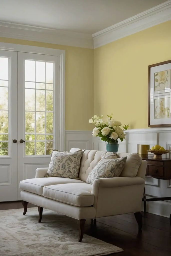
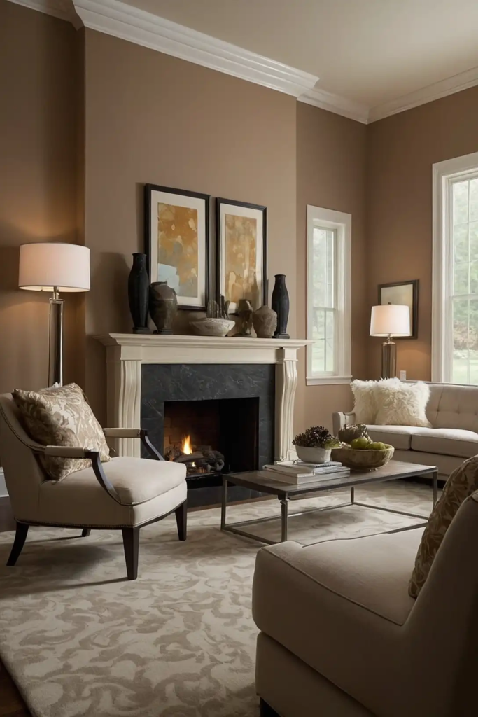
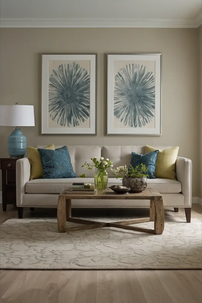
1: Soft Buttery Yellow
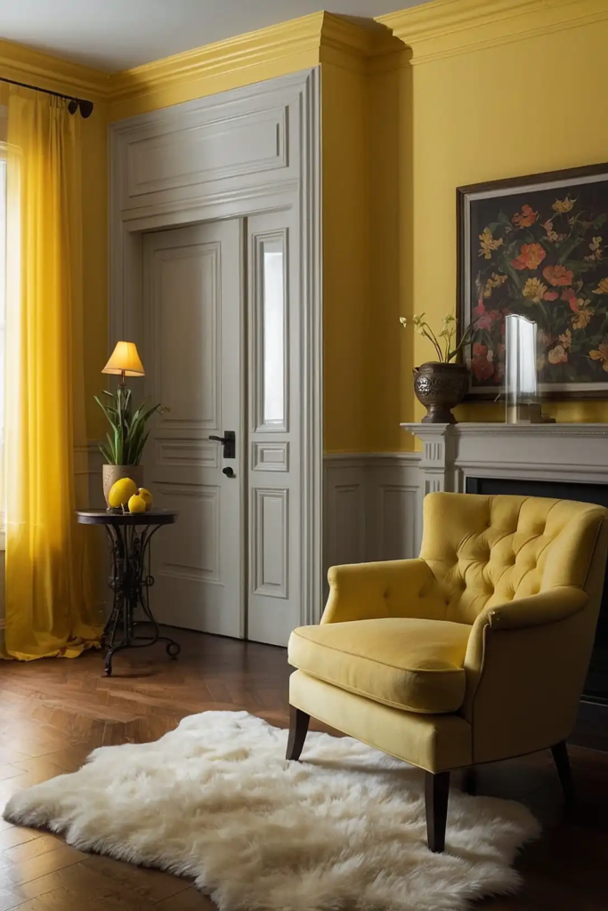
This gentle yellow brings subtle warmth without overwhelming your space.
The buttery tone creates the illusion of sunlight washing over your walls, instantly brightening the darkest corners.
Yellow naturally reflects light, making your room feel more spacious and airy.
Choose a soft, muted shade with warm undertones rather than a bright primary yellow for a sophisticated effect.
Pair with crisp white trim to enhance the brightening impact and prevent the yellow from appearing dingy in low light.
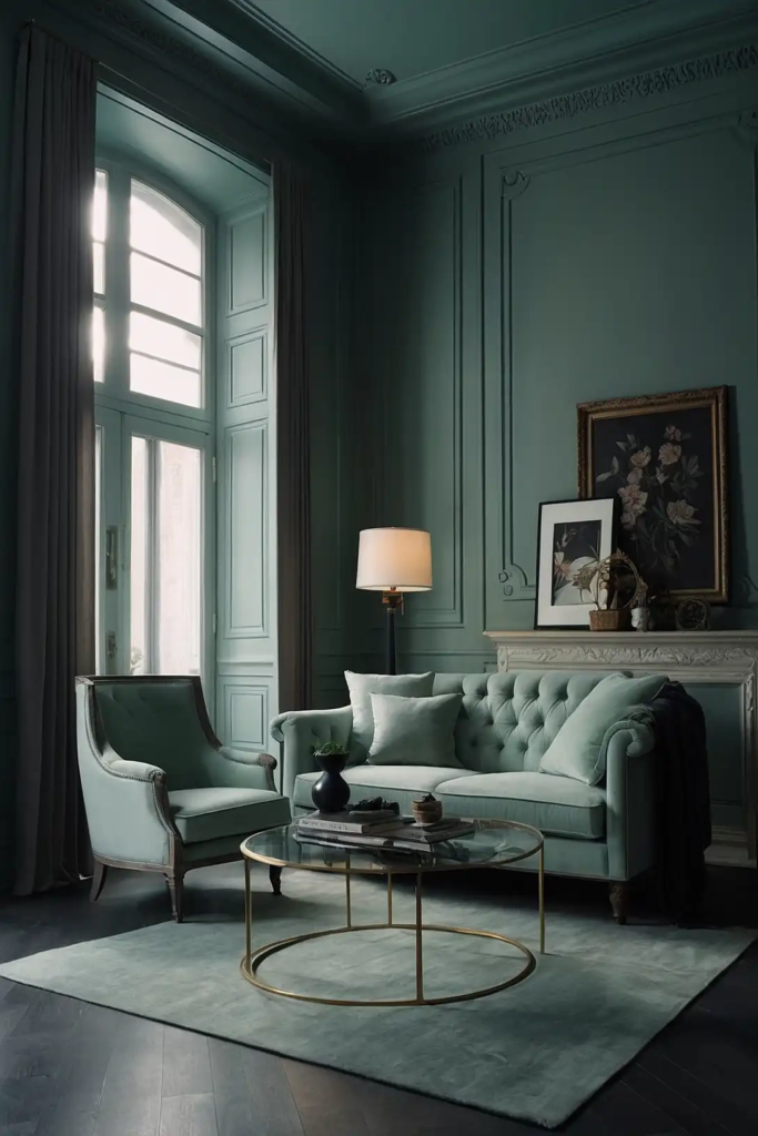
2: Silver Sage
This delicate gray-green hybrid creates subtle dimension in low light situations.
Silver sage contains enough gray to keep it sophisticated while the green component brings life and gentle color.
The reflective quality of the silver undertones helps bounce what little light you have around the room.
The color shifts beautifully throughout the day, appearing more gray or more green depending on your lighting.
This versatile color pairs beautifully with natural wood tones and cream accents for a balanced, organic feel.
3: Pale Lavender
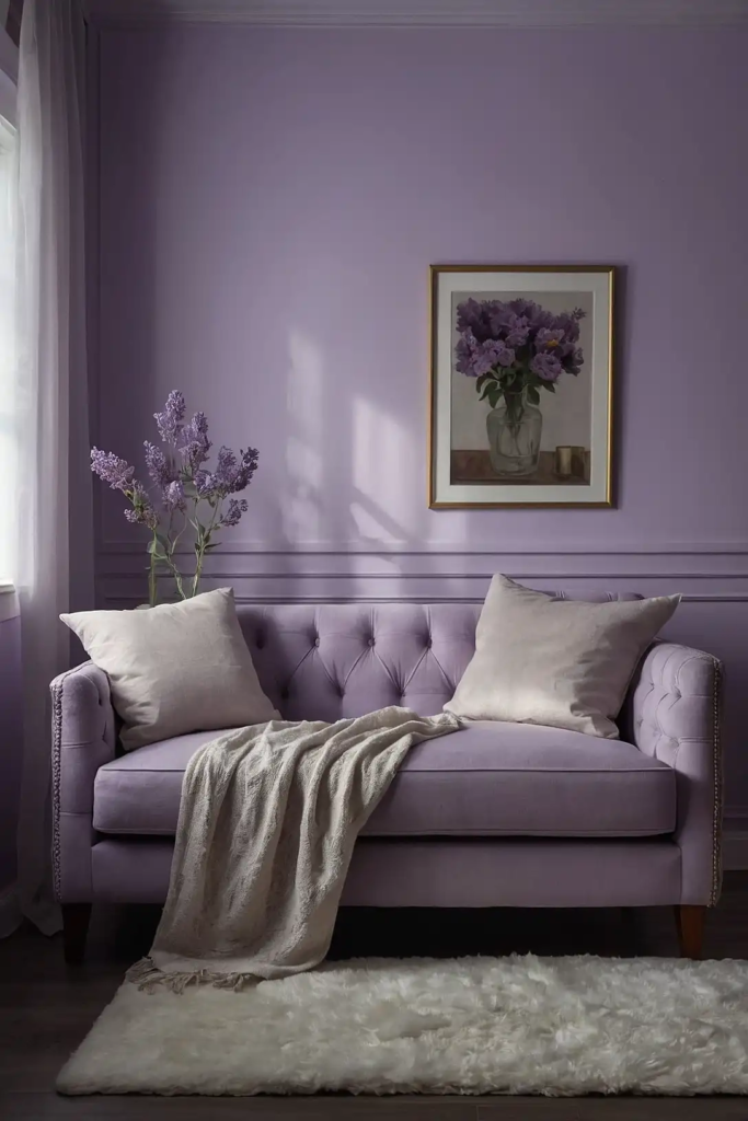
This whisper-soft purple creates a luminous glow in rooms starved for natural light.
Lavender contains both warm and cool pigments, allowing it to adapt beautifully to different lighting conditions.
The gentle purple creates an unexpected alternative to standard whites and beiges without overwhelming the space.
Choose a shade with gray undertones rather than pink for a more sophisticated effect.
This color works particularly well in bedrooms and reading nooks where its soothing properties enhance relaxation.
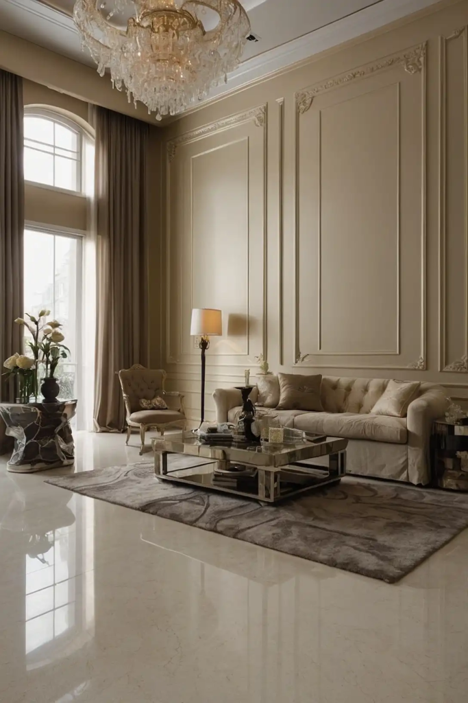
4: Creamy Ivory
This warm off-white brings gentle luminosity without the harshness of stark white. Ivory creates a soft, reflective surface that maximizes whatever light enters your space.
The subtle warmth prevents the color from looking flat or dull in low light conditions.
Choose a shade with yellow or gold undertones rather than pink to prevent it from looking dingy.
Pair with white trim for subtle definition or deeper accents for more dramatic contrast.
5: Pale Aqua
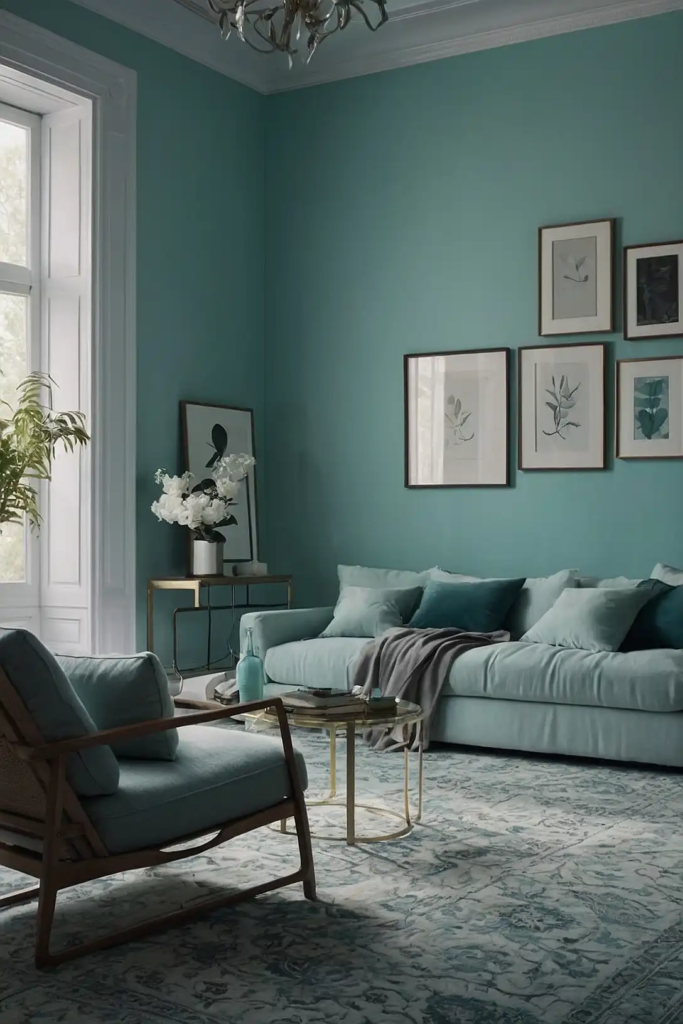
This whisper-soft blue-green hue creates a luminous glow in light-challenged spaces.
Aqua naturally reflects light while bringing a subtle hint of color that feels fresh rather than overwhelming.
The color’s association with water and sky brings spaciousness to confined rooms.
Choose a shade with more gray undertones than bright blue to keep it sophisticated in low lighting.
This versatile color pairs beautifully with both warm and cool accent colors, from coral to navy.
6: Apricot Whisper
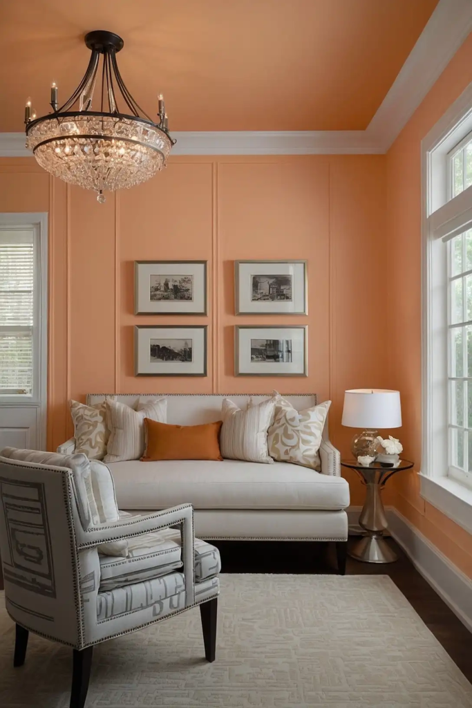
This delicate peach-toned hue brings immediate warmth to north-facing or windowless rooms.
Apricot contains both pink and yellow undertones, creating a universally flattering glow that enhances all complexions.
The subtle color creates a sunset-like warmth on your walls without committing to a definitively orange space.
Choose a shade that reads almost neutral for maximum versatility with your furnishings.
This warming color works particularly well in dining rooms where its flattering glow enhances both food and dinner guests.
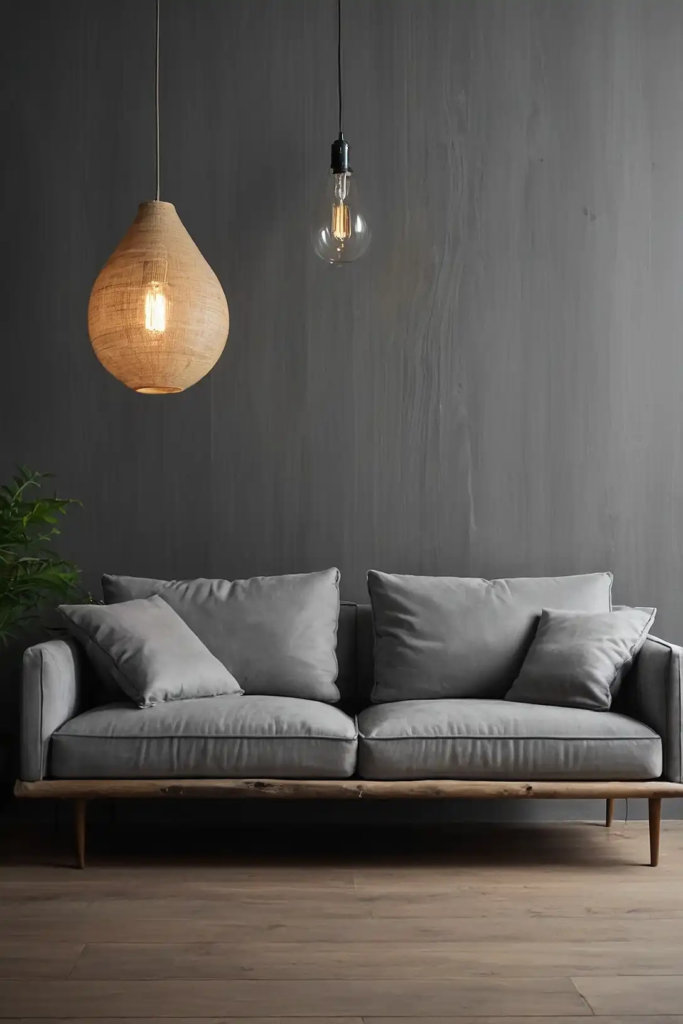
7: Pearl Gray
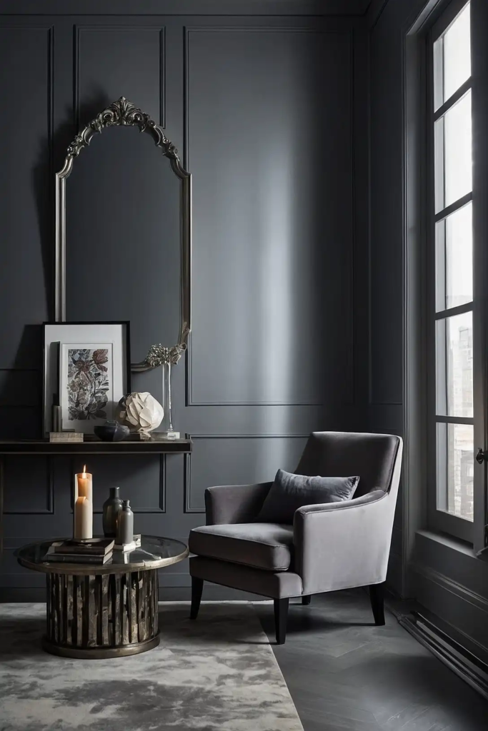
This luminous light gray contains subtle reflective qualities that maximize available light.
Pearl gray creates the perfect neutral backdrop that feels both contemporary and timeless.
The slight warmth prevents it from feeling cold or sterile in light-deprived spaces.
Choose a shade with minimal blue undertones to prevent it from feeling chilly in low light conditions.
This versatile neutral pairs beautifully with virtually any accent color or design style.
8: Pale Celery
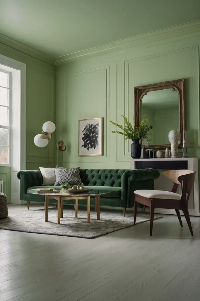
This gentle yellow-green brings nature-inspired freshness to dim rooms. Celery contains enough yellow to reflect light while the green component adds subtle color interest.
The color’s connection to plant life brings vitality to spaces deprived of natural elements.
Choose a shade that reads more pastel than saturated to prevent it from overwhelming the space.
This versatile color pairs beautifully with warm woods, creamy whites, or deeper forest greens for a cohesive palette.
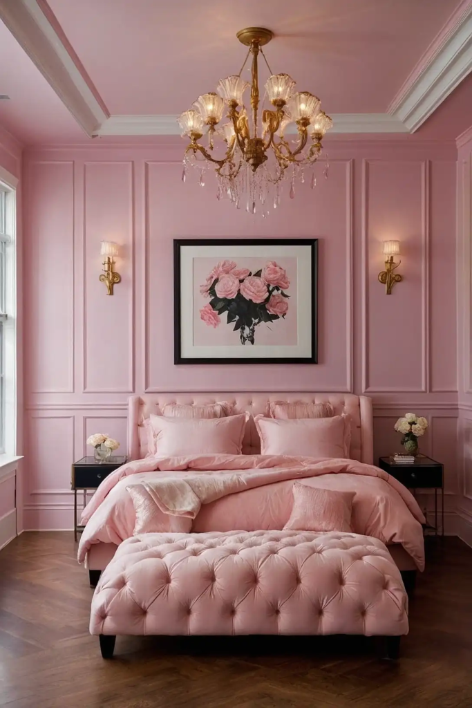
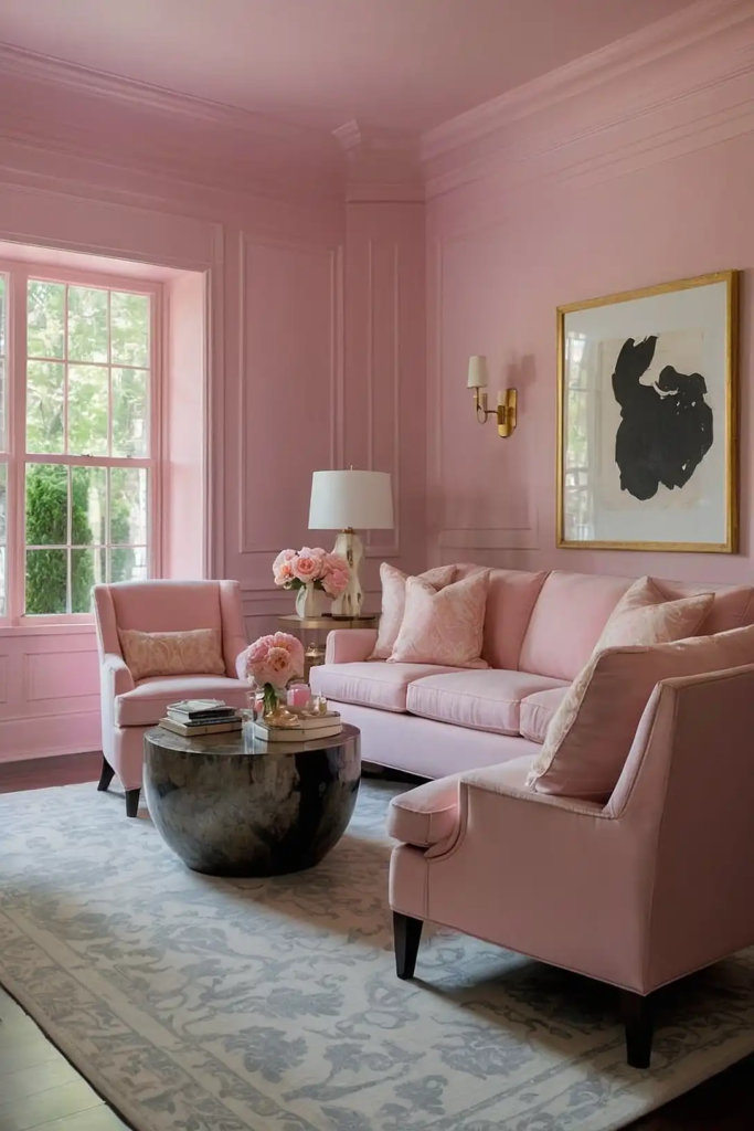
9: Blush Pink
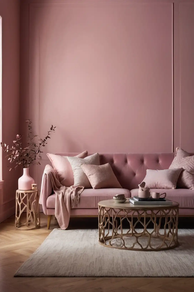
This barely-there pink creates a flattering, luminous glow in rooms with limited light.
Blush contains enough warmth to counteract the coolness often found in north-facing or basement rooms.
The subtle color acts almost as a neutral while adding more personality than plain beige or white.
Choose a shade with gray or taupe undertones rather than bright pink for a sophisticated effect.
This versatile color works beautifully in bedrooms, powder rooms, or any space where a flattering light enhances the experience.
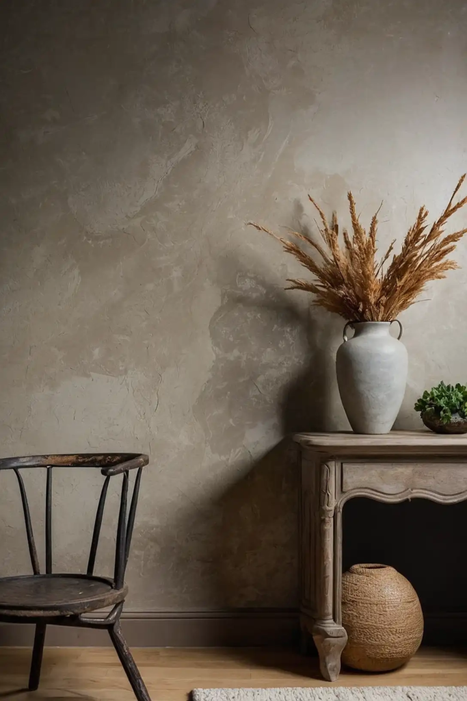
10: Pale Driftwood
This light taupe with gray undertones brings subtle warmth while maintaining brightness.
Driftwood creates a perfect neutral that reads neither too warm nor too cool in variable lighting conditions.
The color’s natural inspiration brings organic sophistication to your space.
Choose a shade with enough gray to keep it modern but enough warmth to prevent it from feeling flat.
This versatile neutral pairs beautifully with virtually any accent color from navy to emerald green.
11: Buttermilk
This soft, glowing off-white brings immediate warmth to spaces lacking natural light.
Buttermilk contains yellow undertones that create a sunny effect without committing to a definitely yellow room.
The color naturally reflects light, instantly brightening dark corners and narrow hallways.
Choose a shade with creamy depth rather than harsh brightness for a sophisticated effect.
This versatile near-neutral pairs beautifully with both rustic elements and more contemporary furnishings.
12: Silvery Blue
This ethereal pale blue creates a luminous glow that expands visual space. Silvery blue contains reflective qualities that maximize whatever natural light enters your room.
The cool undertones bring freshness while the gray component keeps it sophisticated rather than childish.
Choose a shade with more gray than pure blue to ensure it doesn’t turn dull in low light.
This versatile color pairs beautifully with warm woods and creamy whites for a balanced palette.
13: Pale Pistachio
This gentle yellow-green brings subtle freshness to dim spaces. Pistachio contains enough yellow to reflect light while the green component adds nature-inspired vitality.
The color shifts beautifully throughout the day, appearing more yellow or more green depending on your lighting.
Choose a shade with gray undertones to keep it sophisticated rather than cartoonish.
This versatile color pairs beautifully with creamy whites, natural textures, or deeper forest greens for a cohesive palette.
14: Warm Bisque
This creamy neutral brings subtle warmth without overwhelming your space.
Bisque contains enough yellow undertones to counteract the coolness often found in rooms with northern exposure.
The color naturally reflects light, creating an immediately brighter atmosphere.
Choose a shade with depth rather than brightness to prevent it from looking flat in low light situations.
This versatile neutral pairs beautifully with virtually any accent color from navy to burgundy.
15: Pale Celadon
This whisper-soft green-gray creates subtle dimension in light-challenged rooms.
Celadon contains historic sophistication while its pale nature ensures it brightens rather than darkens your space.
The color shifts beautifully throughout the day, creating visual interest without overwhelming.
Choose a shade with more gray than green to ensure it remains sophisticated in all lighting conditions.
This versatile color pairs beautifully with creamy whites, natural linens, or deeper blues for a balanced palette.
16: Champagne
This luminous neutral brings subtle warmth and reflective qualities to dim spaces.
Champagne contains just enough gold tones to create a perpetual glow without feeling obviously yellow.
The color naturally reflects light, maximizing brightness in rooms with limited windows.
Choose a shade with sophistication rather than obvious sparkle for a mature, elegant effect.
This versatile near-neutral pairs beautifully with both cool and warm accent colors for a personalized palette.
17: Ballet Slipper Pink
This ethereal pink creates a luminous glow that brings immediate warmth to cool spaces.
Ballet pink contains enough gray undertones to keep it sophisticated rather than overly sweet or juvenile.
The color shifts beautifully throughout the day, appearing more pink in some lights and more neutral in others.
Choose a shade with subtlety rather than brightness for maximum versatility.
This gentle color works particularly well in bedrooms, dressing rooms, or other spaces where a flattering light enhances the experience.
18: Soft Pewter
This luminous light gray creates sophisticated brightness in rooms with limited natural light.
Pewter’s subtle reflective quality maximizes whatever light enters your space, bouncing it around the room.
The gentle warmth prevents it from feeling cold or clinical in already light-challenged areas.
Choose a shade with minimal blue undertones to prevent it from feeling chilly in northern exposures.
This versatile neutral pairs beautifully with both bold accent colors and subtle tone-on-tone schemes.
19: Pale Honeydew
This whisper-soft green brings subtle freshness to dim spaces.
Honeydew contains enough yellow undertones to reflect light while the green component adds gentle color interest.
The barely-there color creates the effect of nature without overwhelming the space.
Choose a shade that reads more pastel than saturated to prevent it from dominating your room.
This versatile color pairs beautifully with natural woods, creamy whites, or deeper sage greens for a cohesive palette.
20: Oyster White

This complex off-white brings subtle warmth without yellowing in low light situations.
Oyster white contains a perfect balance of warm and cool undertones, allowing it to adapt to different lighting conditions.
The color creates a reflective surface that maximizes brightness in dim spaces. Choose a shade with depth rather than starkness to prevent it from looking flat in shadows.
This versatile neutral pairs beautifully with virtually any accent color or design style.
21: Pale Duck Egg
This gentle blue-green hybrid creates subtle dimension in light-challenged rooms.
Duck egg contains historic charm while its pale nature ensures it brightens rather than darkens your space.
The color shifts beautifully throughout the day, appearing more blue or more green depending on the light.
Choose a shade with gray undertones to keep it sophisticated in all lighting conditions.
This versatile color pairs beautifully with cream, natural woods, or deeper teal for a cohesive palette.
22: Alabaster
This luminous warm white brings subtle depth without yellowing in low light. Alabaster contains just enough warmth to prevent it from feeling stark or clinical in dim conditions.
The color naturally reflects light, creating an immediately brighter atmosphere. Choose a shade from a premium paint line for maximum light reflection and coverage.
This versatile neutral pairs beautifully with both bold accent colors and subtle tone-on-tone schemes.
23: Sand Dollar
This warm beige brings subtle dimension to dim spaces without darkening them further.
Sand dollar contains enough warmth to counteract cool shadows without yellowing in artificial light.
The color’s natural inspiration brings organic sophistication to your space.
Choose a shade with minimal yellow undertones to prevent it from looking dingy in low lighting conditions.
This versatile neutral pairs beautifully with coastal blues, soft greens, or deeper earth tones.
24: Pale Celestial Blue
This ethereal light blue creates a luminous, expansive feeling in rooms starved for natural light.
Celestial blue contains reflective qualities that maximize brightness while adding subtle color interest.
The color’s association with sky brings immediate visual expansion to confined spaces.
Choose a shade with gray undertones rather than bright blue to keep it sophisticated in dim lighting.
This versatile color pairs beautifully with crisp whites, natural textures, or deeper navy accents.
25: Warm Limestone
This complex neutral brings subtle depth without darkening already dim spaces.
Limestone contains natural variation that creates interest in changing light conditions throughout the day.
The color’s connection to natural stone brings organic sophistication to your interior.
Choose a shade with minimal yellow undertones to prevent it from looking dingy in low lighting.
This versatile neutral pairs beautifully with virtually any accent color from burgundy to forest green.
26: Pale Cameo Pink
This whisper-soft pink creates a flattering glow that brightens dim corners.
Cameo pink contains enough gray undertones to keep it sophisticated rather than obviously pink or juvenile.
The color shifts beautifully throughout the day, appearing more pink in some lights and more neutral in others.
Choose a shade with subtlety rather than brightness for maximum versatility.
This gentle color works particularly well in powder rooms, bedrooms, or dining rooms where flattering light enhances the experience.
27: Silver Drop
This luminous pale gray creates sophisticated brightness in rooms with limited windows.
Silver drop’s reflective quality maximizes whatever light enters your space, bouncing it around the room.
The color contains just enough warmth to prevent it from feeling cold in already light-challenged areas.
Choose a shade with minimal blue undertones to prevent it from feeling chilly in northern exposures.
This versatile neutral pairs beautifully with both cool and warm accent colors for a personalized palette.
Conclusion
The right paint color transforms your light-challenged room from dark and dreary to bright and inviting.
Choose a shade that reflects your personal style while maximizing the available light in your unique space.