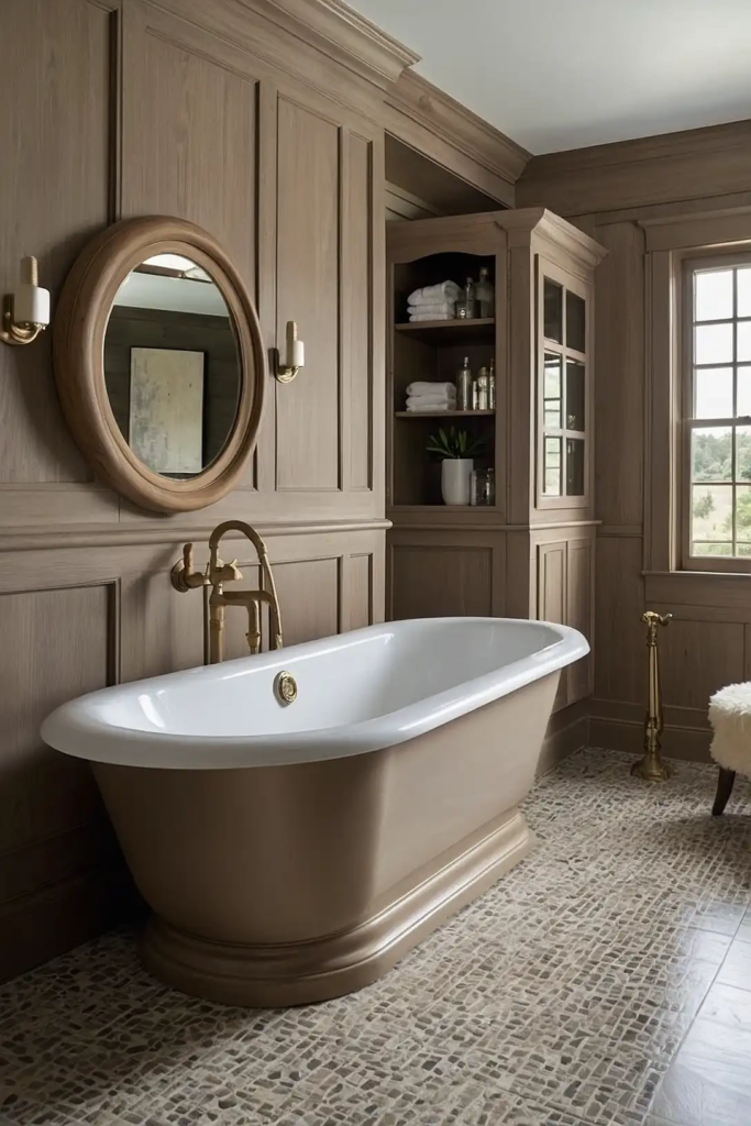
27 Transformative Paint Colors That Give Bathroom Cabinets Stunning New Life
Bathroom cabinets often endure years of use before we consider updating them.
A fresh coat of paint offers the most budget-friendly way to completely transform your bathroom without the expense of a full renovation.
The right cabinet color can make your space feel larger, more luxurious, or perfectly on-trend.
With so many options available, choosing the perfect shade might feel overwhelming.
We’ve curated 27 of the best paint colors specifically selected for bathroom cabinets.
From timeless neutrals to bold statement hues, these colors will help you achieve a professional-looking transformation that completely refreshes your space.
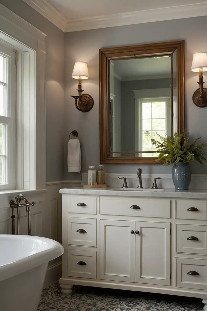
1: Benjamin Moore “Simply White”
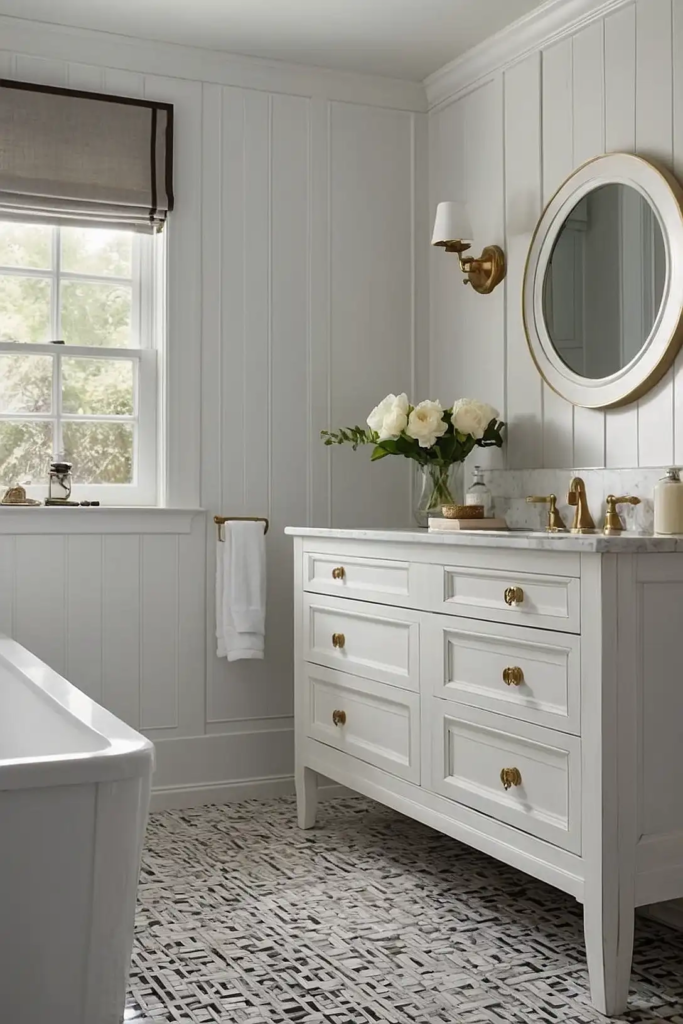
This clean, crisp white brightens any bathroom while providing a timeless, versatile foundation.
“Simply White” reflects light beautifully, making even the smallest bathrooms feel more spacious.
You’ll appreciate how this shade complements any wall color or tile choice. For best results, use a semi-gloss or satin finish that resists moisture and wipes clean easily.
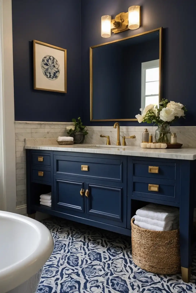
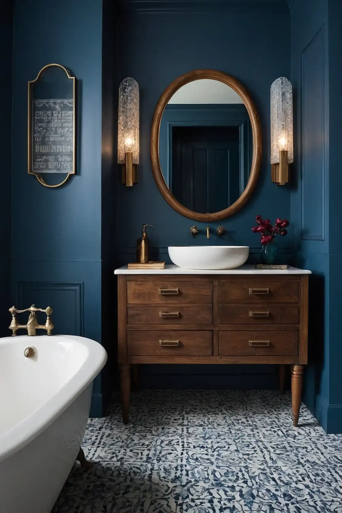
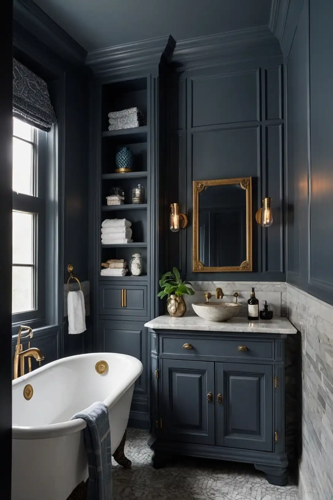
2: Sherwin-Williams “Naval”
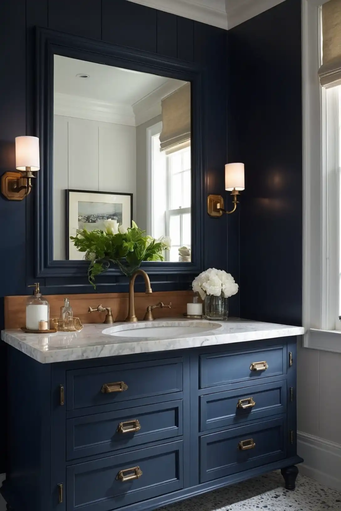
Add sophisticated drama with this deep, rich navy blue. “Naval” creates striking contrast against white countertops and walls while adding unexpected depth to your bathroom.
Navy cabinets work surprisingly well in spaces of any size.
The color reads almost as a neutral while still making a confident style statement that won’t quickly feel dated.
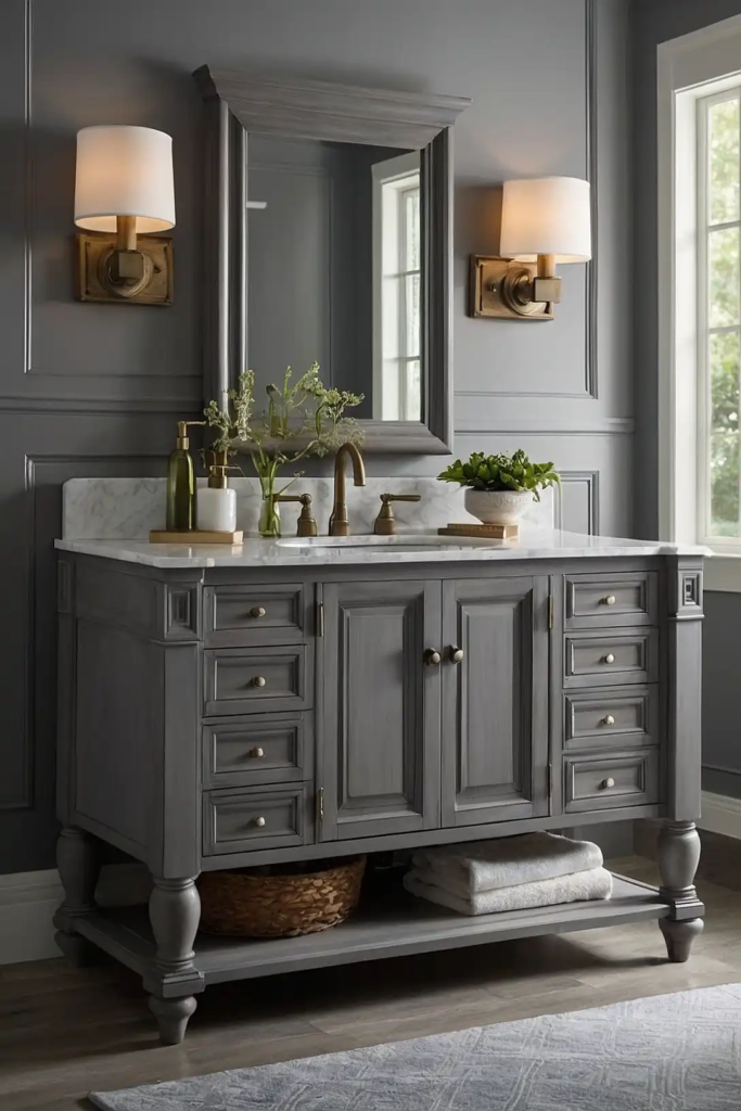
3: Benjamin Moore “Revere Pewter”
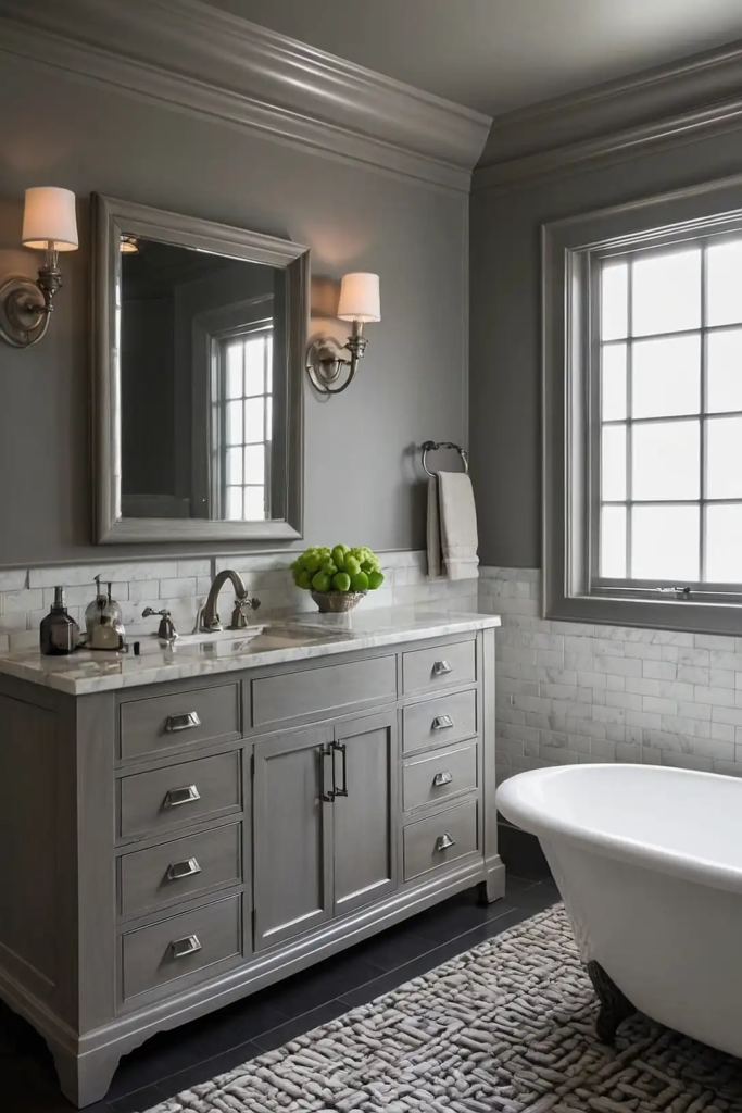
This perfect greige (gray-beige blend) offers subtle warmth without overwhelming your space.
“Revere Pewter” provides sophistication without committing to a definite gray or beige.
You’ll love how this chameleon-like neutral adapts to your existing fixtures and finishes. It works especially well with marble countertops and brushed nickel hardware.
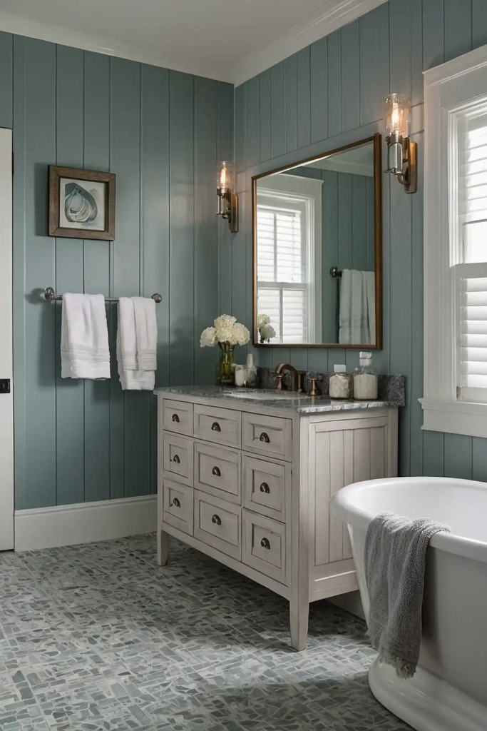
4: Sherwin-Williams “Sage”
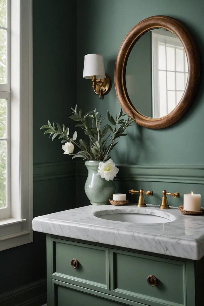
Bring nature-inspired tranquility with this soft, muted green. “Sage” adds color while maintaining a spa-like atmosphere perfect for creating a relaxing bathroom retreat.
This versatile green-gray works beautifully with both warm and cool color schemes.
It complements natural stone, wood accents, and most metal finishes for a harmonious look.
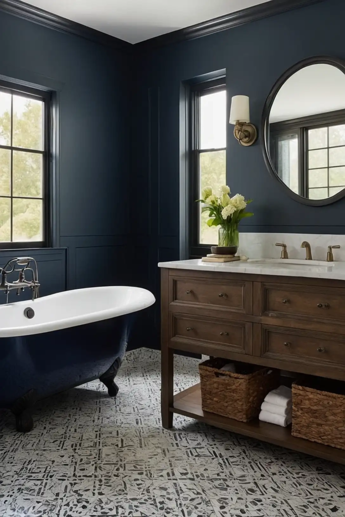
5: Benjamin Moore “Hale Navy”
Create timeless elegance with this deep, muted navy.
“Hale Navy” offers rich color without the brightness of some blues, resulting in sophisticated cabinets that ground your bathroom design.
You’ll appreciate how this classic shade pairs with virtually any countertop material. Add brass hardware for a striking contrast that enhances the navy’s depth and richness.
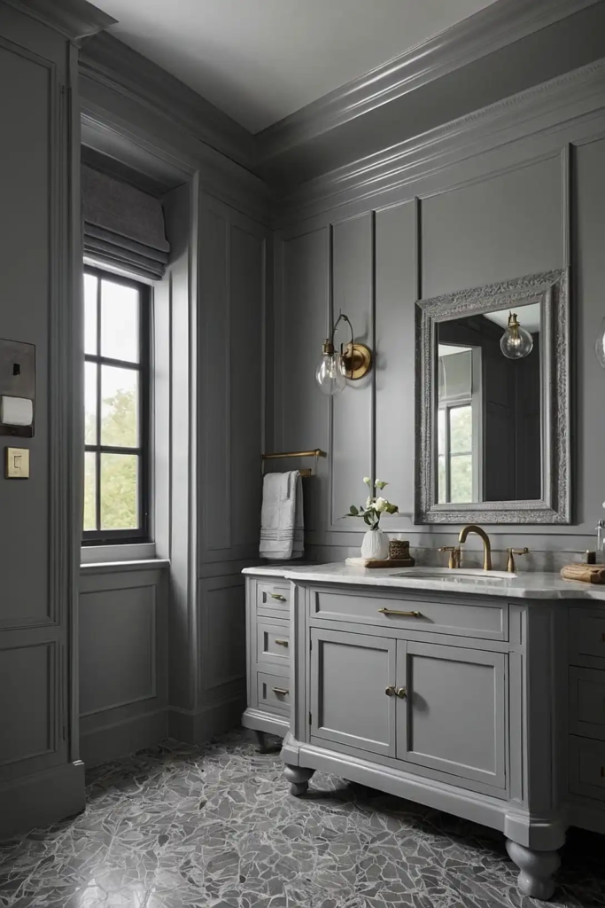
6: Sherwin-Williams “Mindful Gray”
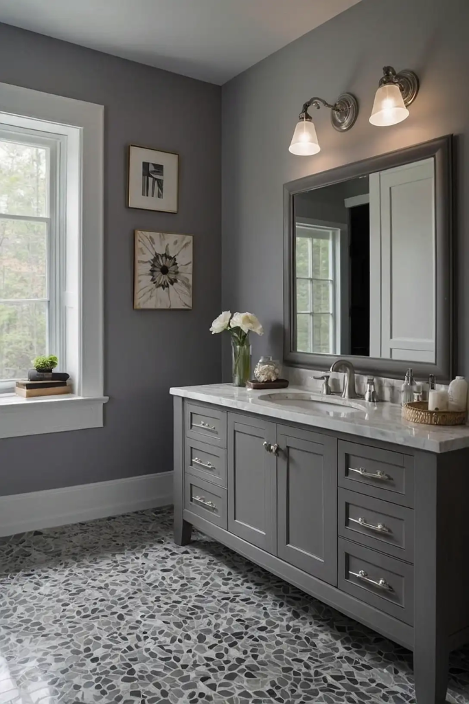
Achieve perfect balance with this versatile medium gray. “Mindful Gray” adds definition to your cabinets without the starkness of darker colors, creating subtle sophistication.
This adaptable neutral works with both warm and cool color schemes.
It provides enough contrast against white walls without overwhelming smaller bathroom spaces.
7: Benjamin Moore “Ballet White”

Add subtle warmth with this creamy off-white that avoids yellow undertones. “Ballet White” brightens your bathroom while providing more softness than stark white.
You’ll love how this gentle neutral enhances natural stone countertops.
It creates an inviting, spa-like atmosphere perfect for master bathrooms and powder rooms alike.
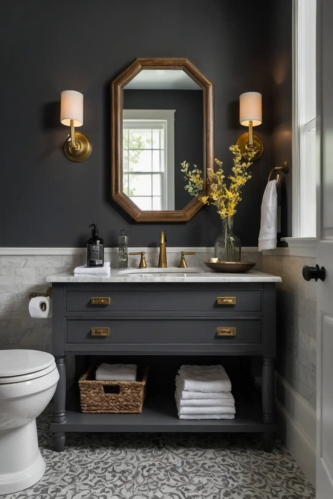
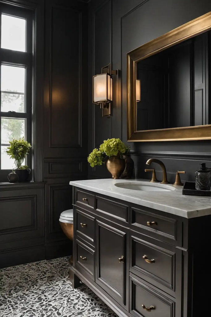
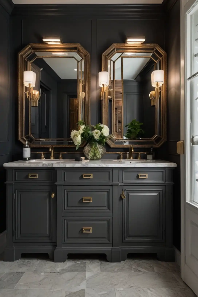
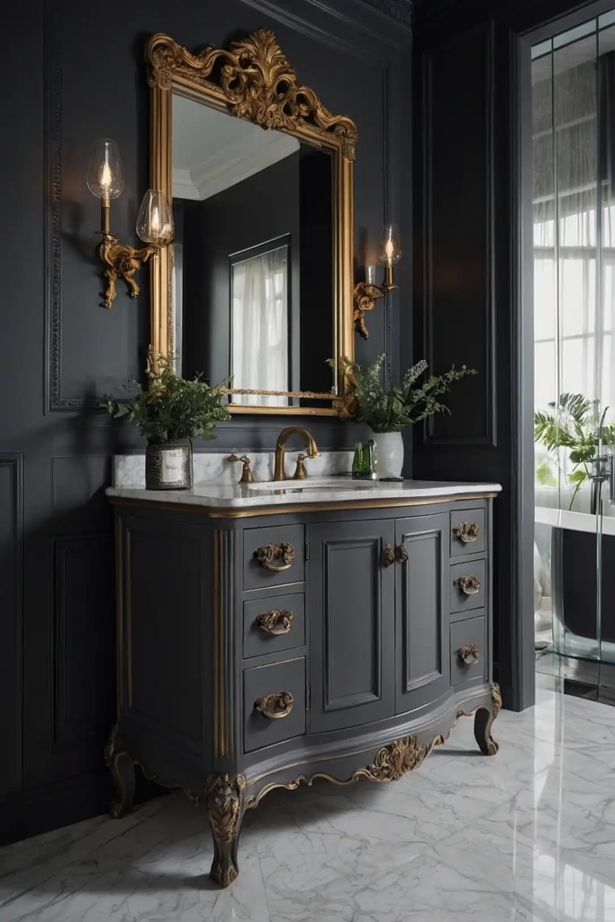
8: Sherwin-Williams “Iron Ore”
Make a bold statement with this deep charcoal that reads almost black without the harshness.
“Iron Ore” creates dramatic contrast against lighter elements in your bathroom.
This sophisticated dark choice adds architectural interest and grounds your space. It pairs beautifully with marble countertops and brushed gold hardware for luxurious contrast.
9: Benjamin Moore “Pale Oak”
Create subtle sophistication with this whisper-soft greige. “Pale Oak” adds dimension to your cabinets without committing to a distinct color, allowing other elements to shine.
This versatile light neutral works with virtually any bathroom style.
It provides just enough contrast against white walls while maintaining an airy, spacious feeling.
10: Sherwin-Williams “Sea Salt”
Infuse your bathroom with spa-like tranquility using this soft blue-green-gray chameleon.
“Sea Salt” shifts subtly throughout the day, creating visual interest without overwhelming your space.
This versatile, nature-inspired shade complements most tile colors and fixture finishes. It excels particularly in bathrooms with natural light, where its subtle color variations shine.
11: Benjamin Moore “Kendall Charcoal”
Add dramatic sophistication with this rich, deep gray. “Kendall Charcoal” creates a luxurious focal point without the harshness of pure black cabinets.
This versatile dark neutral works beautifully with marble, quartz, or solid surface countertops.
Add polished chrome or brushed nickel hardware for classic contrast that enhances the color’s depth.
12: Sherwin-Williams “Alabaster”
Brighten your bathroom with this warm off-white that avoids looking too stark or clinical. “Alabaster” creates a soft, inviting atmosphere while still reflecting maximum light.
This versatile neutral complements both cool and warm color schemes.
It provides the perfect backdrop for statement hardware or colorful accessories that can be easily changed.
13: Benjamin Moore “Van Douse Blue”
Add sophisticated color depth with this historical blue-gray. “Van Douse Blue” creates character and interest without overwhelming your bathroom’s color scheme.
This versatile medium tone works with both traditional and modern design elements.
It pairs beautifully with marble countertops and brass or bronze hardware for timeless elegance.
14: Sherwin-Williams “Urbane Bronze”
Create earthy sophistication with this deep, rich bronze-brown. “Urbane Bronze” adds warmth and depth that pure gray cabinets can’t match.
This grounding neutral pairs beautifully with natural stone and warm metal finishes.
It brings unexpected richness to your bathroom while still functioning as a versatile neutral.
15: Benjamin Moore “Edge-comb Gray”
Add subtle warmth with this light greige that brightens without washing out.
“Edge-comb Gray” provides more dimension than plain white while maintaining an airy, spacious feeling.
This versatile neutral adapts beautifully to changing light throughout the day. It works with both cool and warm color schemes for effortless bathroom harmony.
16: Sherwin-Williams “Rain-washed”
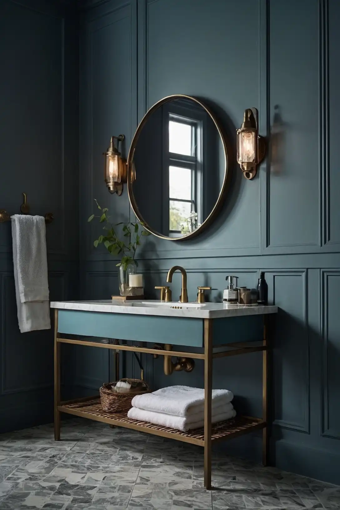
Infuse your bathroom with subtle color using this soft blue-green. “Rain-washed” creates a spa-like atmosphere without committing to a distinct blue or green.
This versatile pastel shifts beautifully throughout the day, appearing more blue or green depending on your lighting.
It pairs wonderfully with white countertops and brushed nickel hardware.
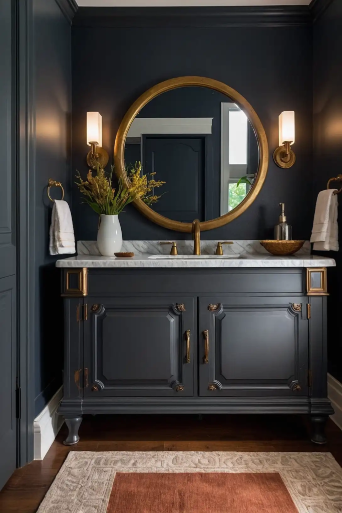
17: Benjamin Moore “Gentleman’s Gray”
Add sophisticated depth with this blue-black hybrid. “Gentleman’s Gray” reads as a deep, moody navy in some lighting and nearly black in others for intriguing dimension.
This complex dark color creates dramatic contrast against lighter bathroom elements.
It pairs beautifully with marble countertops and brass hardware for refined elegance.
18: Sherwin-Williams “Tricorn Black”
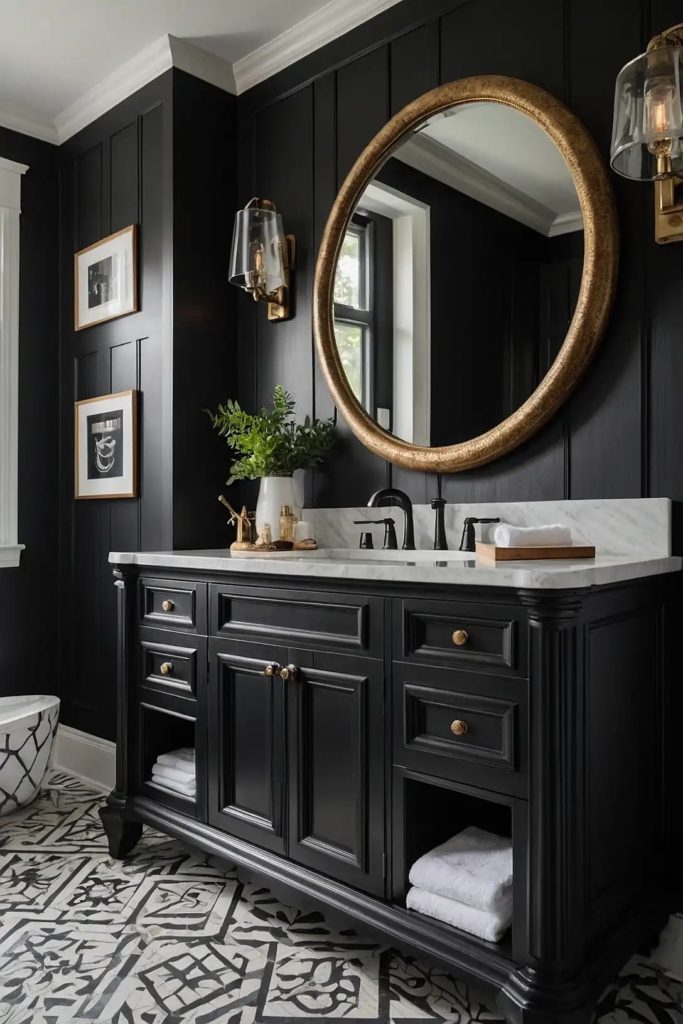
Make a bold, contemporary statement with true black cabinets. “Tricorn Black” creates striking contrast and architectural definition in bathrooms of any size.
This dramatic choice works surprisingly well even in smaller spaces.
Use it with white countertops and walls for high-contrast sophistication or with softer neutrals for more subtle impact.
19: Benjamin Moore “Gray Owl”
Create versatile sophistication with this light gray that adapts to its surroundings.
“Gray Owl” provides subtle contrast against white elements without overwhelming your bathroom.
This chameleon-like neutral can appear more blue or green depending on your lighting and surrounding colors.
It works beautifully with most countertop materials and fixture finishes.
20: Sherwin-Williams “Retreat”
Bring spa-like tranquility with this muted blue-green that evokes natural elements. “Retreat” adds subtle color while maintaining a sophisticated, restful atmosphere.
This versatile medium tone complements both white and cream fixtures.
It creates a cohesive look with natural stone countertops featuring blue or green undertones.
21: Benjamin Moore “Swiss Coffee”
Add subtle warmth with this soft off-white that brightens without harsh starkness.
“Swiss Coffee” creates an inviting atmosphere while still reflecting plenty of light.
This versatile neutral works with both cool and warm color schemes. It provides perfect backdrop for statement hardware or colorful accessories that can be easily changed.
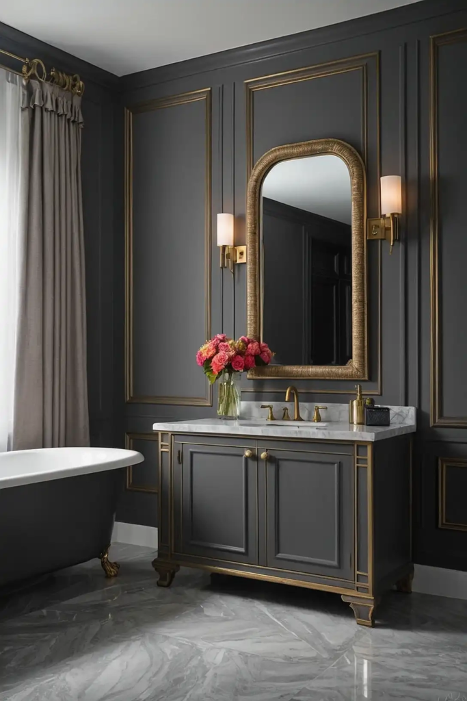
22: Sherwin-Williams “Peppercorn”
Create sophisticated contrast with this deep, cool gray. “Peppercorn” adds drama and definition without the harshness of black or the boldness of colorful cabinets.
This versatile dark neutral pairs beautifully with most countertop materials.
Add brushed nickel or chrome hardware for sleek, contemporary contrast that enhances the color’s depth.
23: Benjamin Moore “Aegean Teal”
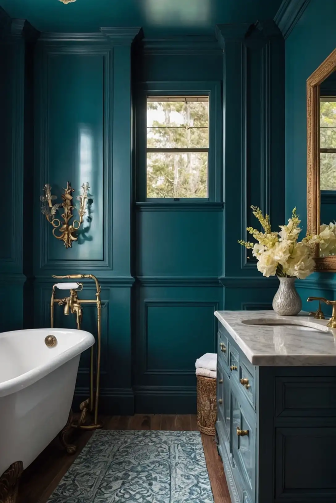
Make a confident color statement with this balanced blue-green-gray. “Aegean Teal” adds personality without overwhelming your bathroom’s color scheme.
This versatile medium tone bridges both warm and cool color palettes.
It creates a focal point that still plays well with various countertop materials and fixture finishes.
24: Sherwin-Williams “Dorian Gray”
Add subtle depth with this perfect medium gray that avoids looking too cool or stark.
“Dorian Gray” provides sophisticated contrast while maintaining a soft, inviting atmosphere.
This versatile neutral works beautifully with both warm and cool color schemes.
It creates the perfect amount of definition against white walls without darkening smaller spaces.
25: Benjamin Moore “Smoke”
Create subtle color interest with this blue-gray chameleon. “Smoke” shifts between gray and blue depending on lighting, adding dimensional interest to your cabinets.
This versatile light-medium tone pairs beautifully with white, cream, or gray countertops.
It adds character while still functioning essentially as a sophisticated neutral.
26: Sherwin-Williams “Pewter Green”
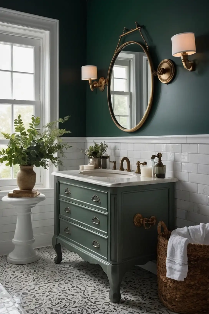
Add heritage-inspired sophistication with this muted, gray-green. “Pewter Green” creates subtle color interest without overwhelming your bathroom’s color scheme.
This versatile earth tone works beautifully with marble, granite, or quartz countertops.
It bridges traditional and contemporary design elements for timeless appeal.
27: Benjamin Moore “Chantilly Lace”

Maximize brightness with this clean, crisp white that contains no undertones. “Chantilly Lace” creates a fresh, timeless look that works with any bathroom style.
This versatile pure white provides the perfect backdrop for statement hardware or colorful accessories.
Use a semi-gloss finish for maximum durability and easy cleaning in moisture-prone bathrooms.
Conclusion
Repainting your bathroom cabinets delivers maximum impact with minimal investment.
Whether you choose timeless white, sophisticated navy, or calming sage, these colors will transform your bathroom into a fresh, updated space you’ll enjoy daily.